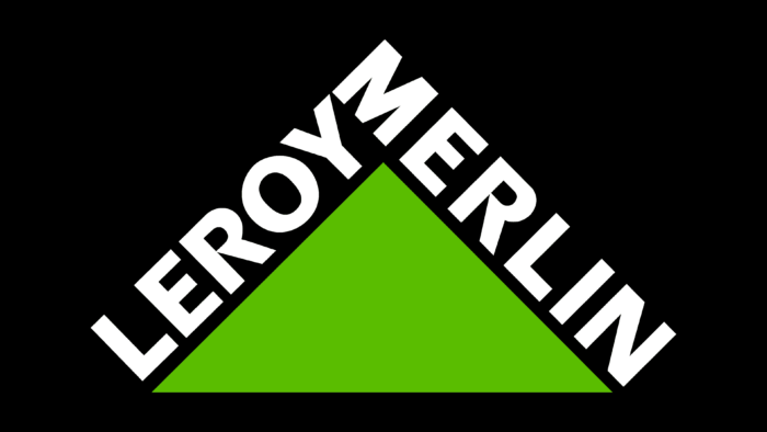
The emblem of the trading house is like a well-groomed corner of the garden, in which the lawn grass is green. The Leroy Merlin logo indicates that you can buy everything you need in the brand’s outlets to create your cozy island of nature.
Leroy Merlin: Brand overview
| Founded: | 1923 |
| Founder: | Adolphe Leroy & Rose Merlin |
| Headquarters: | Lille, France |
| Website: | leroymerlin.com |
Meaning and History
Leroy Merlin is a joint project of a French married couple, which began with a small shop that 19-year-old Adolf inherited from his father. Trading building supplies and prefabricated houses, the couple went through several ups and downs. Children added scale to their business. They registered L’enchanteur Leroy Merlin in the 1950s, equipped the headquarters, and created a chain of do-it-yourself stores operating in the suburbs. In 1981, the company, which consisted of 33 stores, was bought by the larger Auchan concern. With the help of a new owner, it expanded beyond France, absorbing 17 companies. Together with the Auchan brands, this conglomerate was transformed into the ADEO group.
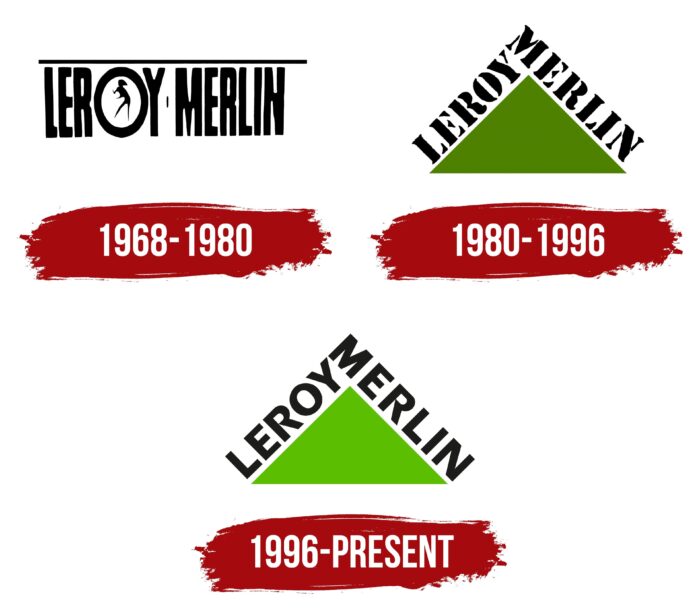
The well-known company logo has changed three times. Each of the changes reflected a new stage in the development of Leroy Merlin.
Who is Leroy Merlin?
It is a French construction hypermarket with offices in 13 countries on three continents. The headquarters is located in Lille and is owned by the Mulliez Family Association.
1923 – 1968
The logo of this period has not been preserved. Before World War II, Leroy Merlin was a single small shop that sold goods to residents and, most likely, did not have a logo. The outlet closed during World War II, and its goods were confiscated for the war effort. And in the late 40s, the couple had to start the business again. Therefore, the first known logo of the company appeared after the sons of Adolf and Rosa, Bernard and Leonel, took over the business.
1968 – 1980
The first known visual sign was developed after the brothers registered the Leroy Merlin Enchantment company (later Leroy Merlin SA) and began massively opening future building hypermarkets. In the 50s and 60s, such outlets were called Do It Yourself (do it yourself).
The logo consisted of the name of the former parent store and the current company: Leroy Merlin. The dividing sign in the form of a small vertical line between the two parts of the emblem indicated the two names of the founders.
Capital elongated, and closely grouped letters were used for the inscription, which symbolized close cooperation and teamwork. At first, the Leroy couple and their children worked together to build a business. Brigades of carpenters, masons, and painters also work together. Only their teamwork helps to create a house.
A thin black line is drawn above the name, creating the impression of a board or a metal rod lying on top. The design evoked a feeling of heaviness pressing on the letters. At the same time, the logo remained straight and inflexible, which hinted at the special strength of Leroy products. And also on the firmness and reliability of the company itself.
The prominent part of the logo was the letter “O” in the surname Leroy. It is made in the form of a circle, inside which a figure of a person is inscribed in profile, painting the letter from the inside. His arms are bent and raised, and his head is drawn in a brush shape. The circle is associated with pipes, nail heads, and rollers – various details necessary for the master.
Even though the logo does not directly indicate the company’s direction, all the details of the image, from the dividing sign to the figurine, formed an association with the construction site, artisans, and building materials.
1980 – 1996
In the late 70s, the company ran into financial difficulties, and in the 79th, after the death of the founder of the company, Adolphe Leroy, the large French corporation Auchan bought out 50% of the shares. And in the 81st, after the death of Bernard, she bought the company completely. With the advent of the new owner, the idea of the logo was revised.
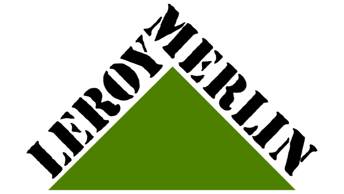
According to the new concept, the brand’s main goal is to help people create their dream homes. This is what the triangle in the center of the composition says. It is a symbol of the roof of the house, the green lawn in front of it, and a hint of gradual progress towards your goal, to the top – the ideal home.
The two names of the founders are placed on the sides of the triangle. On the left half is the word “Leroy” towards the bottom to the top. The primary arrangement and writing from bottom to top indicated the path traveled by the Leroy family before the company appeared (Adolf’s father was also involved in the sale of materials before the First World War). Rosa’s last name, Merlin, is placed on the right side of the figure and is directed from top to bottom. Visually, it looks larger and richer. It symbolizes the prosperity and development that came to the family when doing business together.
The composition is placed in a rectangle with a very light greenish background.
1996 – today
In the 90s, the company opened branches in Spain, Poland, Italy, and Brazil and began to acquire other chains. The logo has undergone minor changes to reflect the expansion.
Do-it-yourself stores were already called hypermarkets, and the hint of homemade stencil production was gone. Therefore, the font was changed to a more even, printed sans-serif.
The rectangle with the light green background was removed as if expanding the company’s horizons, allowing it to rise and spread more widely. The central triangle brightened up, resembling young shoots – a symbol of new stores, young offshoots of the company.
Font and Colors
The main colors of the logo are black and green.
- Green is the color of life and positivity, a symbol of renewal that comes with repairs, an indication of gardening products. The shade shows that thanks to the company’s products, the house turns into a comfortable and pleasing place to live.
- Black – an indicator of reliability, perseverance, and overcoming difficulties. The business of the Leroy family fell into decline three times and revived three times.
The 80s logo uses Stencil Antiqua EF Rough stencil font. It was as if the name had been handwritten under a stencil, another indication of a “do it yourself” store. The font is similar to ITC Eras Std Bold in the modern emblem with an unusual letter R.
Leroy Merlin color codes
| Kelly Green | Hex color: | #5abd00 |
|---|---|---|
| RGB: | 90 189 0 | |
| CMYK: | 52 0 100 26 | |
| Pantone: | PMS 802 C |
| Eerie Black | Hex color: | #1c1c1b |
|---|---|---|
| RGB: | 28 28 27 | |
| CMYK: | 0 0 4 89 | |
| Pantone: | PMS Neutral Black C |
