LetyShops: Brand overview
In 2014, LetyShops, the brainchild of visionary Igor Gnatovsky, was born in Csomad, Pest, Hungary. The company aimed to revolutionize online shopping by introducing an attractive cashback and rewards system. With the help of browser add-ons and plug-ins, LetyShops empowered its users by offering them a percentage of their money back when they made a purchase at one of the platform’s partner stores.
As word spread about the LetyShops platform, its partnerships with global online retail giants multiplied, increasing its appeal. Since the launch of the platform, its user base has increased dramatically and it has become a favorite among online shoppers. This has pushed the company to diversify and expand its cashback offerings.
By its five-year anniversary, LetyShops has already attracted the attention and registrations of more than 11 million users worldwide. The company is represented in more than 30 countries and is a leader in cashback and rewards. The basic principle remains unchanged: the buyer gets a part of his expenses back when making transactions through the LetyShops ecosystem.
As LetyShops continues to evolve, it strives to improve its reward mechanisms, create new retail alliances and maintain its credibility among online cashback services.
Meaning and History
What is LetyShops?
LetyShops is an online shopping platform created in 2014 by Igor Gnatovsky. This innovative cashback service has seen exponential growth and has over 11 million users worldwide. With an easy-to-use browser extension, LetyShops offers consumers a convenient way to save money when purchasing goods and services, making it a dominant player in the cashback industry.
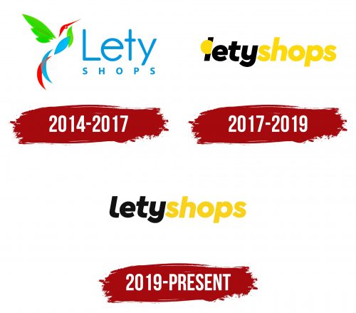
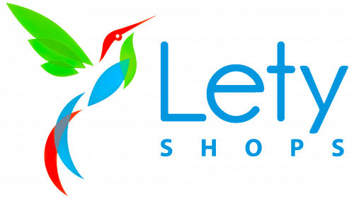
2014 – 2017
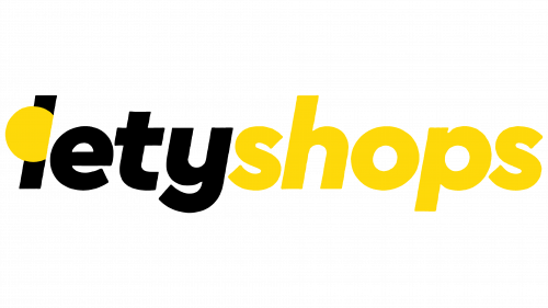
2017 – 2019
2019 – today
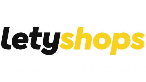
The shorthand in the LetyShops logo makes it easily recognizable and gives it a brand identity. Although the name is presented as a single word, it is visually divided into two halves by color: the first half is black, and the second half is yellow. The font is very bold, blocky, lowercase. The letters have smooth curves that exclude sharp corners, except for the curves of the letters “u” and “e .”The coarseness of the letters speaks of the reliability and confidence of the company.
The two different colors seem to say, “Hey, we have variety and we’re fun!”. The cursive lettering adds personality. Thick and large letters are reminiscent of a firm handshake, letting you know that the company is reliable. The slight curves of the letters “y” and “e” are reminiscent of the little quirks that make a person unique and interesting.
LetyShops color codes
| Yellow | Hex color: | #fbd21b |
|---|---|---|
| RGB: | 251 210 27 | |
| CMYK: | 0 16 89 2 | |
| Pantone: | PMS 116 C |
| Smoky Black | Hex color: | #121212 |
|---|---|---|
| RGB: | 18 18 18 | |
| CMYK: | 0 0 0 93 | |
| Pantone: | PMS Black 6 C |
