![]() Liberty Flames Logo PNG
Liberty Flames Logo PNG
The Liberty Flames logo is purposeful, dynamic, and simultaneously menacing. And how else should it be, since it is meant to instill fear in the opponent so the team can emerge victorious in sports battles. The mascot does not look so evil as it is focused on victory, so the main impression conveyed by the emblem is resilience in the face of any difficulties.
Liberty Flames is tied to Liberty University, founded in 1971 by Jerry Falwell Sr. in Lynchburg, Virginia. The school was created as a Christian university, and athletics became part of campus life from the early years. The first teams competed in lower college divisions while the university was still building its finances, facilities, and student base.
The Flames name reflected the religious language around the university’s mission, using fire as a symbol of faith and spiritual commitment. Blue and red became the team colors, and the flame mascot later gave the athletic program a clearer identity. A major institutional step came in 1988, when Liberty moved into NCAA Division I, requiring stronger recruiting, coaching, and athletic facilities.
Football became the main driver of national attention. Liberty spent many years in the FCS before moving its football program to the FBS level in 2018. The shift required major investment in Williams Stadium, training facilities, and staff. In 2019, Hugh Freeze became head coach, and the team won a bowl game that season, marking an early milestone for the young FBS program.
Other Liberty Flames teams also developed within NCAA Division I, including basketball programs that reached NCAA tournaments and women’s teams that won conference titles. During the 2000s and 2010s, Liberty competed in conferences such as the Big South, facing schools including Gardner-Webb and Campbell. In 2023, most Liberty teams joined Conference USA, giving the program a new competitive setting at the FBS level.
Meaning and History
![]()
The name Liberty University did not appear immediately, but in 1985, the visual identity of the sports department changed along with the university’s identity. Despite the rebranding, the team’s LU card remained a bonfire (fire, flame) from the word “Flames” for a long time. Then the mascot was updated to an eagle, whose image transitioned into the logo. This bird is the national symbol of the USA and is directly linked to the word “freedom,” which was incorporated into the modernized name of the student teams. The patriotic emblem has long become the embodiment of this educational institution.
The first nickname (Flames) was approved in 1972. It was chosen by the students themselves, guided by the school’s motto, “Knowledge Aflame.” Later, the word “Liberty” was added to the name as the Virginia college rebranded. The new Liberty Flames mascot appeared in the recently accepted color scheme a few years later.
What is Liberty Flames?
Liberty Flames is a participant in Liberty University’s intercollegiate sports program. It consists of 20 student teams competing at the NCAA Division I level. In addition, they are part of the ASUN Conference, Big East (field hockey), Conference USA, and CCSA (swimming and diving). The footballers compete in the FBS Independent. The location of this division is Lynchburg, Virginia. The mascot is an eagle.
1979 – 1980
![]()
The Liberty Flames logo is directly linked to the name of the sports program:
- The flying eagle symbolizes “Liberty”;
- The burning torch represents “Flames.”
The bird is depicted in flight, as evidenced by the raised wings, as if in the act of a stroke. In the claws of the left paw, it holds a lit torch. The eagle is drawn in contour in a realistic style. All elements are painted in blue and red, which were not official at the time.
1980 – 1984
![]()
The eagle turned red and tilted left, as if diving at opponents. The wings are folded in the top position; the beak is sharp and outlined by a white wavy strip, and the tail has a clear triangular shape. This is done so that the silhouette would resemble the first letter of the team’s nickname, “F.” The rest of the name, “lames,” is on the right. It imitates careless handwriting and consists of bold glyphs. A thin ring outlines the mascot.
1984 – 1985
![]()
The Liberty Flames emblem consists of three key elements, united by a common concept. These are an eagle (in this case, its head), a flame (tongues of fire on the left), and a double ring (a symbol of their unity). The sign is executed in an abstract style with wide red lines.
1985 – 2000
![]()
Designers proposed a strict logo featuring the abbreviation “LU,” next to which the remainder of Liberty University’s name is written in small letters. The first letters are large and blocky. The rest of the text is typed in a small sans-serif font and painted in two colors: the top line is red, and the bottom one is blue. The eagle is drawn in contour: the head is profiled and directed to the right. The powerful beak looks menacing and adds authority to the bird. The mascot occupies the entire upper-right corner, and the monogram occupies the lower-left corner.
2000 – 2003
![]()
Developers wanted to move away from the image of the formidable eagle and focus on the flame. As a result, a flaming “L” appeared. The flame is on the left and placed horizontally. The first letter of the abbreviation “LU” is superimposed on the second, forming a geometric circle. The glyphs have a triple frame of white, red, and blue stripes.
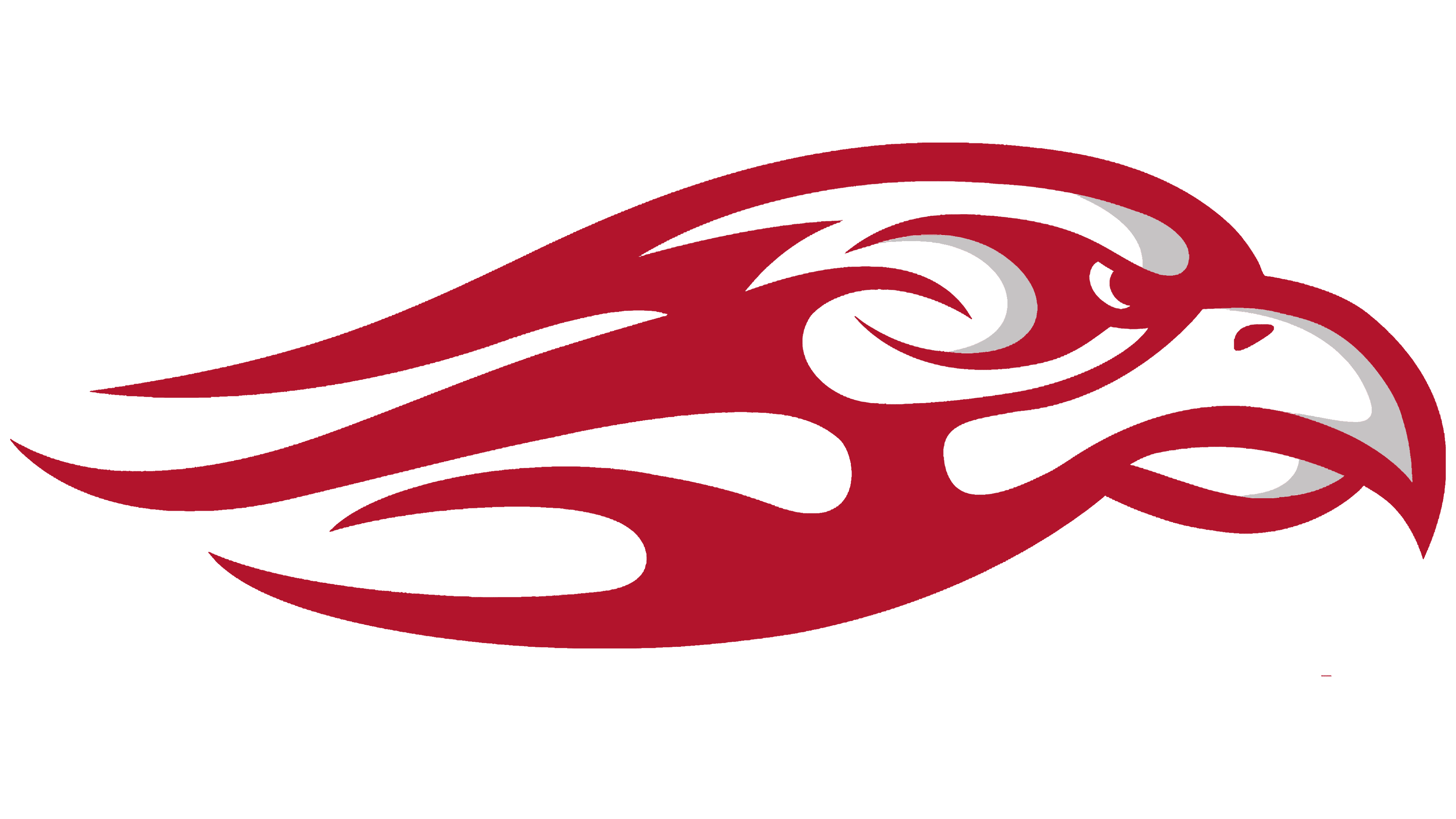
2003 – 2013
![]()
The eagle returned to the Liberty Flames logo. Its head consists of single wavy stripes reminiscent of tongues of flame. In this way, designers combined two key images: the mascot and the team’s nickname. The name of the sports department is centered and divided into two horizontal rows, aligned with the right edge. The letters in the upper line are large and bold, and in the lower line, small and semi-bold. The bird’s gaze is frightening, and the beak is large, sharp, and curved.
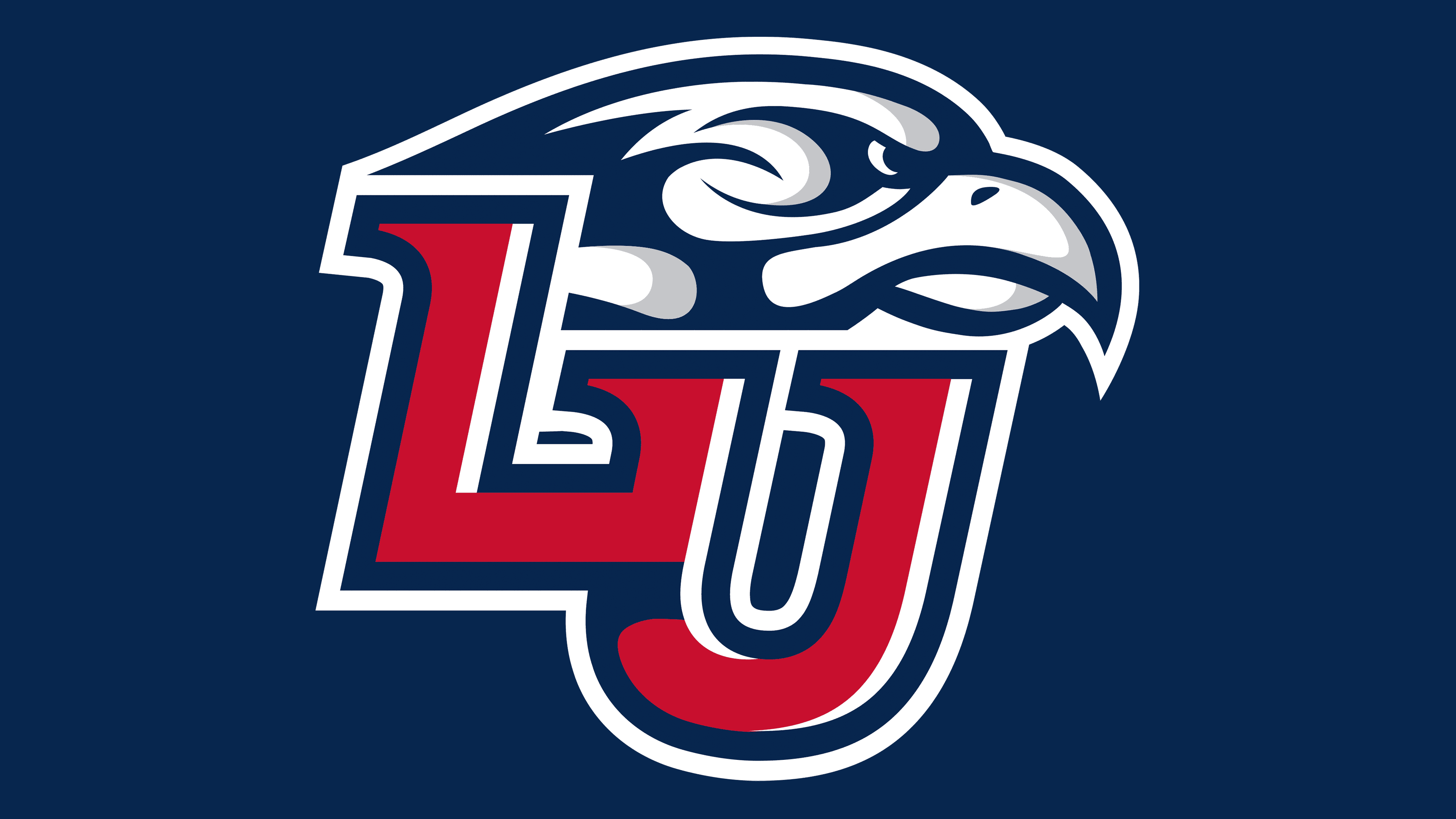
2013 – today
![]()
The sports department has updated its visual identity without deviating from the traditional design. The emblem represents the university’s abbreviated name and the team’s mascot. They divide the space into two parts:
- The top features a formidable eagle looking to the right.
- The bottom consists of a monogram made up of abbreviations.
The sign’s updated look gained sophistication and modernity. In addition to the basic colors, gray formed shadows on the bird’s head. The block letters are set widely, with the glyphs gaining serrated serifs that point to the right.
Font and Colors
Designers chose grotesque fonts for the Liberty Flames emblem, flat and smooth. Some resemble careless handwriting; others are reminiscent of Grotesque Medium Italic by Wooden Type Fonts or created with a custom typeface.
The logos’ color scheme is defined by the university’s official palette, which combines red, navy blue, and white. They (or at least one of them) are present in all student team signs and correspond with the colors of the U.S. national flag.