


![]() Lilymanga Logo PNG
Lilymanga Logo PNG
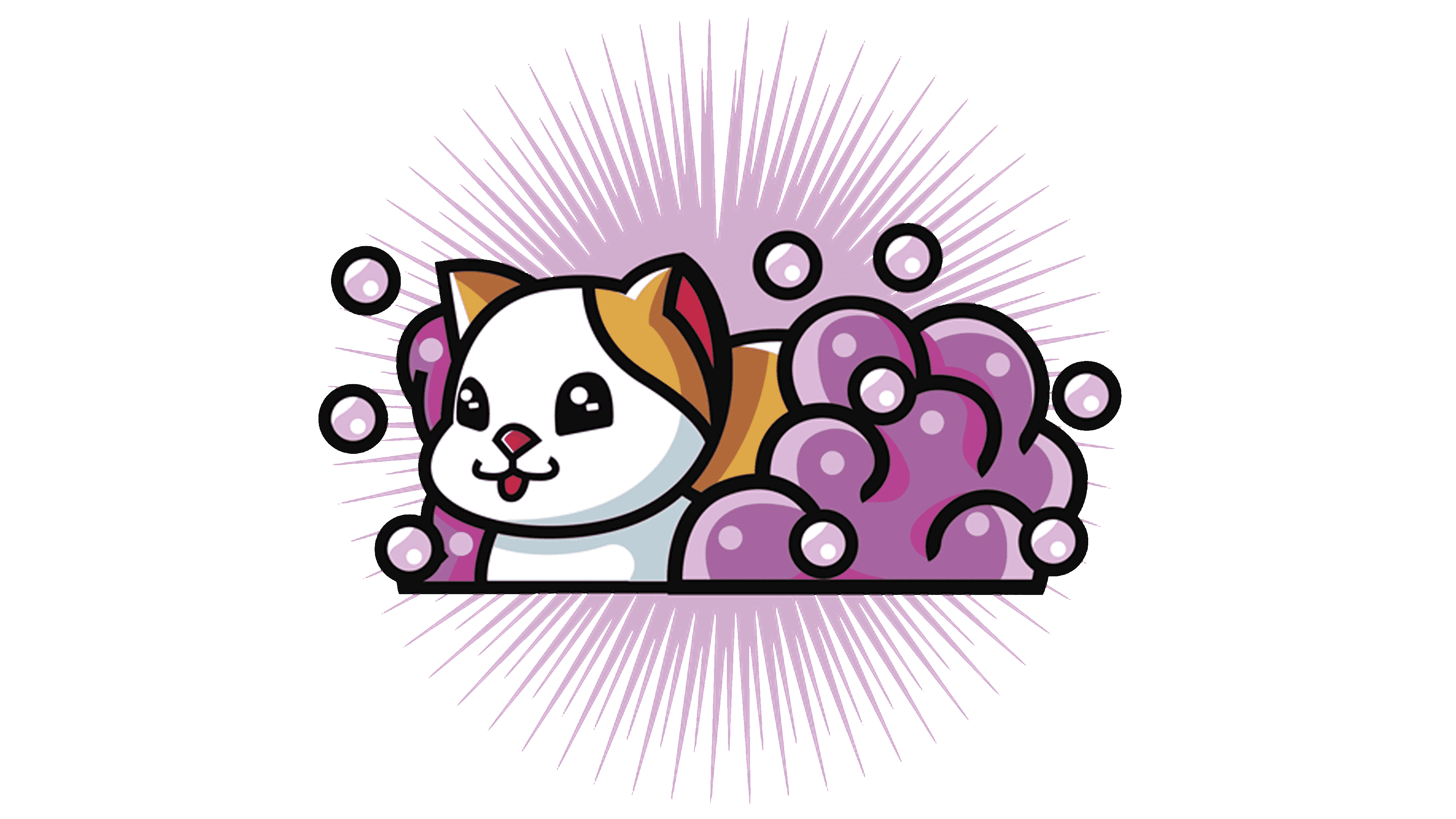
The Lilymanga logo exudes friendliness, kindness, and tenderness. The logo encourages users to go to the site and watch anime. At the same time, the emblem features universal images unrelated to specific plots, as the catalog includes content from different genres, publishers, and countries.
Meaning and History
The site’s name is taken from the 2016 anime of the same name, which tells the story of the love between two girls. The portal offers selections in fantasy, sports, adventure, horror, and drama, but they all touch on gender relations. The resource especially supports women’s genres: paid and free content from Japanese yuri, shojo, and josei, as well as topics such as mature, shojo Ai (most anime), romance, gender bender, etc.
All content is “managed” by the cat. It is she who is depicted on the logo. Her image was not chosen by chance. Mythology and folklore in Asian culture place special emphasis on animal features in human imagery. This connection is transmitted by adding the ability to reincarnate, the presence of a spirit companion, and the characters’ rudimentary organs. The cat occupies a privileged position among animals. The animal is the carrier of the feminine spirit. Comic book characters often meow to convey a seductive, cute, playful image. Mythical nekomata, bakeneko, and nekoshojo with a tail or ears are found regularly. Imitating them, girls in real life wear nekomimi, hoops with cat ears, and apply animal makeup on their faces.
What is Lilymanga?
A site of anime of different genres, touching on the topics of intimate relationships. Contains about 2600 films.
The cat on the Lilimang logo conveys a feminine image and indicates that the site is primarily dedicated to the fair sex. The animal evokes tenderness, softness, airiness, and kindness. A smiling white-red cat with sparkles in her eyes lies with her head up in a calm pose. As if looking at the screen of an invisible TV. She exudes friendliness. It makes visitors want to “sit down” on the site and watch movies with the animal.
The emblem shows the head and front part of the torso. The rest of the body is hidden in a cloud of pink foam with bubbles flying around. It seems that the animal is bathing. This idea is also supported by pink rays that radiate from the center of the image in all directions. They are a symbol of radiance and purity. It demonstrates a special halo emanating from a fresh, clean, and fluffy beauty. It conveys the theme of purity and innocence. The pink foam at the bottom of the cat hints at the intimate relationship between women and the content’s special direction.
Below the image, in yellow letters of varying heights, the inscription “Lily manga” is slightly arched. It completes the logo’s easy look.
Font and Colors

The main colors of the emblem are pink, white, and red.
- Pink – the color of female love, falling in love, daydreaming, fantasies.
- White – young age, virginity, purity, the search for one’s orientation.
- Red – seductiveness, playfulness, passion.
- Yellow – joy, creativity, inspiration.
All shades are warm. Often in anime, they are used to portray tsundere female dual characters whose behavior changes depending on the situation. In this case, individuals are prone to flirting and losing self-control when in the presence of someone they like.
A font like KillJoy Outline Regular uses a lowercase “n” and all uppercase letters. It hints at the heroine’s young age.