The emblem is a symbol of live communication. On the Internet, everyone is given the opportunity to express their opinion and receive comments from the audience. The Line logo shows an active, growing community and promises constructive and friendly communication.
Line: Brand overview
| Founded: | June 23, 2011 |
| Founder: | Line Corporation |
| Headquarters: | Tokyo, Japan |
| Website: | line.me |
Meaning and History
Tragic events prompted the program. Her idea began with a massive and deadly earthquake that triggered a tsunami. This natural phenomenon dates back to the spring of 2011, when telecommunications infrastructure was disrupted throughout the country. NHN Japan representatives (the South Korean division of NHN Corporation) decided to release a special communication tool based on Internet technology. In the summer of the same year, the service was already ready to launch.
It turned out to be so popular that it started to overload the server. Therefore, the developers decided to connect the open source HBase platform written in Java to Line. It has become the basic repository for user accounts, groups, and contacts. The instant messaging service has become incredibly popular in the Asian region: in Indonesia, Thailand, Japan, Taiwan, Cambodia, and Turkmenistan. In particular, it is available in 17 languages.
Starting as an app to run on Android and iOS operating systems, Line has gradually been adapted to other platforms, including BlackBerry OS, Nokia Asha, Windows Phone, Firefox OS, Microsoft Windows, and macOS. Therefore, the program is now available on smartphones, tablets, laptops, personal computers, smartwatches. It is recognizable by its simple and bright icon, which stands out from its counterparts. Moreover, her visual identity sign turned out to be so successful that the service never changed it – it only made minimal corrections. There were two of them.
What is Line?
The Line is a communication app that supports the exchange of text messages, audio files, videos, photos, and images. It was created in 2011 after an earthquake in Japan left people without communication. NHN Japan, now known as Line Corporation, decided to help people during a critical time. They offered an alternative to the popular KakaoTalk by making their messenger completely free.
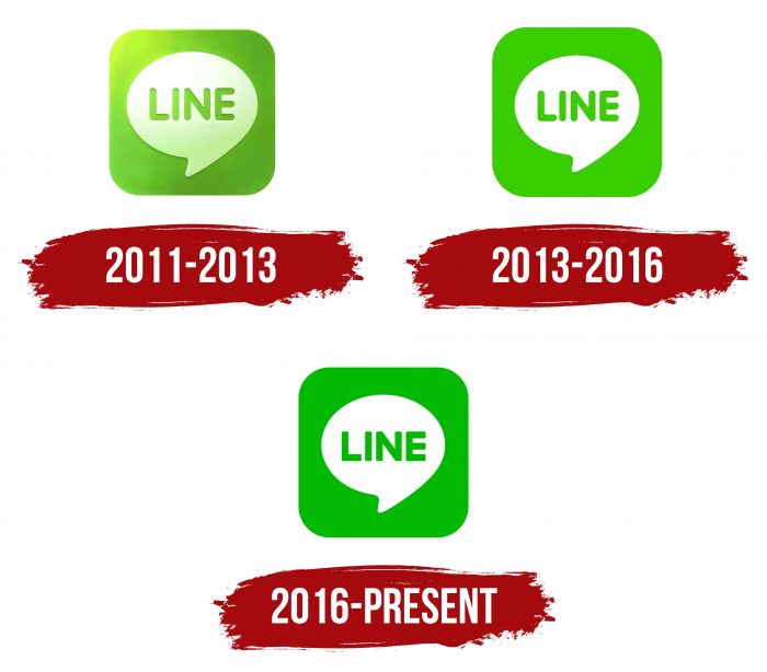
2011 – 2013
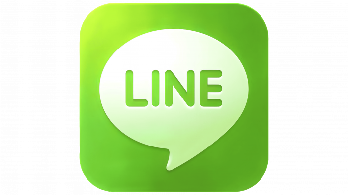
To make the logo clear, catchy, simple, and at the same time indicative of a specific activity, the developers used the principle of geometry. To do this, they took a square and rounded off all four corners. This made it possible to smooth out the sharpness. Then they placed a white text balloon in the square – a callout of direct speech, like comic book characters. This hinted that the program is a means of communication between users and allows you to send and receive information.
In the dialog box center is the Internet service’s name, written in grotesque uppercase letters – printed letters, even, bold, of the same height. The icon also has a lens flare located in the upper left part. Simultaneously, the designers applied a gradient in the center on a light background and around it, on a green one.
2013 – 2016
After the redesign, the emblem retained its shape, size, a grouping of elements, and number. Only the color has changed. In this version, the authors removed gradient transitions, reflections, and white spots, stabilizing the palette. The main shade was lime green. He refreshed the logo, added modernity and recognition to it.
2016 – today
In July 2016, the designers made some adjustments. And they were again insignificant, but already concerned not only the color but also the text. The developers have shifted the palette to a dark spectrum, using a rich shade of green. The streamlined font was changed to an angular one, removing the rounding at the letters’ ends. As a result, the text balloon now looks distinct.
Line: Interesting Facts
Line is a popular communication app, especially in Asia, created in Japan in 2011 after a massive earthquake and tsunami. Originally made by NHN Japan, a part of South Korea’s Naver Corporation, it helped overcome communication challenges caused by the disaster.
- Why It Was Made: After the 2011 earthquake and tsunami damaged Japan’s communication infrastructure, Line was developed to offer a dependable way for people to stay connected, quickly becoming popular.
- Growth: The line grew fast, hitting 50 million users in just over a year, showing its strong appeal as a way to keep in touch.
- What It Offers: Beyond text messaging, Line includes voice and video calls, group chats, social networking, and digital wallets, showing its versatility.
- Stickers: A big part of Line’s appeal is its unique stickers, including ones by famous artists and brands, allowing users to express themselves in ways words can’t.
- Beyond Messaging: Line has expanded into digital payments, music streaming, and taxi services, impacting Asia’s digital economy.
- Line Friends: Characters like Brown, Cony, and Moon have become so popular that Line created a merchandise division for them, leading to products, stores, and theme parks.
- Local Focus: While global, Line has successfully tailored its content and features to meet local preferences in markets like Japan, Taiwan, Thailand, and Indonesia.
- Comics and Manga: Line also offers platforms for digital manga in Japan and webtoons globally, catering to fans and creators of comics and manga.
- Privacy and Security: With end-to-end encryption for messages and calls, Line prioritizes user privacy and security.
- Going Public: In 2016, Line had a dual listing on the New York and Tokyo Stock Exchanges, underscoring its international significance.
From its beginnings as a response to a natural disaster, Line has evolved into a comprehensive social communication platform, impacting how people interact, the digital culture, and even the economy in its key regions.
Font and Colors
The corporate logo of this program is stable. It denotes all its services: social network, telephony, Line TV video, Line Today news, Line Pay money wallet, Line Manga comics, Line Webtoon, etc. The company does not undertake a radical redesign not to lose recognition among a multi-million audience of users. It is always limited to minor changes to the logo.
The designers opted for a typeface with rounded letterforms that resemble the Volkswagen Serial Xbold and Rundschrift Pro Regular for early designs. In the later version, the style is rougher – with right angles and straight lines, echoing Substance Extra Bold and Touche Bold.
The main emphasis from the very beginning was on color, so it was corrected twice. A green with a gradient was used; in the second – a lime shade # 37cf00, in the third – a deep green # 00ba00. The text balloon in all emblems is colored white.
Line color codes
| Deep Green | Hex color: | #00ba00 |
|---|---|---|
| RGB: | 0 186 0 | |
| CMYK: | 100 0 100 27 | |
| Pantone: | PMS 354 C |
