


![]()
Linus has introduced a new visual identity that gives the brand a more playful and engaging look, incorporating a stylized mascot into the logo. The updated design focuses on making SAT preparation feel more interactive and approachable.
The new logo’s standout feature is the letter “L,” shaped like a banana slug. The slug’s antennae form two circular shapes that resemble expressive eyes, giving the design a unique personality. The slug’s organic curves blend smoothly with the lettering, creating a seamless and visually appealing composition.
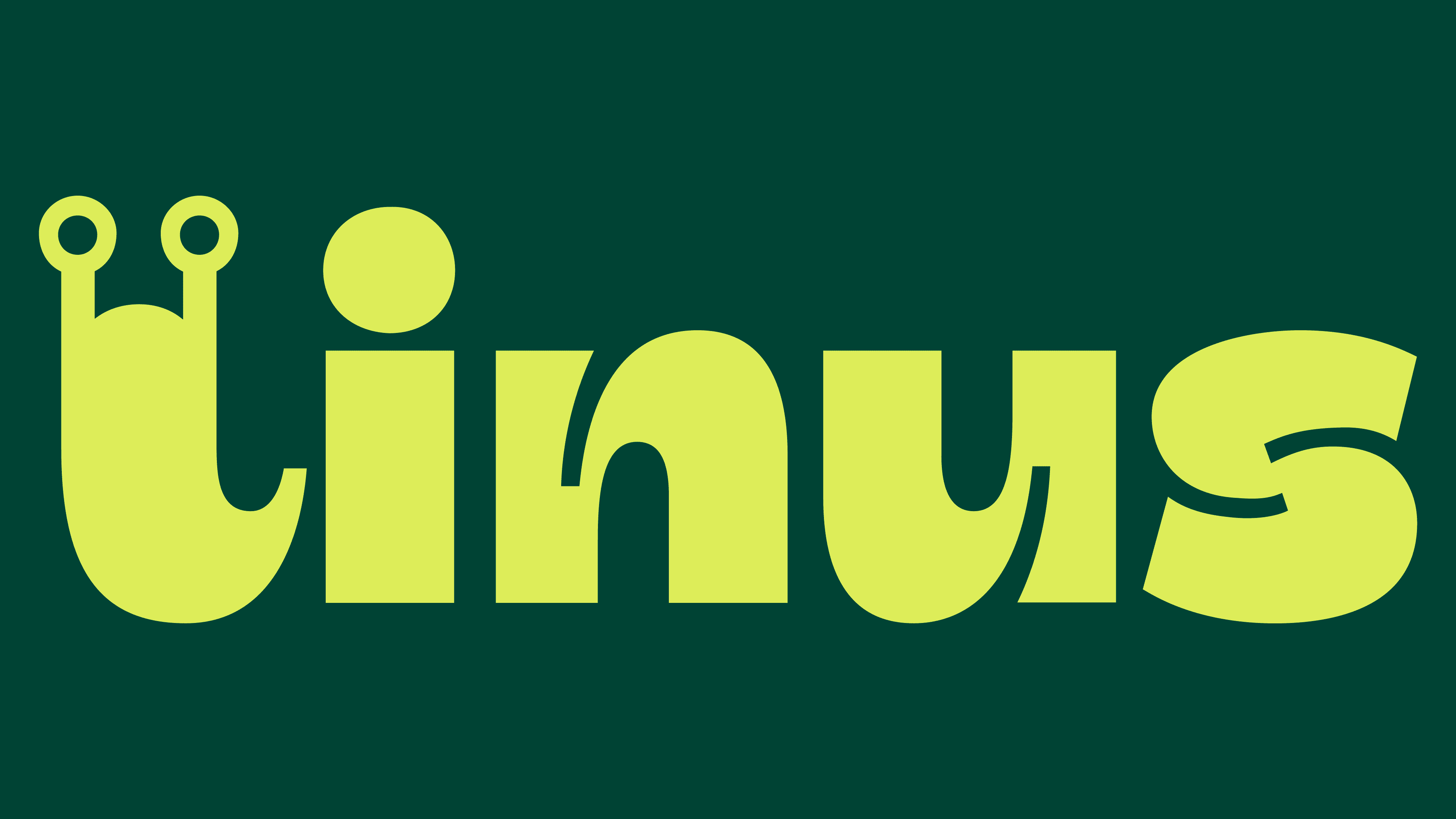
The typography reflects the brand’s lighthearted style. The wordmark uses a rounded, smooth typeface with soft, flowing shapes. A slight curl at the end of the “s” subtly mimics the movement of a slug, adding a bit of motion to the structured lettering.
The color palette features two shades of green, reinforcing a connection to nature. The main text appears in bright, vibrant green, while a deeper, muted green serves as the background. The contrast improves readability while keeping the design fresh and energetic.

Beyond the main logo, the branding includes supporting characters that represent different personalities of high school students. These cartoon-like figures make the experience more relatable and welcoming for students preparing for the SAT.
The redesigned Linus branding brings everything together into a visually engaging system. The playful slug mascot, nature-inspired colors, and relatable characters create a friendly, interactive learning environment. The new identity balances creativity with clarity, making it stand out in digital education.