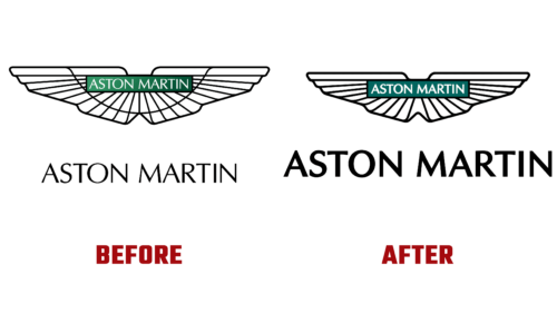
On July 20 this year, an incredible event occurred: the UK’s legendary sports car manufacturer changed its badge. This happened for the eighth time in the brand’s 109-year history and the first time since the turn of the century. A major update of the Aston Martin logo took place with the light hand of Peter Saville, a well-known graphic designer, and art director. He managed to keep the classics and convey the radical progress the car company has been making lately.
Due to the extraordinary author’s position, it may seem that the emblem has remained the same at first glance. But it’s not! She has been updated. This is the true power of professionalism. The ninth symbol of Aston Martin received a more streamlined shape, clean lines, and confident design. The developers retained only the iconic style introduced in 1932 and refined its details.
As a result, the central arc disappeared, which drew attention to itself, leaving the brand name inconspicuous. Now the opposite is true: it has become a key element. A plate with a bold inscription (by the way, the font has also been updated) proudly connects both wings in a clean and bold composition. The company representatives noted that they combined sophisticated design, luxurious craftsmanship, high-octane emotions, and continuous driving pleasure in the identity.
Along with the updated emblem, Aston Martin has a new slogan – “Intensity. driven”. Together with the logo, it reflects the British auto manufacturer’s innovative strategy, which he intends to pursue in the near future. The process has already been launched and cannot be stopped, which is proved by the refined sign on the hood of cars of the beloved James Bond brand. Handcrafted by skilled artisans in Birmingham’s Jewelery District, it will be a fitting addition to Aston Martin’s next generation of sports cars.


