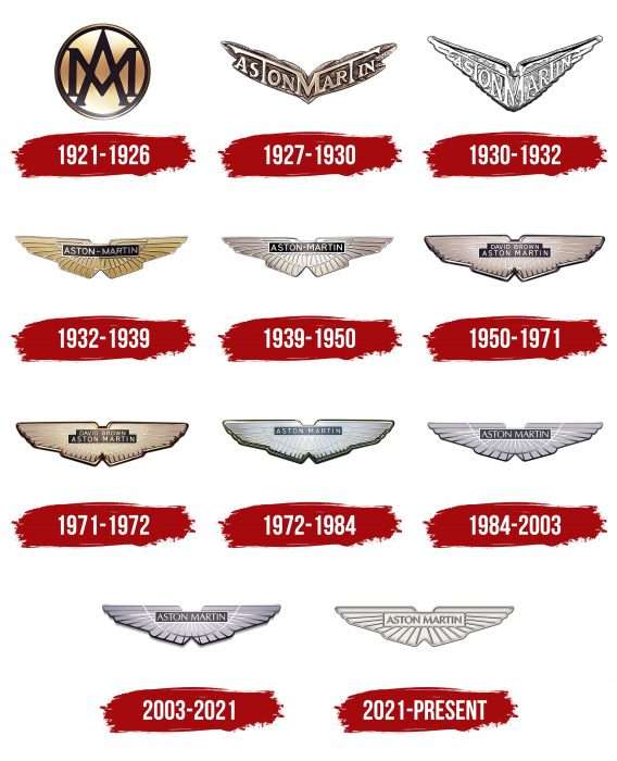
The fame of the quality of the cars has spread far beyond the country of manufacture, says the Aston Martin logo. The emblem promises a combination of elegant design and modern equipment. The car will fly silently without touching the road.
Aston Martin: Brand overview
| Founded: | 15 January 1913 |
| Founder: | Lionel Martin, Robert Bamford |
| Headquarters: | Gaydon, Warwickshire, England, United Kingdom |
| Website: | astonmartinlagonda.com |
Meaning and History
The history of the Aston Martin brand is not easy. The company has experienced crises more than once. For more than a hundred years, it has changed several owners. And only in 2012 Aston Martin became independent. Of course, the lineup of those at the company’s helm influenced the logo. But, despite frequent changes, there were no cardinal transformations. All Aston Martin logos except the first had wings, making the emblem one of the world’s most recognizable. The fenders (according to many experts, they are borrowed from Bentley) symbolize the main features of all the brand’s cars: speed, freedom, and dream.
What is Aston Martin?
It is a company from Great Britain, which produces sports cars and supercars. All its cars are made by hand, and each one has a plaque with the name of the person who made it.
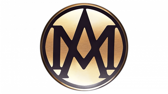
1921 – 1926
The first Aston Martin logo appeared in 1921. It was elegant and laconic: a circle with superimposed letters A and M. The classic strict font, black letters, a circle, and a bronze background make the logo stylish and expensive.
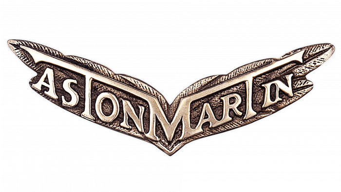
1927 – 1930
In 1927, the Aston Martin logo was changed for the first time, the most dramatic change in its history. Wings, symbolizing speed, replaced the circle. The letters were replaced with the company’s full name. The inscription is located so that the letter M in the center is connected with the horizontal elements of two letters, T. Only the bronze color, strict font, and laconicism remained from the previous logo.
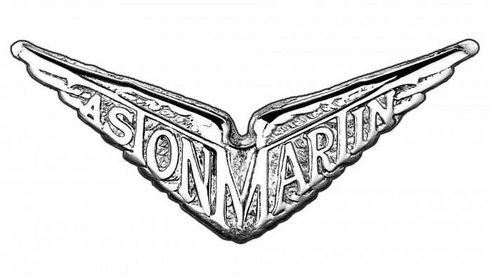
1930 – 1932
In 1930, the logo’s bronze color was changed to silver. The wings were sharpened and acquired a clearer outline. Although the new Aston Martin logo became more solid, it lasted only two years.
1932 – 1939
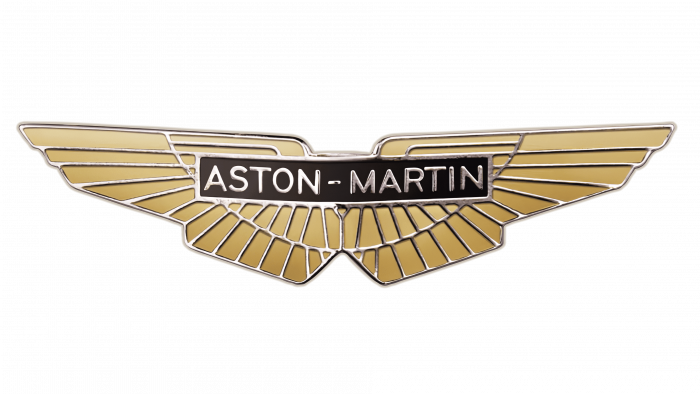
In 1932, the Aston Martin logo became similar to today’s. The wings acquired “feathers” and became smoother; the company name was inscribed in a rectangle and placed in the center. Silver was replaced by gold and black. The new logo looked more luxurious and outperformed the previous one, allowing it to last longer than previous versions—7 years.
1939 – 1950
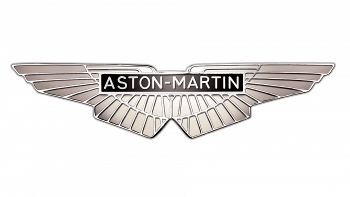
The logo of the 40s differed from what it had in the 30s only in color: gold was replaced by silver. These minor changes made the logo stricter. It was he who became the basis of the emblem that we see today.
1950 – 1971
1947, a significant change occurred in Aston Martin’s history: David Brown became its owner. With his arrival, the company began to develop rapidly, and of course, the changes were reflected in the logo.
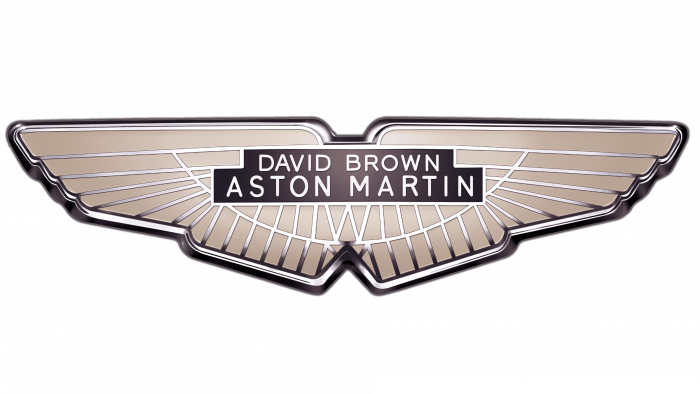
In 1950, David Brown’s name appeared above the Aston Martin lettering, written in a slightly smaller size. The background color is now beige with thin, silvery lines. Thus, a feeling of lightness and freedom was achieved.
1971 – 1972
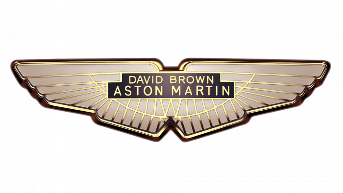
The logo has been updated again. Silver was replaced by gold again. This option was perhaps the most luxurious but did not last long. The reason for this was a change in leadership.
1972 – 1984
In 1972, Aston Martin was acquired by Company Developments Ltd. This led to the disappearance of David Brown’s name from the emblem. The old main color was replaced by a new one—cold gray. The lines remained gold but lighter.
1984 – 2003
According to experts, even though the logo was updated in 1984, it was not the best; it lasted almost 20 years. The enlarged inscription, thickened lines, and narrowed letters made the emblem more brutal and less sophisticated.
2003 – 2021
2003 saw the opening of the new Aston Martin headquarters. And in the same year, a logo appeared, which is still relevant today. It has become more elegant and modern. The words Aston Martin are now in a green rectangle, and the lines have become more elegant.
The emblem embodies the main features of Aston Martin cars: prestige, professionalism, speed, freedom, and superiority. Its simple font, minimalism, and cool silver color indicate that the Aston Martin brand is reliable and expensive, and its cars are always good.
2021 – today
The updated emblem has the same elements as the previous logo because the redesign did not touch the overall style but individual details. Now, ribs appeared on the spread wings, separating adjacent feathers from each other. Thin lines are voluminous and convex, while wide stripes between them are hollow and visually located below their level. This visual effect is created by applying shadows under the upper edges of the raised ribs.
Below (at the junction of the wings), a small triangular notch is formed, resembling a bird’s short tail with a forked end. This stylistic trick further connects the emblem of the automotive brand with fast flight and high speeds. In the center of the horizontal rectangle is the car company’s name. It is also made in ribbed type with a 3D effect, so the letters protrude slightly from the surface.
2016 (according to some sources in 2017), the company registered a new logo, a double-framed circle with intersecting V-shaped lines. It does not resemble the usual wings but resembles the first logo from 1921-1926. According to the brand representatives, the new emblem will be used to brand clothing, accessories, souvenirs, etc.
Aston Martin: Interesting Facts
Aston Martin is a famous British luxury sports car maker known for its style, speed, and uniqueness.
- Beginnings: Founded in 1913 by Lionel Martin and Robert Bamford, the name Aston Martin comes from the Aston Hill climb, a race where Martin’s cars did well. They started with race cars and later made passenger cars.
- James Bond: Aston Martin cars are famously linked with James Bond, the spy from the movies. The Aston Martin DB5 first appeared in the 1964 movie “Goldfinger” and became Bond’s go-to car.
- Racing: Aston Martin has a deep racing history, including winning the Le Mans 24 Hours race in 1959 with its DBR1 car, driven by Carroll Shelby and Roy Salvadori.
- Design: Aston Martins are known for their beautiful designs, sleek lines, and signature grille. They’re also luxury cars that perform well.
- Exclusivity: The company makes a limited number of cars to ensure each is special, adding to their appeal.
- Innovation: Despite its old roots, Aston Martin uses new tech to improve its cars’ performance, efficiency, and driving experience, such as better aerodynamics and electric tech.
- Beyond Cars: Aston Martin is expanding its luxury brand by offering luxury goods and real estate, like the Aston Martin Residences in Miami.
- Ups and Downs: The company has had its financial struggles, including bankruptcies, but has always returned, thanks to dedicated investors and fans.
- Collaborations: Aston Martin often collaborates with other luxury brands to create unique cars and products, showing its dedication to quality and luxury.
- Going Green: The company is working on electric and hybrid cars to meet new demands and reduce environmental impact.
Aston Martin combines great design, engineering, and a racing spirit, making it a highly respected name in the car world.
Font and Colors
Most versions of the Aston Martin logo, including the modern one, are dominated by silver. And this is no coincidence. It is associated with sophistication, grace, elegance, wealth, and self-confidence. Black, also in the logo, symbolizes prestige, sophistication, strength, and power. The company name is on a green background. This color was not chosen by chance because it personifies prosperity, wealth, and reliability. Thus, the entire color scheme of the Aston Martin logo speaks of the company’s authority and stability, that cars are not available to everyone, emphasizing the high status of their owner.
In graphic design, type is very important. It can both improve the company’s image and spoil it. A simple, uncluttered sans-serif font is chosen for the Aston Martin logo. He is sophisticated and strict and combines strength and determination. And it goes well with all the other elements of the logo.
FAQ
What are the colors of the Aston Martin logo?
The logo uses black, green, and white. Black symbolizes sophistication and authority. Green represents tradition and heritage. White stands for purity and simplicity.
The logo’s wings symbolize speed, freedom, dreams, and exploration. This design shows the brand’s focus on performance, luxury, and adventure. The colors and wings create a timeless and dynamic logo representing the brand’s values and goals.
What font is the Aston Martin logo?
The Aston Martin logo uses the Optima STD Roman font as its primary typeface. This serif font is known for its clean lines and classic look, matching the brand’s image of luxury and sophistication.
Optima STD Roman makes the logo’s text easy to read while adding a refined touch. This complements the sleek design of the brand’s cars. This font shows the brand’s commitment to quality, precision, and timeless elegance. It makes the logo instantly recognizable and visually appealing. The choice of Optima STD Roman highlights the brand’s attention to detail and high standards in its identity.
Why is Aston Martin changing its logo?
The brand is changing its logo to make it simpler, more modern, and sleeker. The new design features thicker lines and removes the U-shaped line below the brand’s name. The font has been updated to a more robust typeface. These changes are similar to BMW’s recent logo update, with small adjustments that refine the look.
The aim is to create a cleaner and more contemporary emblem while keeping the essence of the original design. Simplifying the logo enhances its visual appeal and ensures it stays memorable and recognizable. This redesign shows the brand’s dedication to evolving with the times while maintaining its heritage of luxury and elegance.
What does the Aston Martin logo mean?
The logo features wings that symbolize dreams, freedom, and speed. These wings represent the creative flight of the mind and the drive for success. The wings honor the brand’s historical heritage, reflecting respect for the past and a vision for the future. The logo’s wings highlight the brand’s dedication to creating vehicles that embody elegance, performance, and luxury.
What does the Aston Martin emblem look like?
The emblem has two symmetric parts that look like wings. These wings have rows of feathers made up of various quadrangles. This design gives the emblem a sense of motion and elegance.’
At the top center of the emblem is a green rectangular plate with the white inscription “ASTON MARTIN.” This makes the brand’s name stand out clearly against the green background. The wings and inscription create a strong visual symbol representing speed, freedom, and luxury.
Does Ford own Aston Martin?
No, it is not owned by Ford. Ford owned the brand from 1994 to 2007. During that time, Ford helped modernize Aston Martin and improve its production capabilities. This partnership led to several successful models and strengthened the brand’s position in the luxury car market.
In 2007, Ford sold Aston Martin to investors, including David Richards, the founder of Prodrive, American investment banker John Sinders, and two Kuwaiti investment companies, Investment Dar and Adeem Investment. This sale allowed the brand to operate independently. The company has continued to produce luxury sports cars and expand its lineup.
Is Aston Martin still British-owned?
The brand is partially British-owned and has a diverse ownership structure. Many of its shares are held by British investors, but a significant 25% is owned by a consortium led by Canadian billionaire Lawrence Stroll.
Lawrence Stroll’s investment has been important for the company, giving it financial stability and support for growth. Despite international involvement, the brand keeps its British heritage and operates from the United Kingdom. The headquarters and manufacturing facilities are in Britain, ensuring the brand remains rooted in its British origins while benefiting from global investment.

