


 Lion King Logo PNG
The Lion King logo is as majestic as the main character of the film. It’s powerful, noble, strong, and even heraldic, as directly hinted by its royal palette. The strict elegance is conveyed in the geometric shape of the letters, the harsh lines, even cuts, the precise centering of rows, and the size of the inscriptions.
The Lion King began in the late 1980s, when Disney animation president Peter Schneider and studio chairman Jeffrey Katzenberg discussed Africa and coming of age during a European promo tour. In November 1991, Disney artists traveled to East Africa to study wildlife. Within the studio, the project was considered secondary to Pocahontas.
The screenplay by Irene Mecchi, Jonathan Roberts, and Linda Woolverton drew on Hamlet and biblical stories of Joseph and Moses. Roger Allers and Rob Minkoff directed. Elton John and Tim Rice wrote the songs, while Hans Zimmer worked on the score with Lebo M. The film opened on June 24, 1994, during the Disney Renaissance, and earned more than $763 million worldwide, ahead of Forrest Gump and Aladdin.
It won Oscars for its score and song, plus a Golden Globe for Best Musical or Comedy. The soundtrack reached number four on the Billboard 200 and became diamond-certified. A dispute followed over The Lion Sleeps Tonight, after Solomon Linda’s family sued Disney in 2004 over royalties tied to the 1939 song Mbube.
The franchise expanded with The Lion King II: Simba’s Pride in 1998, Timon & Pumbaa in 1999, The Lion King 1½ in 2004, and Julie Taymor’s Broadway musical, which won six Tonys after its 1997 opening. Competition from Pixar and DreamWorks Animation later reshaped animation. Disney released Jon Favreau’s 2019 photorealistic version, earning more than $1.6 billion, followed by Barry Jenkins’s Mufasa: The Lion King in December 2024.
Meaning and History
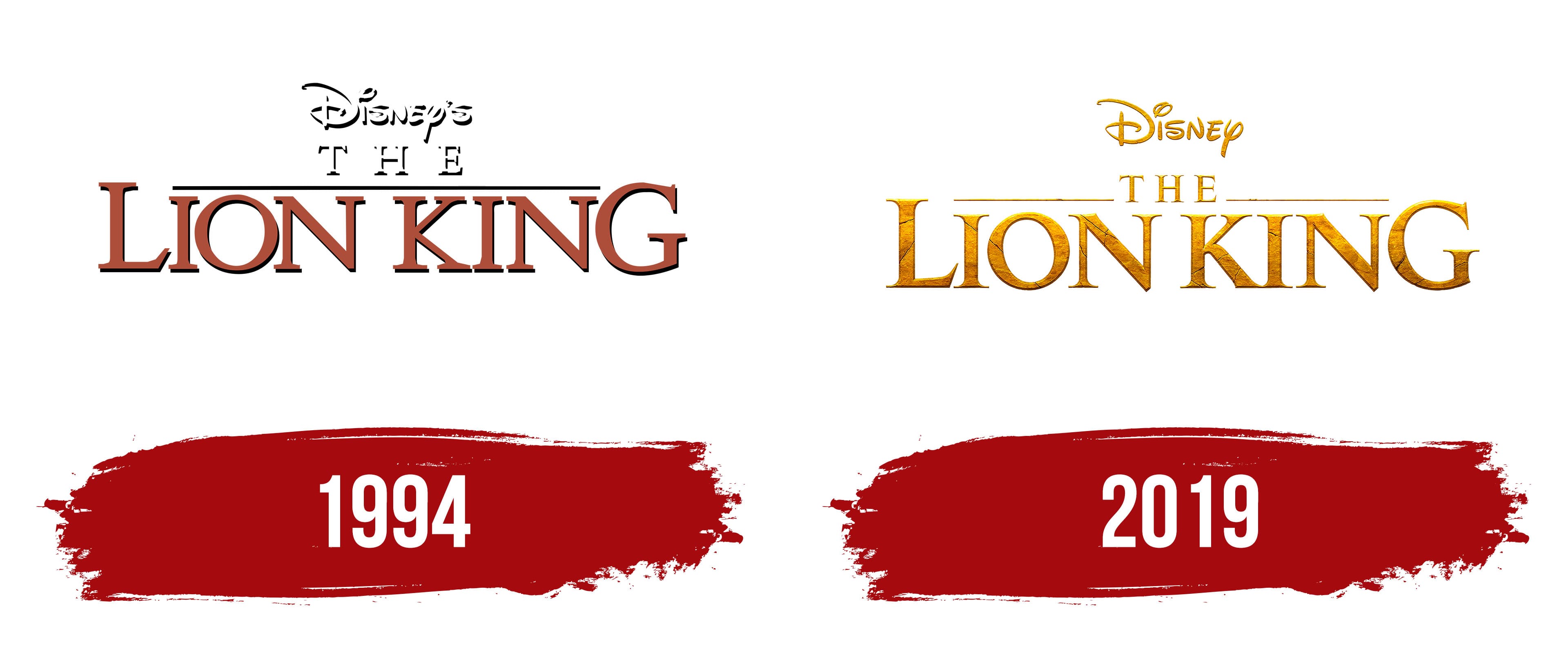
Despite the film’s main characters being animals, it doesn’t really explore the animal world. It’s an allegory, an interpretation of a plot from William Shakespeare’s works, namely his famous play “Hamlet.” The plot also weaves in the biblical stories of Moses and Joseph. Interestingly, a significant part of the artistic film’s concept was inspired by Disney’s classic, the 1942 film “Bambi.”
Together, they significantly influenced the identity: the Lion King logo looks both majestic and touching. It captures a religious spirit, imbued with childlike naivety, as the film collides with two worlds: adult and child, harsh and gentle, cruel and kind. And they are united by justice and Simba, the lion cub, whose character strengthens through hardships.
What is Lion King?
The Lion King is the name of a media franchise based on the eponymous animated film, released in 1994 by Walt Disney Studios. Its directors are Roger Allers and Rob Minkoff. The second is an animated film released in 2019. It’s animated, computer-generated, and maximally realistic. Jon Favreau and Jeff Nathanson participated in its creation. The franchise is also represented by numerous video games, animated series, musicals, and other thematic content, in which the main character is the lion cub Simba, born into the royal family of an African pride.
1994
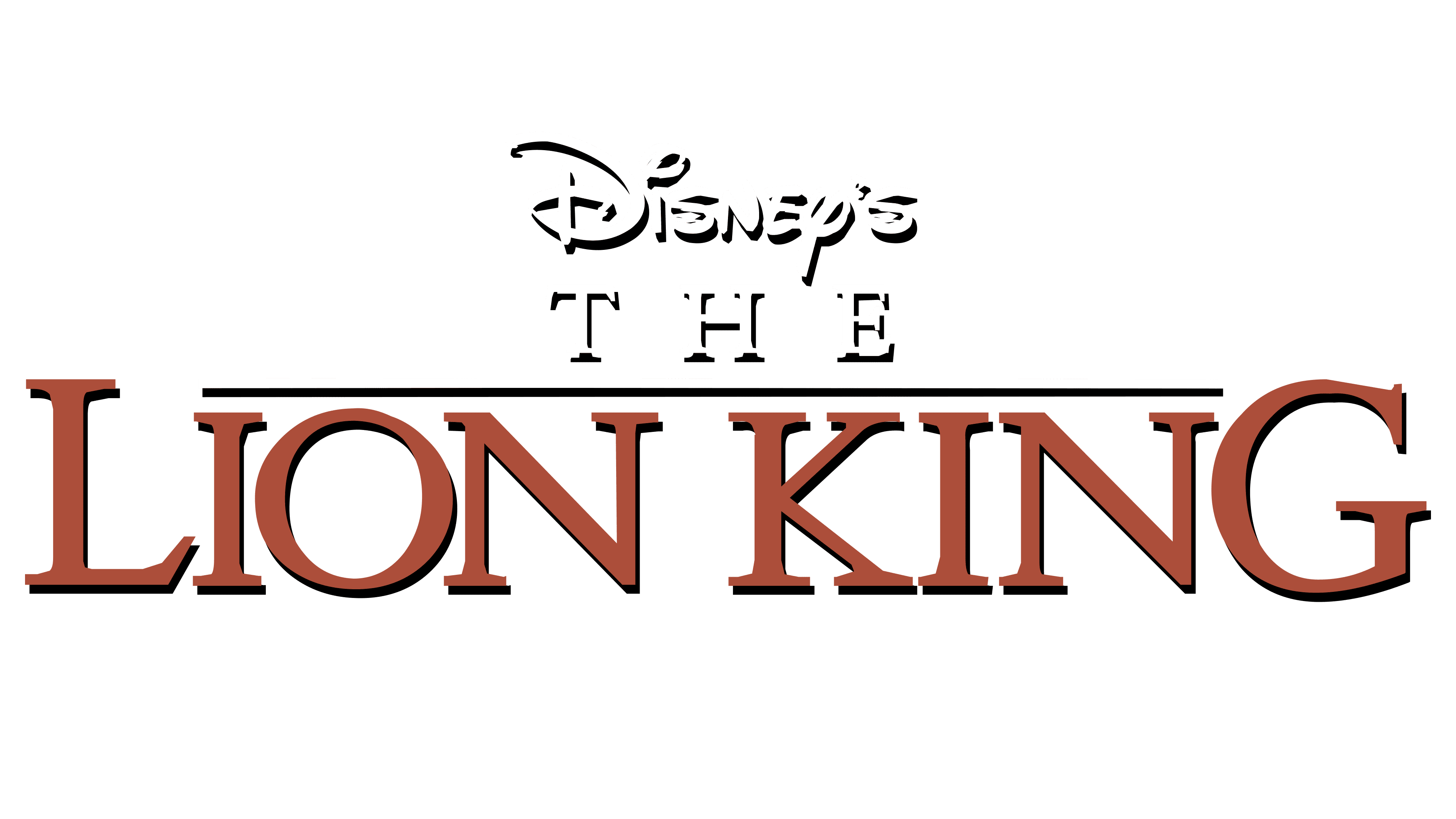
The Lion King emblem is textual. This is how it appeared on posters and in the opening credits of the feature-length animated film. There are three lines. The top is occupied by the classic Walt Disney Pictures logo– the studio’s creator’s personal signature, stylized in a handwritten font. The middle row is entirely given to the article “The”: It excellently performs its grammatical function, but does not interfere with the phrase “Lion King,” which is placed on the lower level. The first two parts are done in a display typeface: white letters with a black outline. They are also designed with shadows, adding volume.
The third line of the movie title is particularly interesting. It’s typed in uppercase glyphs with serifs, but in the middle, there is a dividing line that seems to press down on the lowercase letters, making them appear small. The sides “L” and “G,” on the other hand, are tall and massive. Designers deliberately chose this style: the signs in such a design look like the prickly acacias growing in the African savannah. They have the same, even, broad tops as if cut with a ruler.
2019
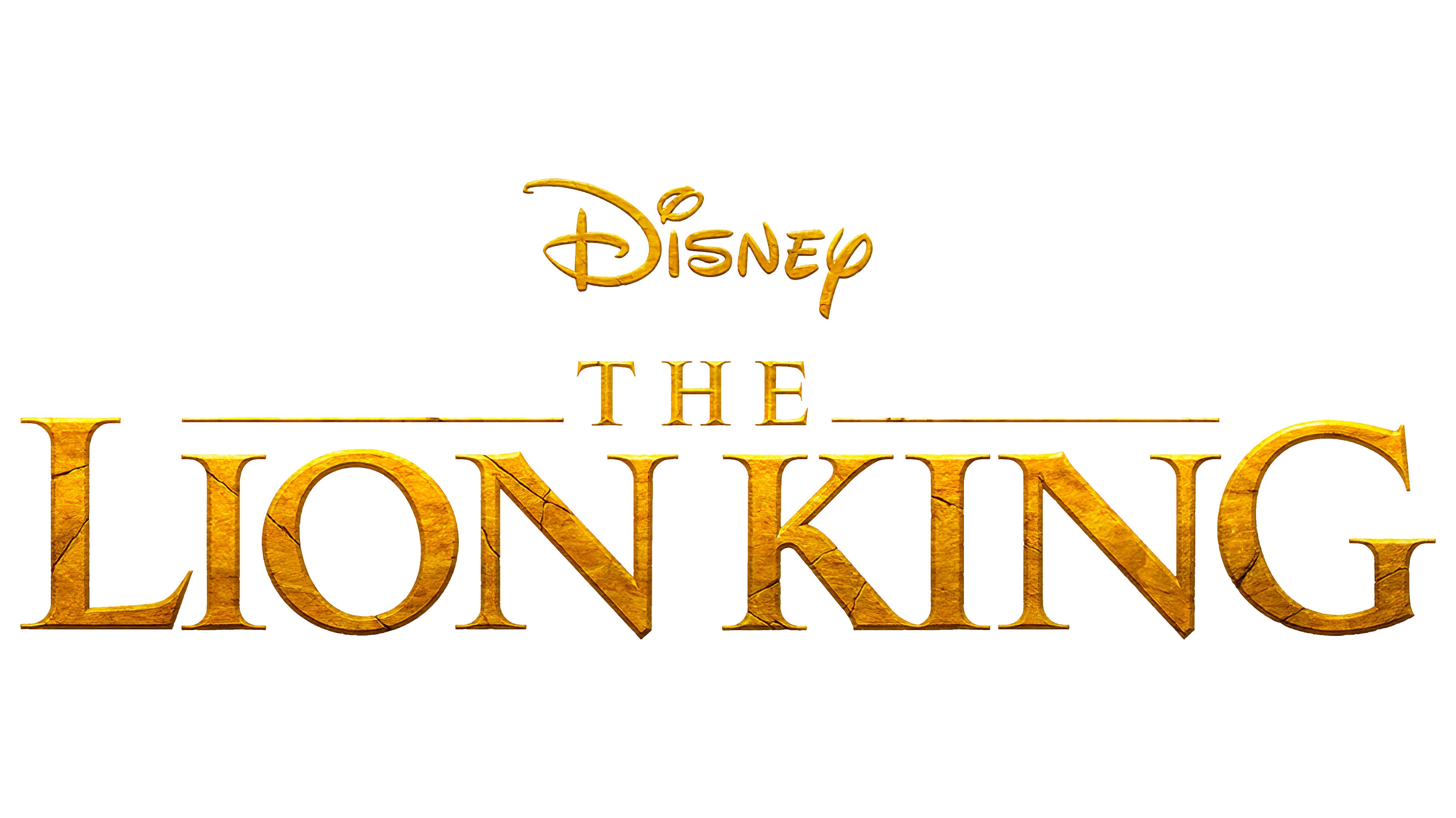
The logo related to the 2019 film has the same structure as the earlier emblem. It is textual, with three lines and similar content. But its style is different: majestic, ceremonial, royal. This effect was achieved by changing the color: all elements are painted gold, even the line, now divided into two parts by the article “The.” The letters are covered in cracks and crevices, resembling the yellow clay earth of the African plains, scorched by the hot sun. This texture makes the inscriptions appear voluminous. Additionally, the glyphs now have thin serifs and side edges.
Font and Colors
The logos use a unique font specially created for this project. Later, a free typeface based on it was developed, named Lion King TTF. Its creator is Melanie Blanco. Overall, the inscriptions are executed in semi-bold antiqua in uppercase. A handwritten font from the Walt Disney emblem is also used for the film studio’s name.
The emblems’ color palette is noble. It includes a classic black-and-white combination, along with two shades of gold. In the early version, there is brick red, reminiscent of the stony land of Africa.