![]() Lionsgate Films Logo PNG
Lionsgate Films Logo PNG
The Lionsgate business logo does not mean boredom. On the contrary, this brand is entertaining and brings joy to the world by distributing artistic films. Therefore, the emblem’s strict stylistics contradict the “internal content” of the film studio.
Lionsgate’s roots go back to 1962, when Canadian producers John Dunning and André Link founded Cinépix in Montreal. The company worked mainly with low-budget genre films, including horror, erotic thrillers, and exploitation cinema. In 1997, financier Frank Giustra bought Cinépix, reorganized it, renamed it Lions Gate Entertainment, and moved the headquarters to Vancouver. The new name referred to the Lions Gate Bridge.
After the relaunch, Lionsgate focused on independent films and material often avoided by major studios. In 2000, the company distributed American Psycho, directed by Mary Harron, and Requiem for a Dream, directed by Darren Aronofsky. Both films helped define the studio’s early reputation for provocative projects with strong critical or cult appeal.
A major commercial turn came in 2003 with Saw, directed by James Wan. Made for about $1 million, it earned more than $100 million worldwide and became the base for a long-running horror franchise. In 2004, Lionsgate bought Artisan Entertainment, the distributor behind The Blair Witch Project, expanding its film library and strengthening its place in independent cinema.
In 2012, The Hunger Games brought Lionsgate into large-scale franchise filmmaking, earning nearly $700 million worldwide on an estimated $80 million budget and putting the company in competition with Warner Bros. and Walt Disney Pictures. The same year, Lionsgate acquired Summit Entertainment, owner of Twilight, for about $412 million. In 2016, the company bought control of Starz for about $4.4 billion, expanding from film production into television, cable, and streaming.
Meaning and History
![]()
The chronology of Lionsgate logos appearing is incredibly intricate, as the corporation includes several movie production and distribution studios. They appeared much earlier than the parent company, which is now its divisions.
The film company was named after the building’s architectural features. Its name consists of two words written together:
- lions;
- gate.
That is, the authors based it on the most striking feature: the stone lion statues at the entrance gates. This naming option has taken hold, pushing out previous names.
What is Lionsgate?
Lionsgate is the most successful mini-studio in North America. It began operations in 1962, when it was called Cinépix, and was created by John Dunning and Andre Link in Canada (in Vancouver, British Columbia). Over time, the company received a new name. It became part of a large structure, Lions Gate Entertainment Corporation, created by banker Frank Giustra in 1997, with its headquarters in the United States (in Santa Monica, California).
1962 – 1969
![]()
The logo consists of a yellow inscription on a blue background. The basis is a horizontal hexagon. The largest word is “Cinépix,” made in a standard print font. The letters are bold, elongated, and chiseled. On the right is an addition indicating the company type “Inc.” It is typed in thin white glyphs and centered.
1969 – 1989
![]()
The emblem depicts a single “C,” stylized as a twist of the film. The designers used the similarity between the first letter of the studio’s name and the film’s title, which actually twists in reality. The ends of the glyph are narrowed, and the middle is expanded. Longitudinal stripes of different widths are applied to the tape. They are painted in contrasting colors: black on white and white on black.
1989 – 1994
![]()
The logo consists of three parts: a drawing, an abbreviation, and a full text. The first is six thin stripes that gradually widen, gathering into a solid black film with a maple leaf. The second is the inscription “C//FP,” obtained from the abbreviation of the phrase “Cinépix Film Properties.” The third is the word “Distribution.” It stretches along the top two elements. The short form of the name consists of capital letters separated by two oblique lines. All glyphs are grotesque and bold.
1994
![]()
The abbreviation “CFP” has been given a new three-dimensional design featuring shadows and dot drawings. Large letters lack serifs and dividing lines; they are very close together. On the left, the designers placed the company’s trademark, a maple leaf, which evokes the film company’s Canadian roots. However, they significantly updated it, replacing the second half with the classic fleur-de-lys.
1994 – 1996
![]()
The block letters have a sharp edge at the bottom, making them look non-standard and balancing a wide, massive top. Under the abbreviation “CFP” is the word “Distribution.” It is made in a capital font with thin glyphs. The first and second lines are centered. The background is a gray horizontal rectangle.
1996
![]()
The style of the inscriptions has changed: the glyphs now have serifs, but they are much thinner. The logo has been regrouped: it is now two-tiered. The upper part is separated from the lower one by a narrow horizontal stripe. The phrase “Cinépix Inc.” appears in the first row, and “Distribution” in the second. All letters are uppercase but vary in size depending on their location. The largest and boldest characters are in the first word.
1996 – 1998
![]()
After the film company was renamed to Cinépix Film Properties, its visual identity was updated. The designers creatively played around with the abbreviation “CFP.” They rounded the side letters to give them an oval shape. The black inscription is placed on a white background.
1998 – 2004
![]()
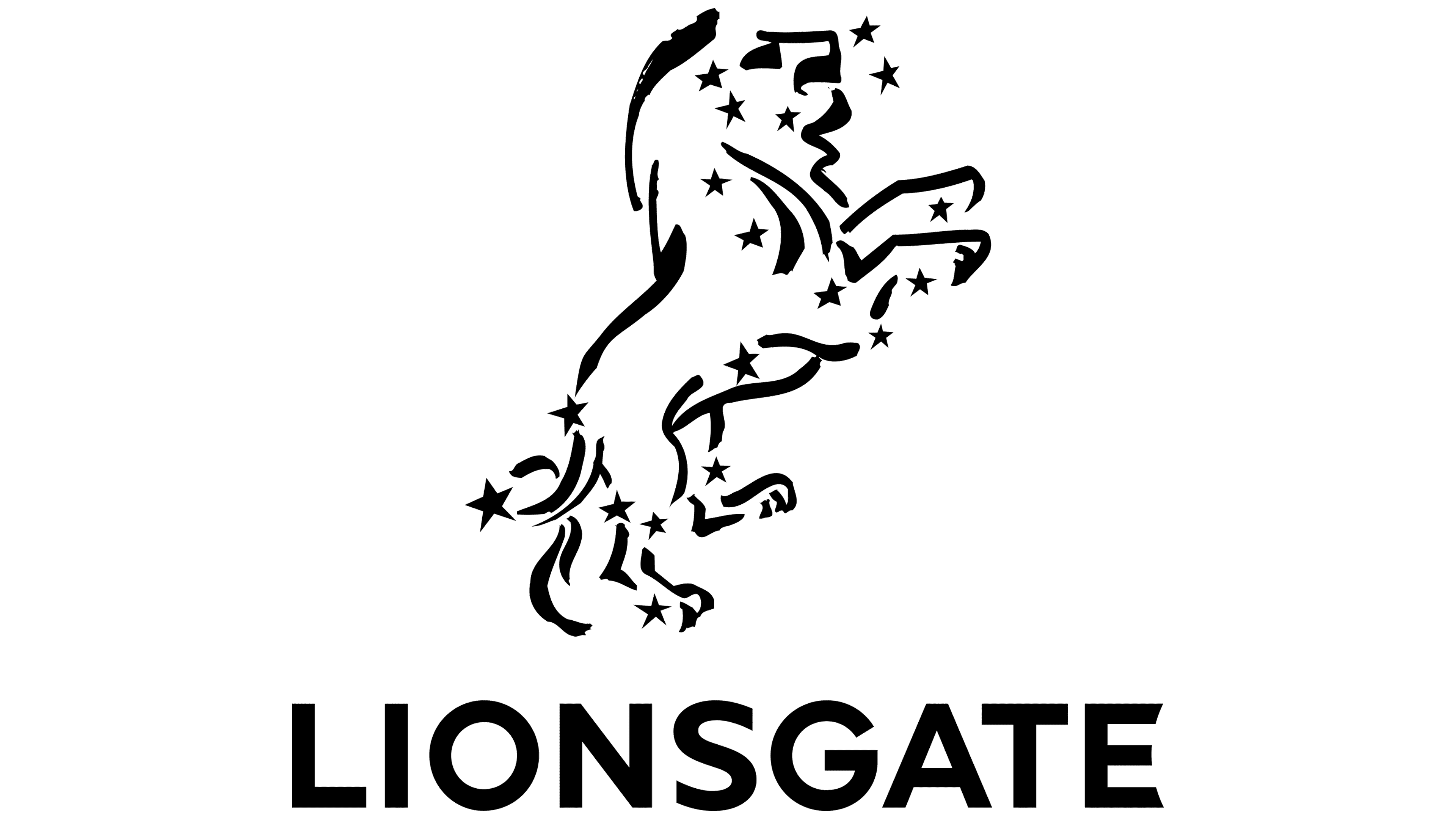
After another rebranding, the film studio adopted a new emblem. Now it is directly related to the name Lions Gate Films, as the lion has become the key element of the visual identity. Small stars surround the animal, and it stands on its hind legs. The management gave up massive signs, replacing the cumbersome, grotesque ones with elegant antiques. The inscription is divided into three rows and arranged in a staircase.
2004 – 2006
![]()
Large block signs returned to the logo; in particular, the abbreviation “LGF,” which took the top position, is made with them. In the second line, the word “Lions Gate” is smaller than in the first. The third row contains a single inscription, “Films,” made with small glyphs. Starting from the middle, a serif font is used, whereas the first line uses a sans-serif font. The central element is isolated with two thin stripes.
2005 – today
![]()
The emblem is laconic. It practically combines two fragments of the film company’s name, which used to be centered. The narrow spacing between the words “Lions” and “Gate” inspired designers to create a merged spelling that avoids highlighting the first letters. All glyphs are of the same size. They are bold, uppercase, and chiseled.
Fonts and Colors
At different times, inscriptions in the logos were set in different fonts. These include the blurry stencil None, the sharp, grotesque Gotham Bold, and individually developed typefaces. The emblem’s palette is predominantly monochrome, except for the initial period, when it included yellow and blue.