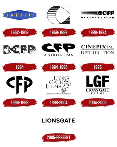
The Lionsgate logo is simple and stylish. It represents a modern film studio that has confidently occupied a small but steady niche in the film world. The sign is an example of simplicity and elegance.
Lionsgate: Brand overview
| Founded: | 1962 |
| Founder: | John Dunning, Andre Link, Frank Giustra |
| Headquarters: | Santa Monica, California, U.S. |
| Website: | lionsgate.com |
Meaning and History
Lionsgate has a very convoluted history. Therefore, despite being founded in 1976, its logos were associated with Cinépix for many years. Numerous rebranding and subsequent revivals of the original name made the history of the emblem and its appearance very diverse. However, a subtle thread running through all the signs is a connection with Canada, the historical homeland of all company owners.
What is Lionsgate?
A Canadian film studio that has given the world such famous films as American Psycho, Saw, Fahrenheit 9/11, The Hunger Games, Dirty Dancing, and Twilight. The studio’s net profit is over $600 million. It includes five additional divisions engaged in games, videotapes, music, and TV shows.
1962 – 1969
In 1962, the company Cinépix appeared in Canada. The name comes from the French word for cinema, as the firm was founded in French-speaking Montreal. The Cinépix logo consists of a yellow name placed on an elongated rhombus with trimmed horizontal corners. The image creates a sense of expansion. Cinépix – expands the world’s view for a person, showing it from a new angle.
1969 – 1989
In 1969, Cinépix turned into a film studio. The company logo was transformed into a roll of film. On its bend, pixels arranged in rows are visible. The bend of the film forms the capital letter C. The transition from a word identity to a completely visual one embodies going into the filming process, the studio’s communication with the world through video pictures. The black and white stripes on the C are like alternating frames.
1989 – 1994
The company merged with the cinema-owning Famous Players to form C / FP Distribution, creating a new logo. The emblem adopted by Famous Players in 1987 was used as a basis. It is a row of stripes with a maple leaf placed on the right side. Unlike the original, a C / FP inscription was added to the joint visual sign, and Distribution was placed below the entire structure.
The stripes on the sign embody the following:
- Rows in a cinema.
- A videotape.
The maple leaf is taken from the country’s flag and indicates the company’s place of establishment. C / FP stands for Cinépix and Famous Players.
1994
The joint venture was renamed Cinépix Film Properties. The company logo became compact—three capital letters as an abbreviation. In front of them, a composition consisting of half the Canadian flag and half the French lily, reflecting Cinépix’s foundation in Quebec, a former French colony.
1994 – 1996
Cinépix bought a share of Famous Players, which was reflected in the new logo. It consists of two levels. On top is the abbreviation CFP (Cinépix Film Properties), and below is Distribution. This approach helped link the company to its line of business. The sharply angled, as if diagonally cut letters made the inscription three-dimensional, fashioned out of filmstrip.
1996
In 1996, the company changed its name to Cinépix Inc. Distribution, restoring its historical name. The updated logo kept the general principle of composition: the company’s name on top and Distribution at the bottom. A standard thin font was chosen for the inscription, but Cinépix was highlighted in bold.
1996 – 1998
A few months later, realizing that the renaming led to a loss of recognition, the company decided to revert to the old name – Cinépix Film Properties, and the logo was again turned into a 3-letter abbreviation.
The inscription formed a horizontal oval with the letter F in the center. The image demonstrated that Cinépix distributes films worldwide. At the time, it owned 56% of Cinégroup, which was showcasing cartoons in 125 countries and had a separate division in the USA.
1998 – 2004
For the first time, the studio’s logo features its current well-known name – Lionsgate. It sounded when Cinépix was bought by IMI Computer Corp. However, this name was born back in 1976. Director Robert Altman founded such a studio in Vancouver. It was involved in film distribution and was sold to Cinépix in 1981. The new owners didn’t allow the company any development until the studio was revived by Frank Giustra, the owner of IMI Computer Corp. He renamed IMI Computer Corp. to Lions Gate Entertainment and Cinépix to Lions Gate Films.
The new emblem visually reflected the name. The company name is divided into three levels: Lions Gate Films. Each word is written with a left shift so that steps are formed. Metaphorically, they also talk about the rise to the top, to success.
Lions Gate is a real object, a suspension road bridge between two mountains in Canada. It’s a very beautiful landmark, a business card of Vancouver. The studio was founded in this city, which is why the name was chosen.
The placement of the inscription in the logo seems to suspend each word, like a straight section of a bridge. In the resulting cutout of the steps on the emblem, the constellation of the lion is drawn. The animal’s image is placed against the stars and points to:
- Respect for the homeland and its history. The rampant lion was the main element of the Guinness family crest – the main investors and owners of the bridge. The lion also pointed to Britain, which owned British Columbia – the province where Vancouver and the studio are located.
- Striving for greatness. The image of the king of beasts spoke of a desire to occupy a dominant position. To rise to the stars.
- Company founder Frank Giustra, who was born under the constellation of Leo.
Beneath the entire composition, there was a small inscription, Lions Gate Entertainment, to show the studio’s affiliation with a larger owner.
2004 – 2006
In 2003, Frank Giustra sold a significant portion of his stake in the company. The new owners shortened the name to the acronym LGF. Below the line, there was an explanation. The large black letters no longer tied the emblem to Canada since the headquarters moved to the USA.
2005 – today
In 2006, the company’s name was shortened to Lionsgate, and the corresponding logo was released – simple, even, smooth capital letters. The symbol conveys the simplification of the name while simultaneously demonstrating the size of the company, which consists of separate large divisions.
Font and Colors
Black color – the leading color in emblems. It associates the company with the world of cinema, rolls of dark film, black frames, and the screen awaiting the start of the show. The color also speaks of scale – over the years, Lionsgate has become a corporation with divisions and subsidiaries in North America.
The font of the inscription resembles Rebelton Medium with smooth and even glyphs.
Lionsgate color codes
| Black | Hex color: | #000000 |
|---|---|---|
| RGB: | 0 0 0 | |
| CMYK: | 0 0 0 100 | |
| Pantone: | PMS Process Black C |


