Liqui Moly: Brand overview
Liqui Moly, a German company known for its oils, lubricants, and additives, was founded in 1957. Headquartered in Ulm, Germany, the company initially gained its reputation for its specialized motor oils and additives.
Today, Liqui Moly is known for its wide range of motor oils, transmission fluids, lubricants, and other chemical products. The company meets the lubrication needs of commercial and consumer vehicles with a wide range of oils and lubricants suitable for everything from gasoline and diesel-powered passenger cars to heavy commercial trucks.
In addition to automotive solutions, Liqui Moly produces lubricants for two-wheelers, marine vehicles, and industrial equipment. The company prides itself on its extensive product portfolio of more than 4,000 products, each meeting various quality certifications.
Liqui Moly is a family-owned company, currently headed by CEO Ernst Prost and employing approximately 1,000 people. In addition, since 2010, Liqui Moly has been the official sponsor of the Sauber F1 Team, demonstrating its commitment to supporting high-performance cars.
Liqui Moly is present in more than 120 countries through a network of importers and competes in a global market. The company’s main competitors in the automotive lubricants market are well-known brands such as Shell, Castrol, Valvoline, and Total/Quartz.
Meaning and History
What is Liqui Moly?
Liqui Moly GmbH has become a well-known manufacturer of oils, lubricants, and additives over its six decades of existence. In 2018, the company was taken over by the Würth Group, with Ernst Prost and Günter Hirmayer as its leading executives. Based in Ulm, Germany, Liqui Moly has consistently strengthened its position as a leading brand in its industry.
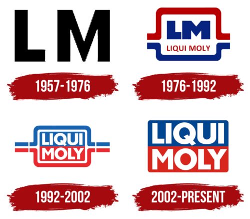
1957 – 1976
1976 – 1992
1992 – 2002
2002 – today
The designers divided the words “LIQUI MOLY” into two lines and placed each part in a separate rectangle. The corners of the base are rounded, which gives the emblem a sense of smoothness and visual softness. The upper half of the emblem is blue, and the lower half is red. This combination of colors emphasizes the dynamism and activity of the company, which specializes in the production of automotive oils, additives, and auto chemicals. The white color of the text is clearly visible, and the bold sans serif font makes it readable, even despite the narrow spaces between the letters.
The blue and red colors are reminiscent of the sky and the road, always ready for a new journey. The rounded corners remind you of the smooth ride of a car when using the company’s products. The bold white text is clear and straightforward, just like the fact that the company wants to be with you.
Liqui Moly color codes
| Safety Blue | Hex color: | #00458f |
|---|---|---|
| RGB: | 0 69 143 | |
| CMYK: | 100 52 0 44 | |
| Pantone: | PMS 7687 C |
| Maximum Red | Hex color: | #d9251c |
|---|---|---|
| RGB: | 217 37 28 | |
| CMYK: | 0 83 87 15 | |
| Pantone: | PMS Bright Red C |
