


![]()
Lobos 1707, the ultra-premium agave spirit brand known for blending tradition with a fresh, bold attitude, has unveiled a new visual identity created by Landor. The update includes a redesigned logo and new packaging, all part of the brand’s “UnDOMESTICATE” campaign—a celebration of individuality, freedom, and the untamed spirit symbolized by its namesake, “Lobos,” which means “wolves” in Spanish.
The logo redesign marks a major shift that reflects Lobos 1707’s growth while staying true to its heritage. The most noticeable change is in the typography. The old logo featured a traditional serif font with sharp contrasts and dramatic flourishes, especially an oversized “S” that stood out. That design leaned heavily into the brand’s historical roots, tied to tequila-making traditions from the 1700s.
![]()
The new logo has a bolder, cleaner look and uses a geometric sans-serif typeface. All the letters are capitalized, giving the word “LOBOS” a strong, confident presence. The spacing between letters feels balanced, and the uniform thickness of the lines adds a sleek, modern vibe. The update makes the logo easier to read and more versatile, whether on a bottle, a billboard, or a social media post.
Previously, the logo included “TEQUILA & MEZCAL” to showcase the brand’s range. The new version simplifies that by focusing solely on “TEQUILA,” which helps the name stand out more clearly. The iconic “1707” remains, anchoring the design and keeping that subtle connection to the brand’s story, inspired by tequila traditions dating back to that year.
![]()
The packaging has been refreshed to match the minimalist feel of the new logo. The bottle’s shape has been subtly refined for a more comfortable grip, while the label now features a striking color palette with rich, earthy tones paired with metallic accents. These colors reveal the natural world of agave farming and the craftsmanship that goes into each bottle. Touches of gold and copper foil add a luxe feel, reinforcing the brand’s premium quality.
The bold “LOBOS 1707” logo is on the label. Details about the specific variety—like Joven, Reposado, Añejo, Extra Añejo, or Mezcal Artisanal—are presented in a smaller, contrasting font that complements the main design without overwhelming it. The combination of matte and glossy finishes creates a dynamic look, playing with light to give the packaging depth and texture.
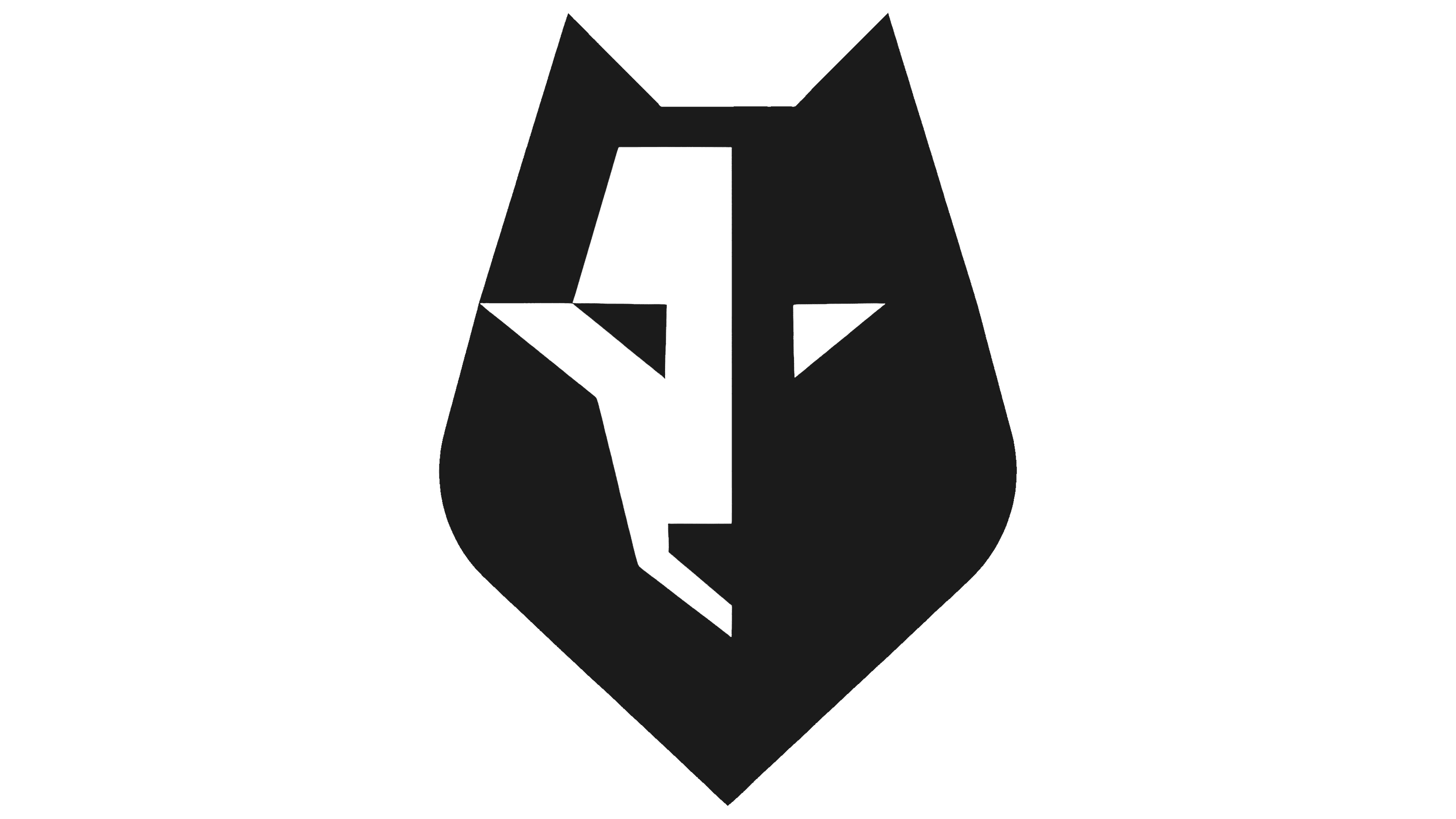
One of the standout details is an embossed wolf motif on the bottle cap and a subtle watermark on the label. It’s a small touch, but it ties everything back to the brand’s core message: strength, leadership, and the freedom to be unapologetically yourself. The wolf serves as a visual reminder to embrace your wild side and break away from expectations.
The rebrand is tightly connected to the “UnDOMESTICATE” campaign, developed with Hudson Rouge. This multimedia effort challenges people to push past societal norms and reconnect with their raw, authentic selves. The campaign includes a series of ads set around the fictional “Center for Human Un-Domestication,” where participants are encouraged to tap into their primal instincts through symbolic rituals—think ice, chili, sea salt, fresh limes, and, of course, Lobos 1707 Tequila.