The Loganair logo successfully represents the Scottish aviation company, combining authenticity, modernity, and forward-thinking. The emblem helps the airline attract travelers’ attention, instilling confidence in its reliability and the comfort of its services.
Loganair: Brand overview
A key player in the UK aviation industry for over 50 years, Loganair has cemented its position as the country’s largest regional airline.
Founded by Willie Logan in 1962, Loganair began as a modest charter airline and ambulance service based at Glasgow Airport.
In 1994, Loganair entered into a ground-breaking franchise agreement with British Airways, giving the airline the benefits of a world-renowned carrier.
In 2008, Loganair took the bold step of terminating its franchise agreement with British Airways and regaining its independence as an airline.
Loganair’s unwavering commitment to excellence has earned it many prestigious honors and awards, including repeated wins for Regional Airline of the Year and Best European Regional Airline.
Loganair has grown from a modest charter and ambulance airline into a prominent player in the air transportation market.
Meaning and History
What is Loganair?
Loganair’s foundations are firmly rooted in Scottish soil, with its central base at Glasgow Airport, near Paisley, Scotland. The airline’s growth trajectory has seen it become the UK’s largest regional airline in terms of both passenger numbers and fleet size. Holding a Type A license issued by the UK Civil Aviation Authority allows the airline to legally carry passengers, cargo, and mail on aircraft, demonstrating its ability to offer a diverse and wide-ranging service.
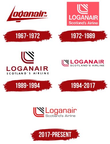
1967 – 1972
The Loganair logo of recent years is imbued with modernity. It is innovative and distinctive, with few analogs among competitors, as it excellently connects the authenticity of the region where the airline is based with high-altitude travel. The key lies in the shape of the first letter used in the emblem. The geometric glyph expresses several concepts:
- Embodies flight, the drive toward vast expanses confidently conquered by the airline.
- Symbolizes the mountains that cover the country from which the airline originates.
- Represents the first letter of the brand name, fitting seamlessly into the innovative typography.
- It acts as an initial (a beautifully designed printed glyph), indicating the airline’s excellent capabilities.
- The company’s identification mark distinguishes it from competitors.
- Depicts a bird freely soaring, confidently flying among the clouds.
The soft curves of the lowercase letters effectively balance the emblem’s professional style. The lower part of the capital “L” extends to the end of the word Loganair, harmoniously arranging the remaining glyphs. The text is italicized and red to attract clients’ attention. In this case, it does not evoke a sense of danger but soothes and instills confidence in the company’s professionalism. Additionally, it is the color of energetic movement and increasing dynamism.
The company’s legal status—ltd.—is indicated in small print at the end. This part of the text is minimalist, discreet, and italicized. The thin and short glyphs are placed in line with the massive and bold letters, making them barely noticeable.
1972 – 1989
The soft style of the Loganair logo is conveyed through paired lines with a smooth curve of the stylized “L.” The rounded corners symbolize smooth flights to any point within the country. They inspire confidence in comfort, professionalism, and impeccable passenger service.
Within the space of the unique mark are three angled stripes of varying lengths; the closer to the center, the longer the line, and vice versa. Thus, the uppermost segment resembles a trapezoid.
The textual part of the emblem is also smooth and soft, instilling confidence, comfort, and trust, which is crucial for a brand aiming to establish a reputation as a professional player in the aviation market. This approach helps attract more clients.
The deep red has replaced a pleasant coral hue—calming and attention-grabbing. This choice stems from a desire to move away from aggressive red to avoid any implication of danger in the future.
The name serves as an identifying element of the company’s unique identity, which originates from Scotland.
- This is indicated at the bottom of the text—the phrase “Scotland’s Airline” is set in a sans-serif font with rounded ends.
- Above it, the word “Loganair” rises, styled the same as the lower line but with glyphs twice the size.
All letters are uppercase and white, making the text stand out clearly against the bright background and softening the intensity of the red color.
1989 – 1994
The emblem in the Loganair logo has undergone slight changes:
- It is now centered, aligning perfectly with the letter “N.”
- It features dual colors, with the two parallel lines symbolizing the “L” in maroon and the three upper stripes in black.
The shift to a Marsala shade was driven by the need to avoid excessive aggression in the identity, as coral, close to crimson, was associated more with blood and danger than energy and movement. Thus, the airline shifted the red spectrum to a darker range.
The text in the emblem is spaced freely, which is significant for the brand, as it aims to convey freedom of movement, unlimited flights, and the absence of boundaries. With wide letter spacing, the inscription appears to breathe or float in the air. One line is set in a large maroon font, and the other in a smaller black font. The font style is geometric and grotesque.
1994 – 2017
The restructured Loganair logo now looks solid and professional. The stylized “L” symbol moved to the front, taking a leading position to emphasize its presentable appearance. As a result, the emblem has been completely transformed:
- It has taken on a rectangular shape.
- It is balanced in the arrangement of elements.
- The color scheme has changed to be more contrasting.
The presentable appearance has not affected the softness of the lines: the curves of the two parallel stripes forming the capital “L” are smooth. This indicates the ease of flights and the convenience and comfort of the aircraft belonging to the Scottish company.
The softness of the logo is balanced by the strict glyphs, executed in a geometric font in uppercase. The first part of the name is large enough to instill trust in clients and be easily memorable. The second half consists of small and thin letters with wide spacing. They are unified by a print style and lack of serifs, hinting at the absence of obstacles in performing flights in any direction.
The emblem’s palette also conveys contrast for a striking visual impact on passengers. The raspberry color is lighter than wine and softer than crimson. It evokes pleasant associations with convenience, comfort, freshness, and calmness.
2017 – today
The Loganair logo features two curved red stripes forming a stylized letter “L.” Three diagonal dark gray lines add a geometric abstraction. The company name is displayed in large red letters next to this abstract symbol, with “Scotland’s Airline” written in gray below. Both lines use a sans-serif font similar to Luke Owens’ Waukegan LDO Extended Regular.
Red evokes energy, passion, and urgency, which suit the dynamic aviation industry. The gray lines add depth, making the design more engaging and balanced. The sans-serif font enhances the logo’s modern and clean look, reflecting Loganair’s commitment to straightforward and reliable service.
“Scotland’s Airline” highlights Loganair’s strong connection to its home country. The gray text subtly contrasts with the bold red company name, ensuring both elements stand out.
The overall design combines modern typography with a unique abstract symbol, creating a memorable brand identity. The red and gray colors and the font choice convey professionalism and trustworthiness. This design approach helps the logo stand out in the competitive aviation market while honoring the brand’s Scottish heritage.
