![]() LoL Logo PNG
LoL Logo PNG
The video game has a golden logo, LoL, the letters which look like precious ingots. They perfectly convey the mood of the story unfolding in the battle arena. The classic game image is reflected in the monolithic lettering. At first, it was on a dark gray background, reminiscent of a fragment of an ancient wall, and then on a neutral white so that the glyphs look even more colorful and spectacular.
LoL is a free-to-play online multiplayer game released in 2009 for macOS and Microsoft Windows. Its developer is Riot Games. It has console and mobile versions and is monetized through character customization. The full name of the game is League of Legends. It is now the largest cybersports game, held at the international level and featuring 12 leagues. On this basis, the world championship of the same name is held annually, with live broadcasts on several well-known Internet platforms (Bilibili, YouTube, Twitch) and on one sports TV channel (ESPN). Thus, in 2019, the final was watched by about 44 million unique viewers.
League of Legends, better known as LoL, of course, started with excitement. Marc Merrill and Brandon Beck, the founders of Riot Games, wanted something on par with DotA (Defense of the Ancients). So they organized a cyber gaming tournament among students at the University of Southern California. Their goal was to secretly discover talented gamers that they intended to recruit for the team. This is how they got to know many of the key figures who played a huge role in launching the novelty. As a result, it was presented four months later, in 2007, at the conference of computer game developers. It was based on the Warcraft III engine.
Meaning and History
![]()
The creators continually update League of Legends, revising the art effects; after 2014, the frequency of adjustments increased to once every 2-3 weeks. Game designers and artists, naturally, do not forget about visual identity. They coordinated it with the game’s content, or rather, with the mood and atmosphere it supports. They got a golden, shiny lettering on a dark gray background. The noble glow is preserved in the second version of the text logo.
What is LoL?
LoL is an acronym for League of Legends. It is an online video game introduced by Riot Games in 2009 and monetized through character upgrades. It is designed for two system platforms: macOS and Microsoft Windows. Today, the multiplayer game is one of the biggest cybersport activities and comprises 12 leagues, with an international final among the winners.
2009 – 2019
![]()
Although the debut LoL emblem is textual, the lettering looks as if it were drawn. The graphic nature of the glyphs is due to their three-dimensionality: the letters are three-dimensional, convex, and massive. This effect is due to the contrasting black borders and dark shadows surrounding the title and background. Blurred outlines and vagueness are characteristic of the text and the long shield with five sharp protrusions. Its edges are also colored gold and have a gradient. As a result, the glyphic font looks mysterious but elegant. The overall image is “stony,” which imitates natural stone’s hardness, hue, and texture. Together, they create a great subtext about the battle of warriors.
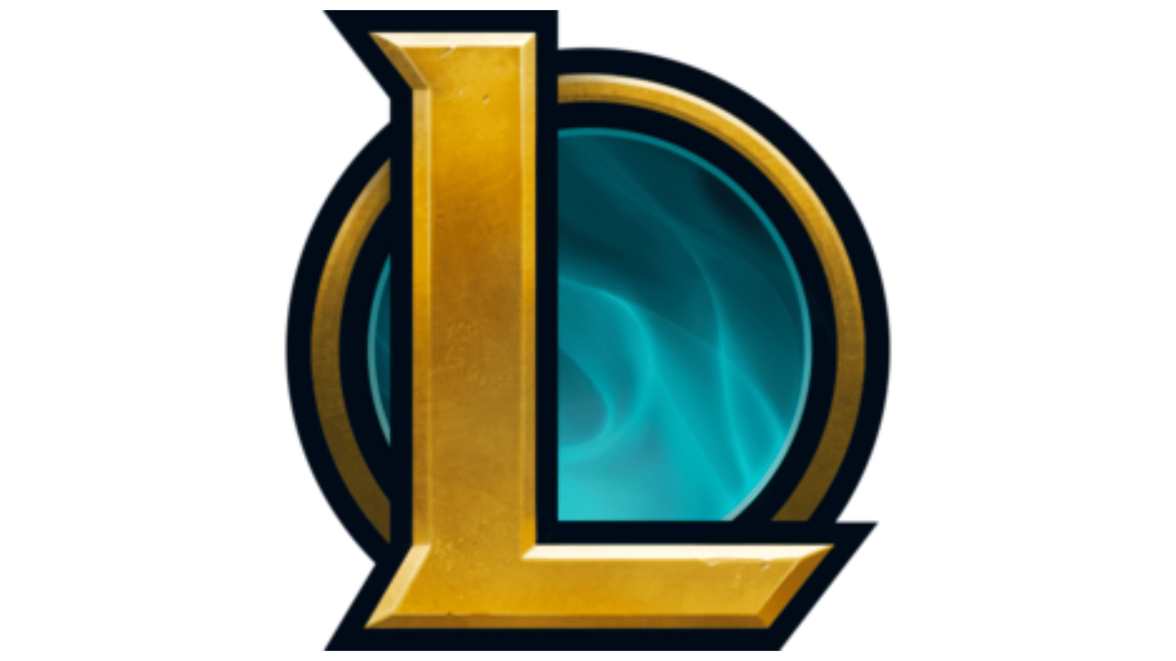
2019 – today
![]()
The current League of Legends logo is lighter and lighter. It has no dark elements and a blurred black background – everything is clean and transparent. Only the letters, stylized as bars of gold with an uneven texture, as if cast under artisanal conditions, contribute to the atmosphere of tension. Each glyph has lines and a narrow shadow, making it three-dimensional. Like the last version of the logo, the preposition “of” is in small type, while the other two words are in large type.
The designer of the lettering for the debut LoL logo is Ernst Friz. This is very important because the typographer essentially served as the designer, since the video game’s visual identity is textual rather than graphic. The second version is also wordy but not as oppressive as the first.
Font and Colors
The three-dimensional glyphs in the early version are made to look old. Such a style adds a noble sophistication and power to the League of Legends inscription. The font is decorated with barely noticeable serifs that look like extensions. Some of them are triangular. The typeface is reminiscent of Ernst Friz’s Friz Quadrata. The second emblem uses the Sharp Sans font. The developer of this wordmark is Emily Oberman of the Pentagram design studio. But the palette always stays the same: it’s gold, which makes the logo royally chic. Dark gray and ashy smoky colors nicely complement it.