London’s Natural History Museum, an internationally acclaimed scientific research center and one of the UK’s most frequented indoor attractions, recently presented its revitalized brand identity. Since its establishment in 1881, the museum has stood as a bastion of knowledge in diverse fields such as botany, entomology, mineralogy, paleontology, and zoology.
Pentagram partner Marina Willer and Nomad triumphed in a competitive pitch against 270 agencies, creating this dynamic brand new identity.
The museum’s preceding logo fell short in typographic finesse, with uneven rhythm across the lines of text due to the inconsistent application of curved letter corners. The unique typeface in use failed to leave a memorable mark.
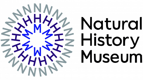
The reimagined logo embraces typography, arranging the museum’s initials in a radial design. The circular, text-centric logo is envisaged with motion graphics in mind. It even has creative applications such as a smartphone camera ‘filter’ that emanates the logo from the user’s mouth. When in motion, the logo conjures up an ambiance reminiscent of examining nature under a microscope.
The Pentagram design team expressed that the museum sought a symbol that encapsulates the complex interweaving of nature and our planet. Despite its balance and composition presenting certain issues, the new logo largely fulfills this objective. The most notable challenge is ensuring the ‘M’ matches the width of the ‘N’ and ‘H’ for a tidy stack, which somewhat undermines its visual prominence. While this balance issue is adequately addressed in the full wordmark, it becomes more apparent in the icon. The initial alignment of the letters gradually gives way to misalignment as they rotate, a compromise to maintain equal spacing and density within each ring. The composition’s strength unfolds in animation, where the logo reveals its full potential.
Accompanying the new Natural History Museum logo, the museum introduced a custom typeface, NHM Wallop, grounded in Displaay Type Foundry’s Wallop typeface.
Although the logo might require some adjustment, it solidifies a strong visual identity for the museum. Without using any singular graphic element, the design encapsulates the essence of ‘Natural History,’ offering a vibrant representation of the museum’s extensive scientific scope.


