


![]() Natural History Museum Logo PNG
Natural History Museum Logo PNG
The NHM logo is more than just a symbol. It is a visual story that captures the museum’s commitment to catalyzing change, drawing inspiration from the interconnectedness and energy that pulse through nature. The logo invites everyone to join this inspiring journey, learn from our planet’s past, and actively shape its future.
The Natural History Museum in London traces its origins to the collection of Sir Hans Sloane, a physician and naturalist who gathered plants, animals, minerals, coins, and manuscripts from across the world. After he died in 1753, more than 71,000 items were transferred to the British nation, leading to the creation of the British Museum that same year.
The natural history collection grew through major scientific expeditions. Joseph Banks brought many specimens from James Cook’s voyage of 1768-1771, and later material arrived from Charles Darwin’s travels and expeditions in Africa, Asia, and South America. By the mid-19th century, the collection had outgrown its Bloomsbury location.
Richard Owen, head of natural history at the British Museum and the scientist who introduced the word “Dinosauria” in 1842, pushed for a separate institution. In 1864, Parliament gave land in South Kensington, and Alfred Waterhouse designed the new terracotta building. It opened to the public on April 18, 1881, as the British Museum (Natural History).
The museum became independent in 1963 and received its current name, Natural History Museum, in 1992. In 1905, Andrew Carnegie donated the Diplodocus cast known as Dippy, which later became one of its best-known exhibits. In 2017, Dippy was replaced in the central hall by Hope, the blue whale skeleton. Comparable institutions include the Smithsonian National Museum of Natural History in Washington and the American Museum of Natural History in New York.
Meaning and History
![]()
For a long time, the museum was part of the British Museum. Officially, this institution became independent only in 1963. The brand’s visual recognition is at the highest level, as the logo has changed infrequently throughout the museum’s history. Perhaps, at least once, every resident of London and the entire United Kingdom saw it. The Natural History Museum logo looks sublime because the designers combined elements of different shapes. Its visual softness is designed to elicit favor and attract potential visitors’ attention. And it is also a symbol of the endless development that underlies historical events.
What is Natural History Museum?
This is one of the world’s oldest and most famous museums, which, as its name suggests, specializes in natural history. Also, it owns a popular franchise.
before 2004
![]()
The Natural History Museum logo depicts an elegant palm branch, symbolizing harmony, beauty, peace, triumph, success, and eternity. It is rendered in soft strokes, with smooth curves that convey its natural form, harmoniously echoing the style of the inscription, arranged in four lines, one word per line. The capital letters reflect a love of natural history, with soft, smooth lines. There are curves at the ends of the legs, in the internal gaps, and on the outer side. The article “THE” is the smallest in size because it is not key to the title and because the palm branch begins to its right.
2004 – 2023
![]()
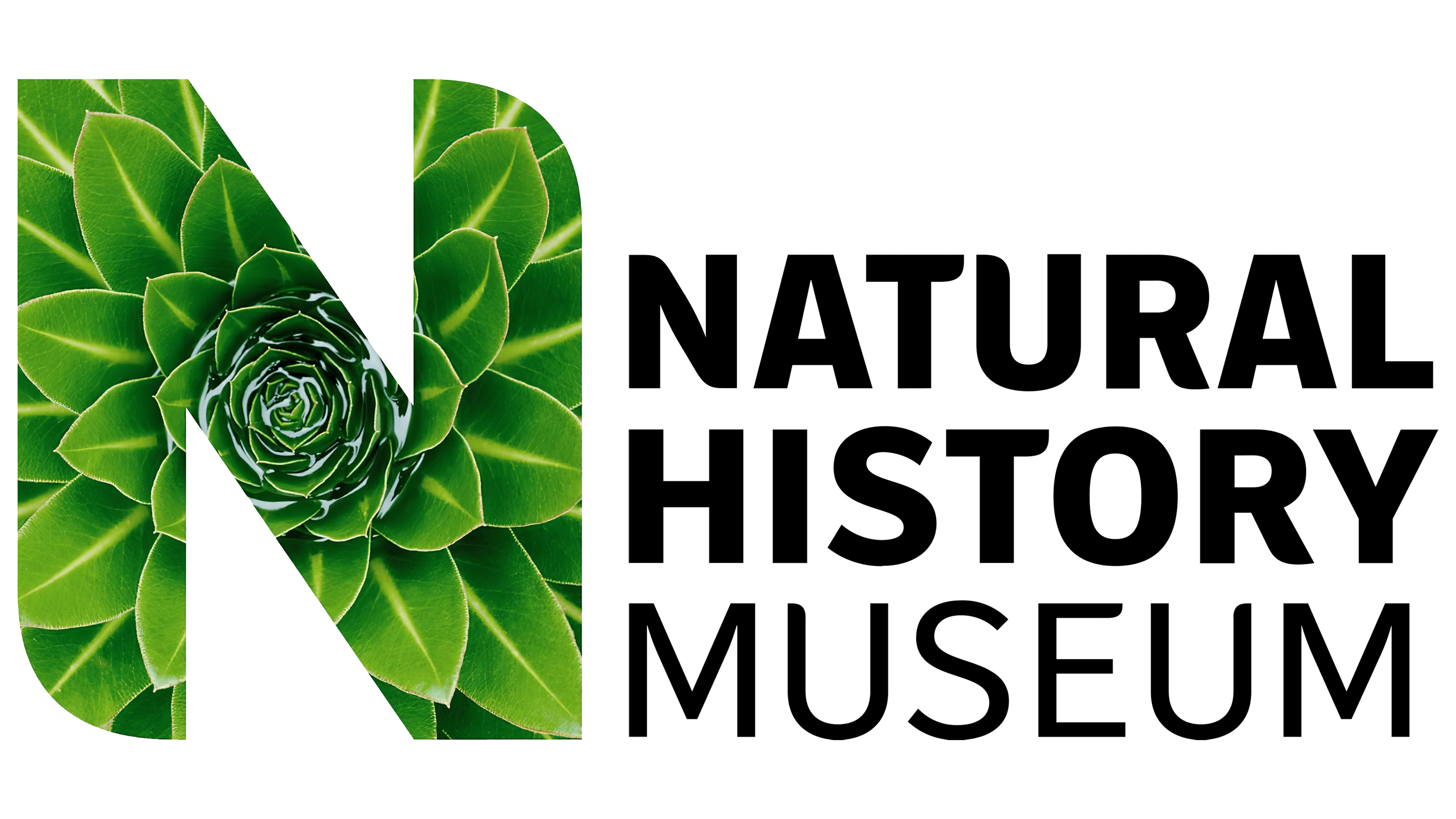
The logo consists of a word inscription and an emblem on the left. It was the capital letter “N.” It uses a modern sans-serif typeface with rounded corners. It looks powerful because the emblem is more than three lines above the main name. This letter is white with a black outline.
As mentioned above, the main title consists of three lines, each with one word. It is worth noting that “Natural” and “History” are in bold type, while “Museum” differs somewhat in both letter style and line thickness. The last line uses the most modest and concise font, while the first two lines look more modern and progressive.
Each word element in the logo contrasts with the others. This contrast is indicated, for example, by the letters “U” because each is different from the others, or by the style of writing “T.”
As a rule, a white-and-black color palette is used. However, new shades can be added to make the logo more appealing to the target audience, depending on its use. It all depends on how the collections are represented and when they occur.
2023 – today
![]()
The Natural History Museum (NHM), a symbol of knowledge and exploration into the wonders of our world, has unfurled a new visual identity. Born to embody their ambition to be a catalyst for change, this renewed brand identity carries a vibrant narrative of life, nature, and dedication to our shared environment.
At the heart of the new logo is the acronym NHM, the museum’s initials. This succinct representation is more than a simple abbreviation; it’s an inviting beacon for knowledge seekers, and it holds the echoes of our planet’s vibrant history and the challenges we face today. The letters are designed to serve as a potent reminder of the museum’s mission and role in today’s society, a world grappling with climate change and other existential crises.
The layout of the NHM initials evokes an engaging visualization that transcends the ordinary. The letters are arranged in concentric circles, drawing inspiration from the patterns found in nature. Look around, and you will find these circular motifs in a sunflower’s seeds, planets’ orbits, or the concentric ripples on the surface of a pond disturbed by a pebble.
This circular design also captures the very essence of a catalyst, the role that the museum aspires to play in today’s world. Like a stone hitting the water’s surface, the museum’s impact creates ripples of change. The pulsating, expanding rings symbolize this dynamic process, reflecting the energy and dynamism the museum aims to instigate.
The circular motif is not static; it’s versatile, symbolizing the museum’s dynamism and adaptability. The rings can change form and communicate various themes, fostering a sense of energy and forward motion.
The logo’s shape has been carefully crafted to capture pulsating energy. It reflects the interconnectedness and cyclical nature of everything in our world. Depending on your perspective, it can represent myriad natural phenomena: a dandelion spreading its seeds, a fossil tracing the contours of a long-extinct creature, a gathering of people striving for a common cause, or a school of fish swirling in unison.
Four motion behaviors ripple, grow, pulsate, and orbit, breathing life into the NHM logo, each drawing inspiration from different aspects of nature. This creates a dynamic, versatile identity that adapts to different contexts and embodies the museum’s holistic approach to understanding our world.
Completing this visually engaging story is the carefully designed wordmark typography by Patrick Giasson and the custom version of the Wallop typeface by Displaaay type foundry. The typography adds another layer of aesthetic appeal, enhancing the brand’s personality and accessibility.
Font and Colors
The Natural History Museum’s logos do not use identical fonts, but similar versions have been modified to match the required style. These include Fira Sans ExtraBold with substantial letters and Axiforma Medium with elegant glyphs without serifs. A personalized typeface called NHM Wallop, based on Wallop by Displaay Type Foundry, is also used.
The emblem’s color palette is much broader than it may seem at first glance, appearing in many variations. For example, the logo with the block “N” represents it in various colors, ranging from green with a succulent to red with erythrocytes. The design themes include a mineral cross-section, a hare, desert sands, a dinosaur skeleton, our planet, a bird at sunset, a shell, and much more. Each has its unique color, transforming the letter into an exclusive symbol.

Multicolor is also inherent to the round sign with the abbreviation “NHM.” Each row has an individual color: “M” is blue, “H” is purple, and “N” is gray. There are also variations in brown, turquoise, cobalt, red, azure, pink, and green. However, in the business style, all emblems are monochrome.