Lorex Technology: Brand overview
Founded in 1991 by the Canadian Klein family of consumer electronics manufacturers, Lorex Technology began as a humble company specializing in security and surveillance solutions. Throughout the last years of the 20th century and the beginning of the 21st century, the company manufactured and distributed surveillance cameras and home security equipment.
With the passage of time, Lorex started manufacturing various products such as video intercoms, baby monitors, car dashboard cameras and other electronic devices. Notably, it was Lorex that introduced easy-to-use plug-in security systems designed for households and micro-enterprises, spurring the development of the DIY security sector.
In the 2010s, the company focused its resources on developing integrated home and app technologies that allowed users to access camera footage via mobile devices from anywhere. In the mid-2010s, Lorex expanded its horizons, which was evident in the 2016 acquisition of IC Realtime, a large video surveillance company.
Lorex is now a leader in the camera and surveillance equipment industry, serving a wide range of customers from individual consumers to large commercial enterprises. Operating under the wing of FLIR Systems, Lorex maintains an international presence and focuses on products that promote safety and security.
Meaning and History
What is Lorex Technology?
Based in Ontario, Canada, Lorex Technology specializes in providing first-class security solutions including state-of-the-art CCTV cameras, video intercoms and smart home integration systems that provide reliable surveillance and peace of mind in residential and commercial environments.
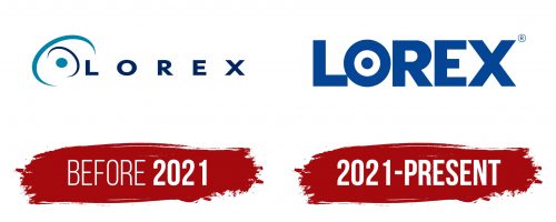
Before 2021
2021 – today
An online store that sells surveillance cameras has embodied this image in its logo. The designers replaced the letter “O” in the word “Lorex” with a camera lens. To do this, they used the classic circle shape. The letter looks usual, but in the center on a white background is drawn a large dot. The text is in bold, sans-serif font. The letters are large, blocky, and located close to each other. However, due to their size, they do not merge with each other and are easy to read. The logo is made in blue color.
The blue color evokes a sense of trust when looking at it. The camera lens in the center makes it clear what the store is selling. Seeing the logo, it is immediately clear that this is a store where you can buy surveillance cameras. The entire design is neat and clear, making it easy to remember.
Lorex Technology color codes
| Safety Blue | Hex color: | #044595 |
|---|---|---|
| RGB: | 4 69 149 | |
| CMYK: | 97 54 0 42 | |
| Pantone: | PMS 7687 C |
