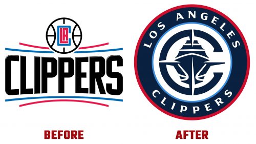
In a significant branding evolution, the Los Angeles Clippers have officially introduced a new logo, marking a fresh identity for the esteemed basketball team as they prepare to enter a new era. The Clippers, with a history that traces back to their origins as the Buffalo Braves before transforming into the San Diego Clippers and finally settling in Los Angeles in 1984, have long been a staple of American professional basketball. Despite a challenging start, the team has seen a resurgence in the 2010s, with notable playoff appearances and division titles highlighting their ascent.
The Los Angeles Clippers logo redesign is pivotal for the team, currently holding a commendable 4th place in their conference and boasting a roster filled with stars such as Russell Westbrook, James Harden, Kawhi Leonard, and Paul George. The Clippers’ rejuvenation is further bolstered by owner Steve Ballmer, the tech mogul whose leadership and investment have been instrumental in the team’s recent successes and ambitious plans. This includes the construction of a new $2 billion arena set to open for the 2024-25 NBA season, signifying the team’s commitment to excellence and innovation.
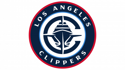
The new logo, rumored to be the work of Brooklyn-based Doubleday & Cartwright with typographic contributions from Matthew Wolff, is a tribute to the Clippers’ nautical namesake. The original name, adopted during their San Diego days, references the swift clipper ships of the mid-19th century. This historical nod is vividly captured in the logo’s design, which integrates a ship, a compass, the letter “C,” and a basketball into a cohesive and dynamic emblem.
The design cleverly utilizes the compass to form the ship’s hull and sails, with the basketball seams adding a modern twist that inadvertently gives the ship a more contemporary appearance. Despite this modern flair, the logo retains a sense of tradition through vintage-inspired typography that circles the nautical imagery. This blend of old and new mirrors the Clippers’ journey from underdogs to contenders, symbolizing their rich history and bright future.
Critics may note the logo’s complexity and the stark contrast between its various elements, yet this diversity is also its strength, offering a broad palette for merchandise and branding opportunities. The Clippers’ new identity does not shy away from its unique story, instead embracing its heritage with a bold and inclusive design strategy. The refreshed logo is a beacon of their evolving identity and aspirations as the team looks forward to moving into their new arena and building on recent successes.


