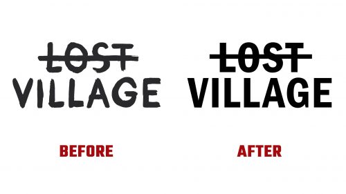
Lost Village, a unique four-day festival in Norton Disney, Lincolnshire, has introduced a new logo and brand identity designed by Only. This update modernizes the festival’s visual identity while keeping its distinctive character.
The previous logo had a hand-brushed look with a crossed-out “LOST,” giving it a mysterious feel. The new logo keeps this concept but uses Franklin Gothic, a typeface known for its timeless elegance. This change gives the logo a cleaner and more refined look while maintaining its original character.
The new logo aligns the festival’s identity with its evolving audience. The design reflects a more mature tone, appealing to festival-goers who have grown with the event. The challenge was modernizing the visual identity without losing the festival’s unique spirit.
Franklin Gothic is paired with Garamond, balancing boldness with elegance. Franklin Gothic brings confidence and directness, while Garamond adds nuance and sophistication. This combination supports bold statements and detailed storytelling, fitting the festival’s narrative-driven experience.
The emblem and wordmark have been cleaned and boldened but retain the recognizable composition. The hand-drawn elements have evolved into a more expressive scrawl, reflecting the festival’s dynamic and creative nature.
The color palette stays true to the festival’s earthy setting but includes more vibrant shades to reflect its lively atmosphere. Using black and white in the logo and graphics enhances visibility and impact, especially against photographic backgrounds.
Graphic elements and dingbats play a key role in the new identity. These elements, used in large sizes and bold black colors, overlay photographs and create a striking visual impact. They add complexity and celebrate the festival’s quirky vibe.
The rebranding includes updated social media templates, promotional materials, and merchandise designs. These applications showcase the new logo and graphic elements in various contexts, ensuring a cohesive brand presence across all platforms. The refreshed identity allows for creative expression while maintaining a consistent look.
This update reflects Lost Village’s growth and commitment to providing an immersive experience. By embracing a more sophisticated aesthetic, Lost Village positions itself as a forward-thinking event that honors its roots and looks to the future.
The new logo and identity for Lost Village mark a significant step in the festival’s journey. Franklin Gothic and Garamond typefaces and expressive hand-drawn elements create a distinctive visual language. This rebranding modernizes the festival’s appearance and reinforces its core values of creativity, inclusivity, and individuality.


