The Lufthansa CityLine logo symbolizes the reliability and high professionalism of the airline, which easily conquers the skies and regularly flies to many countries around the world. The emblem reflects confidence in providing impeccable hospitality for travel to any destination.
Lufthansa CityLine: Brand overview
Lufthansa CityLine’s unique history spans over six decades and began in 1958 in Emden, Germany, as Ostfriesische Lufttaxi (OLT). Initially, the airline offered air cab services using propeller-driven aircraft, serving local communities. Today, as a subsidiary of Lufthansa, Lufthansa CityLine continues to thrive while maintaining its interesting history.
In 1974, Lufthansa acquired OLT, which led to the company’s amazing transformation into a regional airline known as DLT (Deutsche Luftverkehrsgesellschaft mbH).
Throughout the 1980s and 1990s, DLT expanded its operations, focusing on establishing reliable domestic and European routes. A significant rebranding in 1992 resulted in the Lufthansa CityLine.
Part of the respected Lufthansa Regional brand, Lufthansa CityLine provides passengers with a comfortable and efficient travel experience aboard its modern aircraft, including the Bombardier CRJ900 and Embraer 190.
Based at Munich Airport, Lufthansa CityLine plays an important role in air transportation across Germany and Europe, connecting major international destinations with smaller regional airports.
Meaning and History
What is Lufthansa CityLine?
Lufthansa CityLine, founded in 1958, is a well-known German airline. Originating as Ostfriesische Lufttaxi, the company initially offered domestic flights, gradually expanding its operations and rebranding to Lufthansa CityLine in 1992. Headquartered at Munich Airport, Lufthansa’s regional division has a history of providing comfortable, efficient, and reliable air transportation to millions of people in Europe and beyond.
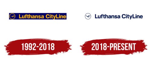
1992 – 2018
The rebranding of Deutsche Luftverkehrsgesellschaft mbH led to a new name and logo for Lufthansa CityLine. The logo features a simple geometric shape—a narrow horizontal rectangle in dark blue. This deep color palette evokes the sky at dawn or dusk when it becomes most saturated due to the contrast with the rising sun’s rays. This color scheme expresses the concept of comfort and reliability for flights at any time of day—the elongated shape of the emblem hints at spacious aircraft.
Despite the absence of rounded corners, the circle placed before the text conveys the soft style of the logo well. Inside the circle is a crane flying to the left, with an elegant long neck and large, powerful wings consisting of four narrow strips symbolizing feathers. This is the airline’s unique symbol and mascot.
The frame is medium in width, outlining the space around the bird to make it more visible on the emblem. The need to encircle the crane and highlight it arises from the uniform color of all elements: both the name and the image are colored yellow. This warm orange shade:
- Creates a sense of comfort, calmness, and confidence.
- Adds informality to the strict geometric font.
- Supports a relaxed atmosphere in the identity.
- It makes the logo striking and visible on any background.
The blue and yellow color scheme effectively attracts customers’ attention, while the combination of straight edges and smooth curves instills a sense of reliability and high professionalism.
2018 – today
Lufthansa Cargo’s subsidiary has a logo similar to its parent company, ensuring a consistent and recognizable brand identity. On the left side is a circle with a stylized crane designed by Otto Firle. The crane flies diagonally, with its wing raised and a crest on its head, symbolizing elegance and flight.
The right side of the logo displays the subsidiary’s name in a bold and professional font. The letters are substantial, conveying strength and reliability. The text is mostly in lowercase, with the first letters of each word capitalized for readability and a professional appearance. The entire logo is dark blue, reinforcing the qualities of reliability and professionalism.
Keeping the logo almost identical to Lufthansa Cargo’s highlights the strong connection between the parent company and its subsidiary. This ensures brand consistency and makes it easier for customers to recognize and trust the subsidiary as part of the Lufthansa family. Dark blue, often associated with trustworthiness and expertise, enhances this unity.
With its raised wing and crest, the stylized crane adds elegance and sophistication to the logo. It represents the airline industry and the high standards of service and quality upheld by Lufthansa Cargo and its subsidiary.
The bold letters in the subsidiary’s name emphasize strength and dependability. The clean text design ensures readability while using mostly lowercase letters, which gives it a modern and approachable feel. The dark blue color unifies all elements, creating a cohesive and professional look.


