The Luxair logo symbolizes the ease of reaching air travel destinations, the high professionalism, and the airline’s excellent technical foundation. It conveys the company’s commitment to developing and perfecting flight skills over any distance.
Luxair: Brand overview
Luxair, Luxembourg’s national airline and flagship carrier, has connected Luxembourg residents with destinations in Europe, North Africa, the Mediterranean, and the Middle East for nearly six decades.
Luxair Airlines was established in 1961 through a partnership between the Luxembourg government, the Luxembourg Society for Research and Engine Construction (SLECM), and a private Luxembourg investor to meet the growing demand for reliable air transportation from the bustling European center that is Luxembourg.
Luxair experienced significant growth and expansion during the 1970s and 1980s, modernizing its fleet with modern aircraft such as the Boeing 737 to meet the growing demand for air travel.
In 1985, Luxair was privatized, with private shareholders acquiring a 44% stake in the airline.
In the 21st century, Luxair has invested in fuel-efficient airplanes to reduce its environmental impact. The company implemented digital transformation to improve online booking and introduce innovative customer service initiatives.
Meaning and History
What is Luxair?
Luxair emerged in 1961 as the national airline of Luxembourg, symbolizing the small nation’s significant presence on the international scene. From its headquarters at Luxembourg Airport, the airline operates passenger and cargo services. The company’s journey from a small regional carrier to an international player has been marked by a focused attention to service quality and a commitment to connecting Luxembourg to the world.
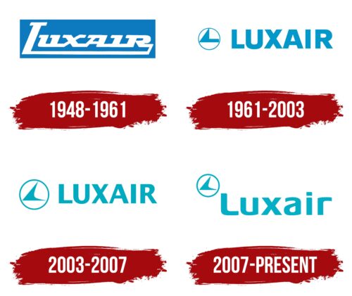
1948 – 1961
The Luxair emblem embodies perfection, symbolizing aviation services linked to the boundless sky. The pleasant blue color conveys a sense of confidence, freedom, and calmness, which is crucial for an airline. Additionally, it signifies the high achievements the Luxembourg-based company strives for, demonstrating to the world that a small country can have significant potential. The pastel palette has a soothing effect on clients, helping build brand trust.
Against the pastel blue background is a white inscription, occupying the entire rectangular space horizontally. The informal font style creates a soft visual identity despite the prominent presence of various angles. The inscription is uniform in height, with only a large letter at the beginning of the compound word “Luxair,” blending the second part with the first. The name is derived from two bases:
- Luxembourg (the country to which the company belongs)
- Air (confirming its connection to the airspace)
The logo fully aligns with the brand, representing it in domestic and international aviation markets. The italicized glyphs make it widely recognizable.
A solid line runs along the bottom, stretching from the first letter to the last, demonstrating that all flights are executed precisely according to their route. Planes adhere strictly to their course and arrive at their destinations on time. This creates an impression of reliability and meticulousness, reflecting the airline’s high responsibility towards its passengers.
1961 – 2003
After expanding its aircraft fleet, the company redesigned its emblem to showcase its seriousness, professionalism, and reliability. As a result, the Luxair logo now features a small circular symbol with a bird inside, resembling a classic paper airplane.
It has a straight tail, and a triangular wing pointed upward. Hypothetically, there is a second wing identical to the first one hidden behind it. This detail has simplified the identity, making it more accessible and approachable for everyone.
The most significant change occurred in the brand name. It became more substantial, consisting entirely of monolithic letters – uppercase, bold, and grotesque. The absence of serifs indicates openness to clients and no barriers to flying with this airline.
The rectangle was removed to demonstrate the company’s global connection and easy access to any part of the world. However, the light blue remained, now adorning the text instead of a geometric shape. The sky-blue glyphs stand out brightly against the white background, clearly presenting the brand name.
2003 – 2007
The new Luxair logo conveys the most important aspect for a company associated with airspace – lightness. This quality is now reflected in all visual identity elements, perfectly embodying the airline’s concept.
- The font style is simplified with thin letters. Narrow lines add lightness to the name, visually making it less heavy. Thanks to the ample intra-letter spacing, it appears to breathe, free of obstacles. All glyphs are uppercase, smooth, tall, balanced with sharp angles and soft curves.
- The circular symbol with the bird inside is light because large areas with smooth curves surround it. Despite the pointed tips of the tail, wing, and beak, they do not evoke a sense of danger. On the contrary, their thinness indicates the ability to effortlessly and quickly cut through the air, reaching the end of the planned route.
All these elements ensure the company’s recognizability and closely associate it with its services. Upon seeing the logo, potential customers immediately understand the brand’s field. The other identity elements create a positive image of a trustworthy airline.
2007 – today
The logo combines “Luxembourg” and “Airline” to form its name. The text is large, soft, and friendly, with rounded letters except “x” and “i.” Most of the font is lowercase, with the lowercase “r” matching the uppercase “L.” In the upper left corner is a ring with a stylized bird inside. The bird, resembling an arrow, clearly shows wings, body, tail, and head. The entire emblem is sky blue.
The logo’s rounded letters make it welcoming and show the company’s friendly approach. The lowercase “r” matching the uppercase “L” highlights its Luxembourg roots. The sky-blue color adds a sense of calm and reliability.
The ring with the bird in the upper left corner adds a dynamic element. The bird, designed like an arrow, suggests movement and progress. It symbolizes travel, freedom, and aspiration, aligning with the sky-blue color and representing open skies and possibilities.
Sky-blue, the color of the sky, connects the logo to air travel and evokes tranquility and trust. The friendly letters and dynamic bird create an approachable and forward-thinking logo.
The design balances friendliness and professionalism. The soft letters invite trust and warmth, while the stylized bird suggests efficiency and reliability. The sky-blue color ties everything together, making the logo cohesive and memorable.
