The Luxembourg Football Federation (FLF) has introduced a new visual identity for its national teams, marking a significant change in Luxembourg’s football journey. This update reflects a modern and refined aesthetic.
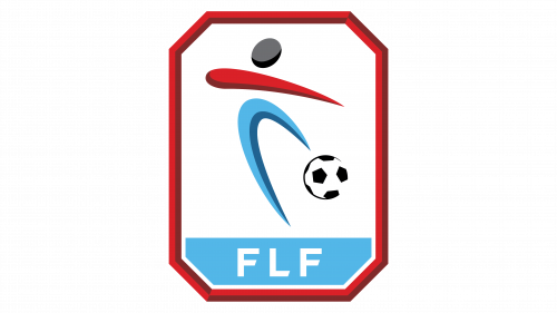
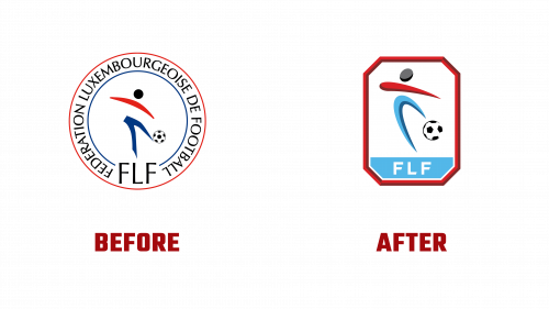
The new logo features a polygonal design, replacing the previous round emblem. It retains the core colors of blue, red, and black. The logo showcases an abstract football player as its central element, drawn with two-tone strokes, while the ball is depicted more realistically to add depth. The bold octagonal red border defines the logo’s new shape. The abbreviation “FLF” is prominently displayed at the bottom, simplifying the previous text-heavy design.
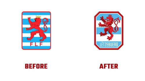
The Red Lion shield, a historical symbol of Luxembourg, has undergone significant changes. The lion’s legs and head have been remodeled to create a consistent and modern appearance. Its crown and claws are now red, complementing the lion’s color scheme. The background, previously featuring nine stripes, now displays five blue-and-white stripes. The text “FLF” has been replaced with “LËTZEBUERG,” the country’s name in Luxembourgish.
Inspired by the previous emblem, the new logo’s octagonal border establishes visual continuity while modernizing the look. This element ties the new design to its historical roots, ensuring the emblem remains recognizable to fans and players.
FLF President Paul Philipp highlighted the rebranding as a symbol of renewal for Luxembourg football. This redesign aims to redefine the federation’s essence and set a new direction for its future. The overhaul aligns with contemporary design trends and conveys a dynamic, forward-looking image.
The new design has sparked discussions among design experts. Some argue that traditional elements, like the Telstar soccer ball with pentagonal patches, might seem outdated. Integrating these elements with abstract lines introduces a unique blend of classic and modern styles. The decision to use a single-color lion moves towards a cleaner and more modern aesthetic.
While the updated logo has received mixed reviews, it represents a significant effort to modernize Luxembourgian football’s visual identity. The octagonal border offers a distinct and bold look. Simplifying the lion’s design and reducing the stripe count in the background streamlines the emblem, making it more visually appealing and easier to reproduce across various media.
Despite recent modest success on the field, Luxembourg’s football federation is optimistic about the future. The new visual identity is part of a broader campaign, “Lëtzbuerg rules sports,” to boost national pride and inspire better performance. This rebranding effort is seen as a step towards enhancing the overall image of Luxembourgian football and engaging a wider audience.
The FLF’s new logo and emblems represent a significant shift towards a more modern and sophisticated visual identity. By updating traditional elements and incorporating contemporary design trends, the federation aims to position itself for future success and recognition in football. This rebranding reflects a commitment to innovation and a fresh start for Luxembourg’s football community.


