Maestro Logo

Maestro LogoMaestro Logo PNG

The Maestro logo is characterized by its consistent concept and has been used by the company for over 30 years in various iterations. The emblem radiates warmth, affirms unity, and evokes a sense of completeness. It creates the impression of a superior product and highlights the utmost care for clients within the program.

Maestro: Brand overview

In 1992, MasterCard International launched a new brand to support debit card services in Europe, marking the start of the Maestro payment system. Maestro was introduced to meet the growing demand in Europe for a reliable tool to handle everyday banking needs. Its purpose was to replace traditional bank cards for cash withdrawals with a more versatile payment solution.

Rapid infrastructure expansion and partnerships with European banks characterized the system’s early years. Between 1992 and 1995, the network of ATMs and payment terminals grew extensively, providing cardholders with convenient access to services. A key innovation during this period was the introduction of online payment authorization technology, which significantly enhanced transaction security.

By the mid-1990s, the system had expanded beyond Europe, entering markets in Latin America and Asia with substantial potential for debit card adoption. This expansion led to a notable increase in issued cards and merchant acceptance points worldwide.

By the end of the 1990s, the system had established itself as a global payment network. A significant milestone was the adoption of chip technology on cards, which greatly improved security and functionality and reduced the risk of fraud.

In the early 2000s, contactless payment technology became a focus. The system was among the first to implement EMV chip technology, accelerating transaction times and improving payment security. Online payment capabilities were enhanced during this period, and debit cards became integral to e-commerce transactions.

The brand transformed digitally in the 2010s. Integration with digital wallets and mobile payment systems allowed the system to adapt to emerging technologies. Adopting tokenization technology added an extra layer of security for digital transactions, addressing concerns about fraud in the digital payment landscape.

In 2015, a gradual transition began in some regions, with Maestro cards being rebranded under the Debit Mastercard name. This decision was part of a broader effort to streamline MasterCard’s product offerings and enhance operational consistency.

In July 2023, Mastercard announced it would cease issuing new Maestro cards in Europe. Existing cards will remain valid until their expiration dates. This decision reflects a shift toward modernizing payment methods to align with digital advancements and changing consumer preferences.

For over 30 years, the system has been key in advancing cashless transactions and building modern payment infrastructure, contributing to the widespread adoption of electronic payments in Europe and beyond. While the brand is being phased out, its legacy of innovation and security continues to shape the future of the payment industry.

Meaning and History

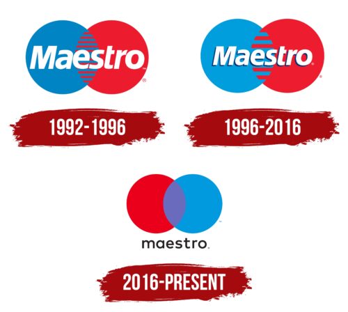
Maestro Logo History

What is Maestro?

This is a debit payment system owned by Mastercard. The cards allow customers to make payments and withdraw cash at ATMs worldwide, where the system’s cards are accepted. The main feature of these cards is that all transactions are made directly from the customer’s bank account, so transactions are processed instantly. This means that no credit limit is required, unlike credit cards. These cards are widely used in Europe and many Latin American countries and are accepted by millions of merchants and ATMs. Additionally, they offer high security through a chip and PIN code.

1992 – 1996

Maestro Logo 1992

Since its inception, the brand has utilized a powerful visual symbol with significant meaning. At the center is a circle, symbolizing wholeness and perfection. Within the circle are two key figures: one represents the customer, and the other represents the Mastercard system. At the intersection of these figures lies the potential unlocked by the Maestro card.

The connection of the two circles forms the infinity symbol, representing the program’s limitless possibilities. Each figure on the logo is divided into stripes, resembling puzzle pieces that fit seamlessly together, emphasizing all participants’ close connection and unity.

The circles represent the globe, reflecting the system’s global reach. Maestro cards are accepted in over 90 countries, highlighting the brand’s international presence and market coverage.

The geometric shape, reminiscent of Vesica Piscis, ties the logo to the process of cell creation and division, reinforcing the company’s image of growth and expansion worldwide.

The upper portion features a large white “Maestro” inscription in italicized font, emphasizing dynamism and the drive for growth. Thus, the brand evokes a sense of movement and progress.

1996 – 2016

Maestro Logo 1996

In the late 1990s, the number of intersecting stripes on the circles was reduced, and the size of the name was decreased. These changes created a more geometrically complete and balanced image, enhancing its visual appeal.

2016 – today

Maestro Logo

Pentagram Studio’s rebranding resulted in changes to the central part of the emblem. The intersection of the circles was removed, and each figure became independent. This emphasizes clients’ voluntary participation in the program, which can be discontinued anytime. The new logo reflects respect for personal boundaries, highlighting the ease and convenience of the system while creating a sense of friendliness.

The combination of red and blue colors produces a purple hue, conveying creativity and the opportunities unlocked by using the system. The company name is placed at the bottom of the design, rendered in a thin black font, maintaining the harmony and geometric balance of the overall composition.