The Mafia logo is familiar to all gamers who love the gangster genre, as this game offers an interesting pastime and a boost of energy. To keep it widely in demand, the developers made it thrilling and complemented it with a well-recognized emblem.
Mafia: Brand overview
Meaning and History
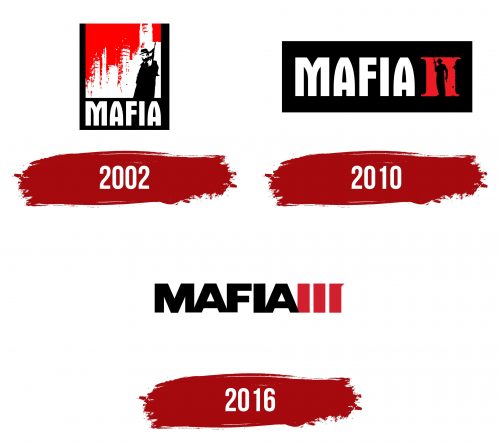
While all three games in the series tell about different heroes trying to assert themselves in the criminal world, their logos are made in one style. They contain at least one element indicating the storyline. If in the first two emblems, the hint is direct (depicting a mafioso with a sawed-off shotgun), then in the third one, there is a symbolic detail – a sharp triangular protrusion in the shape of a sight or a piece of cold steel. The colors in all cases are thematic, fatal – red in various shades, reminiscent of arterial and venous blood, and black as a hint of the dark side of human nature and society.
What is the Mafia?
Mafia is a series of computer games in the form of an adventure action game with elements of a third-person shooter. As of 2023, there were three, each focused around different heroes. The first two versions are built on individual storylines that do not intersect with each other, while the third version is essentially a continuation of the second. The release of the game is handled by the Czech company 2K, formerly known as Illusion Softworks, but renamed after transitioning to Take-Two Interactive. The original idea’s author is game designer Daniel Vávra.
2002
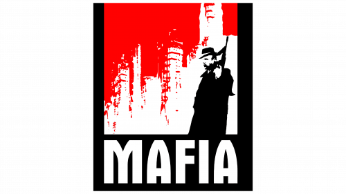
The Mafia logo of this period looks like a poster. It consists of a drawing where white outlines of high-rise buildings emerge from a solid red background. This could be a typical landscape of any district in any city – hinting at the deep roots of the Mafia that it penetrates everywhere. The buildings are unclear and slightly blurred because they are executed with careless strokes. Against their background is the figure of the main character with a short-barreled rifle in his hands. It is raised upwards, indicating that the person is on alert and ready to use the weapon instantly. The figure’s pose is confident, like that of the master of the surroundings.
The lower part of the improvised poster is occupied by the word “Mafia.” It is typed in white font with uppercase letters. There are no serifs, as they would interfere with expressing the game’s action genre concept. If you look closely at the glyphs, you can notice their resemblance to bullets or bullet marks. This is particularly evident in both “A”s: they have rounded and smooth sides with the characteristic outline of bullets. Weapons and bullets are also well conveyed in the spaces within the letters: the elongated openings in “M” resemble single-edged knife blades, while in “A,” they look like sharp daggers.
2010
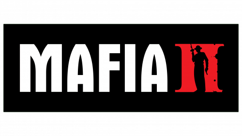
While keeping the style of the inscription, the designers changed the graphic part of the Mafia logo. They reduced the picture to the size of the glyphs and placed it to the right of the inscription. This graphic image turned into the Roman numeral II, indicating the next part of the game series. For this, the emblem’s authors divided the solid red background with a black figure of a man with a machine gun in the right hand and a pistol in the left. This shows the character’s constant readiness for attack or defense. The mafioso is dressed in wide trousers, a shirt, and a wide-brimmed hat. The text and pictures are located in a black rectangle.
2016
The mafioso character disappeared from the game’s logo. Indeed, the emblem of the third part is fundamentally different from the first two versions. It is massive, extra bold, and textual. There is no drawing. Its place is taken by the Roman numeral III, made of wide bands, the last of which has a triangular serif at the top, resembling a gun sight. The sharp protrusion also signifies the tip of a knife blade. The inscription is in uppercase with blocky glyphs. They are so close to each other that they touch. For example, “M,” “A,” and “F” are connected, as well as “I,” “A,” and the numeral I.
Font and Colors
In the first two parts of Mafia, the title is executed in Aurora Bold Condensed font, in which the glyphs and spaces within letters look like bullets and knife blades. In the third case, Tungsten is used, reminiscent of simple fonts like Univers and Arial Black with massive, smooth letters.
The emblem’s palette corresponds to the gangster genre: it predominantly features red, black, and white. In all three versions, the red has different shades: scarlet (like arterial blood) and burgundy (the color of venous blood). Black demonstrates the secrets of the mafia clan and the dark side of society. White serves as an excellent contrast to them and visually balances the oppressive atmosphere.
