The Makita logo is full of life and energy. It demonstrates a leader in its industry. The emblem reflects the company’s active position and products made up of moving parts intended for work.
Makita: Brand overview
| Founded: | March 1915 |
| Founder: | Mosaburo Makita |
| Headquarters: | Anjō, Japan |
| Website: | makita.co.jp |
Makita is a Japanese corporation that has been manufacturing power tools since 1919. It has 11 factories and over 19,000 employees worldwide. The manufacturer owns 40% of the global tool market, bringing in a net profit of 600 million dollars.
Meaning and History
The evolution of logos reveals the company’s expansion process across the world. From the very beginning, the owners did not plan to limit themselves to the country of origin and were targeting the West. However, most of the products were sold in Asian countries, as indicated by the bilingual visual sign. The modern emblem demonstrates a wide coverage of countries and continents using the primary international language.
What is Makita?
A large corporation that produces electric and gasoline-powered tools and accessories for them. It offers more than 7,000 items in total. Production facilities are in South America, China, the United States, Canada, and Asian countries. The manufacturer has 40 subsidiaries. The headquarters is located in Anjō.
Old
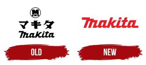
The initial logo of the corporation consists of three levels. The top-level features a circular emblem with the capital letter of the name. Such a symbol was suitable for marking products.
In the central part, large kanji characters represent the company’s name in Japanese. Emphasizing the local language demonstrated respect and love for the homeland, focusing on selling products in Japan and nearby countries. Each character is written sharply and clearly. The outlines of the symbols resemble various tools.
In the bottom row, the English word Makita represents the desire to attract foreign buyers’ attention. The name was chosen after the founder Masaburo Makita, who opened company manufacturing generators and motors, which later transformed into a power tool conglomerate.
The gradual change in visual elements told the story of the founders’ plans: to spread from a small workshop throughout the country and then start exporting abroad.
New
The significant expansion of the company, with the emergence of about 40 subsidiaries, required a review of visual identity. The modern logo represents leadership and energy.
The red calligraphic inscription, with letters connected at the bottom, demonstrates the cohesive work of the giant, Japanese precision, and productivity. The choice of palette conveys that despite its century-long history, the company’s heyday is just beginning, with new achievements and heights ahead.
The capital letter consists of elements arranged in a staircase pattern. The hooks of the “M” form three schematic images of a handheld drill. This technique embodies the corporation’s sphere of activity and tells of producing tools of different shapes and sizes for large firms and home use.
Font and Colors
The monochrome logo represents a large-scale corporation. The color is typical for leaders. The manufacturer is ready to offer the world something new. The red hue reflects one of the company’s features – innovative technologies. Makita invests significant resources in development. The bright palette is also related to the theme of electricity.
The font resembles Atomicaboy Regular. Slender letters with smooth elements hint at the harmonious shape of tools and pleasant-to-touch materials. The lower extensions of the characters show the construction element of many Makita products – a battery pack for autonomous operation, which attaches to the product from below. Each letter connects sequentially with the next, demonstrating the plugging in of power tools.
Makita color codes
| Pigment Red | Hex color: | #ec1b24 |
|---|---|---|
| RGB: | 236 27 36 | |
| CMYK: | 0 89 85 7 | |
| Pantone: | PMS Bright Red C |
