 Malév Hungarian Airlines Logo PNG
The futuristic logo of Malév Hungarian Airlines reflects the brand’s great ambitions and potential. The simple geometric shape of the elements emphasizes a commitment to a systematic approach and discipline, which underpin the airline’s responsible operations.
Malév Hungarian Airlines: Brand overview
For over six decades, Malév Hungarian Airlines (Magyar Légiközlekedési Vállalat in Hungarian) has played a key role in connecting Hungary to the global community through its hub at Budapest Ferenc Liszt International Airport. Founded in 1946, Malév Hungarian Airlines became the country’s flagship carrier, providing Hungarian citizens with ample travel opportunities and opening doors to the world.
During the 1950s and 1960s, Malév Hungarian Airlines achieved considerable success and grew rapidly. The airline’s network expanded considerably, and international flights connecting Budapest with numerous European cities were introduced. Introducing modern jet airliners, such as the Tu-134 and IL-18, was a milestone for Malév Hungarian Airlines, demonstrating its commitment to growth and development.
In the 1970s, Malév Hungarian Airlines entered the “jet age” by expanding its fleet with Boeing 737 and 767 aircraft.
Joining the prestigious Oneworld alliance on March 29, 2007, was another important milestone for Malév Hungarian Airlines.
Despite significant achievements, Malév Hungarian Airlines faced financial difficulties due to intensified competition and the global economic downturn. Bowing to these pressures, the airline decided to suspend all operations on February 3, 2012.
Meaning and History
What is Malev Hungarian Airlines?
Malev Hungarian Airlines, Hungary’s national flagship carrier, began operations in 1946 and, until 2012, made a significant contribution to the development of world aviation in Hungary. The company was an integral part of the country’s rise in the post-war period, supporting economic development through international trade and tourism. Over the years, the airline expanded its domestic and international routes, becoming a significant player in the global aviation industry.
1970s – 1989
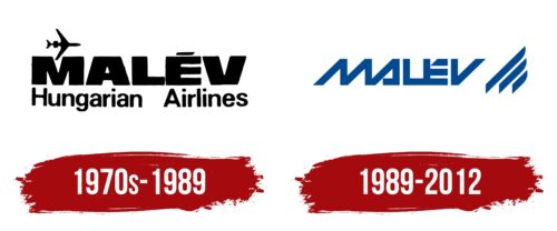
The old Malév Hungarian Airlines logo has a simple design but makes a powerful visual impact. A small flying airplane demonstrates the company’s connection to the aviation industry. Its wing is nestled between the two diagonals of the letter “M,” emphasizing the brand’s pursuit of harmony and balance.
The airline’s name is divided into two parts using different fonts. The first word is in uppercase extra-bold glyphs, symbolizing Malév’s significant contribution to the Hungarian aviation market. The second part is less massive, featuring mostly lowercase letters with many rounded shapes. The thin, smooth lines evoke feelings of trust and safety.
The brand chose not to experiment with color, opting for a classic black-and-white combination. The simple monochromatic design highlights the airline’s business image and demonstrates its serious approach to work.
1989 – 2012
The logo uses a businesslike, creative, and compact design with letters made of wide diagonal stripes that convey dynamism and energy. The uppercase, sans-serif font has a unique style that stands out.
The letters “M” and “A” are connected, as are “L” and “E,” creating a sense of cohesion and flow. The letter “V” stands alone, giving it emphasis. The crossbar in “A” is replaced by a curved foot, and the top of “E” is cut off, adding a modern twist to the design.
To the right of the text are three lines with rounded tops resembling airplane wings and tail feathers. These lines enhance the sense of motion and speed, reflecting the dynamic nature of the aviation industry.
The connected letters “M” and “A,” as well as “L” and “E,” symbolize unity within the company. The curved foot in “A” and the cropped “E” provide a modern, stylish look. The three lines on the right side represent airplane features, reinforcing themes of flight and movement.
The logo’s design is deliberate and meaningful. The diagonal stripes and connected letters create a cohesive and dynamic visual. Modern twists in the letter forms and airplane-inspired lines communicate speed, unity, and modernity, making the logo stand out while maintaining a professional appearance.


