The Mall of Asia logo emphasizes the scale of the mall. The emblem informs us about the huge areas, countless shops, cafes, and entertainment areas, which will bring unforgettable emotions.
Mall of Asia: Brand overview
| Founded: | May 21, 2006 |
| Founder: | SM Prime Holdings |
| Headquarters: | Bay City, Pasay, Metro Manila, Philippines |
| Website: | smsupermalls.com |
Mall of Asia is the 12th largest mall globally, owned by SM Prime Holdings and located in the Philippines Manila. It occupies an area of 67 hectares on which there are four buildings and outbuildings with more than 800 hundred retail outlets. It has 8 thousand parking spaces. It is part of the Central Business Park.
Mall of Asia is a place for recreation and shopping, operating since 2006. At the time of opening – the largest in the country. There are cinemas, restaurants, shops, supermarkets, conference halls, parking lots, and sports arenas on its territory. The latest renovations, which will be completed in 2023, will add a football field, a renovated ice rink, a museum, and a botanical garden to the center.
Meaning and History
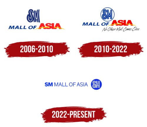
The evolution of the SM Mall of Asia logo has been gradual, with the visual symbols becoming more organized and minimalist as the shopping center developed and acquired new buildings. The disharmony that was present at the beginning gradually gave way to a balanced design.
All versions of the emblem indirectly emphasize the diversity of goods that have filled the hundreds of stores and restaurants at MoA. And the memorable monogram made up of the letters “SM” pays tribute to tradition, as it appeared on the façade of the shopping center from the first days of its opening. Mall of Asia uses this symbol to link the past with the present.
What is the Mall of Asia?
The fourth-largest shopping center in the Philippines is located in the Pasay City area. It consists of two large retail buildings and two parking lots with a total area of 559 thousand square meters, surrounded by many other buildings and outbuildings on the territory of the business park.
2006 – 2010
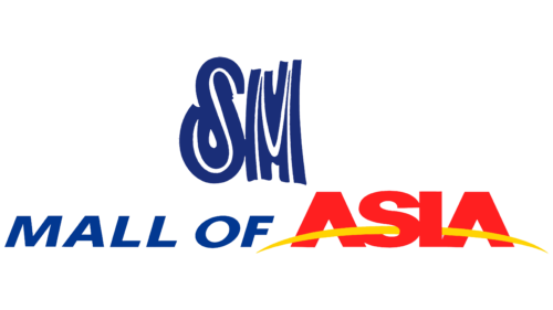
The visual sign of the center is very inharmonious. It uses four fonts that differ in style, size, and color. However, such a move can be considered a symbol of the unification of many shops, cafes and recreation areas under one roof.
At the head of the visual sign is the three-dimensional abbreviation SM, which personifies both the parent company and the abbreviation Super Mall (shopping center). Below is the inscription in blue “Mall of.” The italic and gradient all around give the impression that the lettering lies horizontally. Next to it is a large upright red word Asia. Its scale indicates that the center is a major enterprise not in the Philippines but all of Asia. Massive letters symbolize a large area of the institution, and the red color – revival, crowds, hot discounts, and many emotions.
The yellow arc passing through the word Asia represents the sun. She makes a geographical emphasis, showing that we are talking about the part of the continent where the luminary rises. Asia seems to have “hooked” with its letters A on the edge of the sun, and as it rises, it pushes the name up. In general, such visualization indicates the high level of the center, its leading position, and its large size. He rises to the sky, towering over all his competitors.
Below the word Asia is a slogan in jagged thin black letters: No Other Mall Comes Close. It can be translated as “no other shopping center can compare with us.” This is an allusion to several malls that closed after the mall opened and to large sizes (now the Mall is the 4th largest in the country).
The background of the logo is blue with a blue gradient. It resembles the sky, in which the name floats in the daytime in a bright cloud. And at night, the gradient creates an association with a neon sign. The white halo around all the inscriptions reinforces this impression.
2010 – 2022
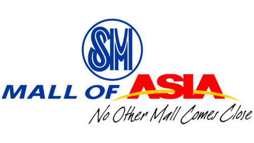
In 2010, the usual globe, which welcomed the mall’s guests and was its symbol, was converted into Globamaze – a panoramic video screen, the only one in Asia. After that, the logo was also slightly “modernized.”
The blue background has been removed. The letters SM were placed in a circle, which symbolizes the fact that the Asia Trade Center belongs to the network of such centers, creating a sense of community and unification. The circle also hints at the Globamaze globe – the new “face” of the mall. All other parts of the logo remained unchanged.
2022 – today
The appearance of the new SM Mall of Asia logo is related to a massive rebranding of SM Investments Corporation (SMIC), which affected all the conglomerate’s retail brands and was intended to unify their appearance. The designers kept the traditional blue color but slightly changed its shade to make it more appealing to customers. The combination of red and yellow and the massive bold grotesque font used for the word “ASIA” disappeared. Now all inscriptions are done in the proprietary font Henry Sans. It was developed by SMIC’s own team and named after its founder Henry Tan Chi Sieng Sy Sr.
The name of the Philippine shopping center takes up one line. The “SM” abbreviation is bold, while the other words are made up of thin lines. This contrast makes the emblem balanced, as at the end of the inscription, there is a large blue circle with white stripes forming the letters “S” and “M.” Mall of Asia inherited this stylized monogram from its parent company SMIC, which began using a similar modern letter symbol as early as 1975. The new MoA logo reflects the brand’s evolution and the entire SM network.
Font and Colors
Primary colors of the logo:
- Blue – heavenly shade, Indicates a large corporation, reliability, and a stable position.
- Red – the color of the scale, a large crowd of people.
- Yellow is the symbol of the sun. Predicts profit, expansion, and prosperity.
- Black – used for the slogan. Both the color and the inscription embody the power and leading position of the center.
The “Mall of” part of the lettering has fairly versatile letters that can fit in various fonts. The closest of them is Univers Next Pro 841 Extended Black. For the word Asia, the strict font PODIUM Sharp 8.11 is used. At the same time, the jumpers of the letters A are replaced by a solar arc. The slogan is written in capital “dearJoe 1.”
Mall of Asia color codes
| Han Purple | Hex color: | #012fff |
|---|---|---|
| RGB: | 1 47 255 | |
| CMYK: | 100 82 0 0 | |
| Pantone: | PMS Blue 072 C |
