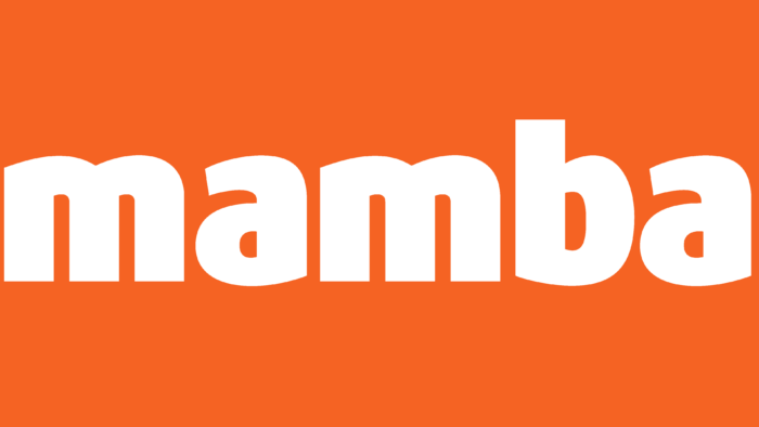
The Mamba logo is as provocative, fiery, and dynamic as the dance after which the brand was named. This is a justified decision because a dating site should attract attention and encourage people to communicate actively.
Mamba: Brand overview
| Founded: | 2002 |
| Founder: | Mamba Joint Stock Company |
| Headquarters: | Russia |
| Website: | mamba.ru |
Meaning and History
The startup of the Russian businessman Andrey Andreev, which appeared in 2003, had 7,000 registrations a day a year later. And after the purchase of the platform by Viktor Remsha (Finam) and the launch of an affiliate program, the service became the leader of Runet dating. In 2006, 40 thousand users per day were registered in the system. By acquiring Wamba in 2013, the company entered the international market and continues to expand actively, launching dating services on partner sites and receiving 30% of their profits.
Visual sign verbal: Mamba. It means the name of a Cuban temperamental and sensual dance that conveys passion. It is performed in pairs, where, with the help of movements, partners communicate and express their feelings for each other. Therefore, Mamba was the best suited for the name of a dating site.
What is Mamba?
An international franchise dating platform with an audience of 60 million. Provides paid and free services. The annual revenue of the project is 18 million dollars. The main owners are Viktor Remsha and Alisher Usmanov.
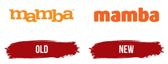
Old
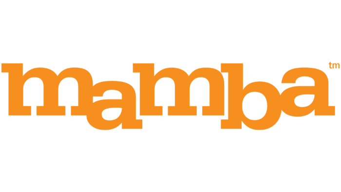
The logo of the project received the corresponding name – dancing. Thanks to the two-level arrangement, it seems that the word is dancing. The second and fourth letters landed, while the first, third and fifth bounced. Therefore, even though the visual sign is verbal, it perfectly conveys the mambo rhythm, energy, and idea of movement. It captures and circles, just like the site circles users in a whirlwind of meetings and continuous communication (up to 2 million acquaintances occur daily on the service). In the rhythm of the Mamba, the second and fourth beats slow down, which is conveyed in the word by the omission of the corresponding letters.
The name of the portal consonant with the dance was chosen for a reason. In the Russian-speaking environment, dances and balls have always been places for young people to meet. Noble girls were taken to balls to find a good party, and village girls participated in folk festivals with songs and dances. A joint dance helped young people get closer and feel each other’s energy. So the portal is a place where you can look after yourself as a couple.
Unusual serifs distinguish the letters. The letters “m” stand out in particular. The lower protrusions-serifs of the first and last legs are turned inward. And the central leg has a long two-sided serif. They form cozy, almost completely closed arches in the rises of the “M.” Arches evoke a sense of security, comfort, and safety. The user can meet people while maintaining personal space. He is free from excessive pressure and can interrupt communication at any time.
Arches are also similar to windows with semicircular vaults. They create an association with “windows to the world.” Exit to the new solar space Mamba. Thanks to the computer window of the program, you can see other people looking for dating. Four windows are a symbol of many options, with several profiles open in the program at the same time—the ability to correspond and communicate immediately with any number of applicants. And the location in each M with two windows indicates the choice of a suitable partner.
The first two and last two letters of the word touch each other, resembling dancing couples. They circle, communicate, passing the initiative to each other. It is like the development of a relationship between two lovers.
New
The current Mamba logo has a different concept than before. The inscription present in it is made in mega-bold orange characters. The letters “m” are rounded at the top, “a” – at the top and bottom, and “b” – on the right. The font is in lower case and does not contain serifs. The designers removed them and the connecting tail of the “a,” so the glyph looks compact.
Font and Colors
The rich orange color was used for the visual sign. It is a warm shade that symbolizes social interaction. Indicates pleasant communication, friendship, and meetings. It brings joy, and positive creates an open, friendly atmosphere. Causing an association with the sun, the color is reminiscent of summer, the holiday season, and relaxation. Looking at it, users relax and more easily tune in to acquaintances.
The font looks like a slightly transformed Egyptienne Medium Wide.
Mamba color codes
| Neon Orange | Hex color: | #f46322 |
|---|---|---|
| RGB: | 244 99 34 | |
| CMYK: | 0 59 86 4 | |
| Pantone: | PMS 1655 C |
