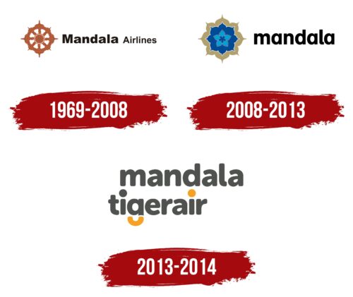
The Mandala Airlines logo creatively incorporates the new brand name, Tigerair Mandala. Its unique design demonstrates a readiness for innovation, as this Indonesian company has “revitalized” its fleet by using relatively new aircraft.
Mandala Airlines: Brand overview
Mandala Airlines, an Indonesian regional charter airline, was established in 1969 under the patronage of Saratoga Group, an Indonesian media company.
During the 1970s and 1980s, Mandala Airlines evolved from a charter airline to a scheduled passenger carrier. It became a conduit for travel from Jakarta to other significant cities in Indonesia, bringing the archipelago closer together with its domestic routes.
In the following decades, Mandala Airlines leaped modernization. It expanded its services by adding jets to its fleet for domestic and regional destinations such as Singapore, Malaysia, and Australia.
In the mid-2000s, Mandala Airlines gained momentum and became the third-largest carrier in Indonesia after Garuda Indonesia and Lion Air. At its peak, Mandala Airlines had a fleet of more than 30 aircraft and gained a significant position in the country’s aviation industry.
Unfortunately, Mandala faced financial difficulties in the late 2000s. High fuel prices and competition from low-cost carriers such as Lion Air increased financial burdens. The airline became mired in debt and eventually declared bankruptcy.
As fate would have it, Mandala Airlines was bought by Indonesian budget airline Tigerair in 2011. The new owner attempted to revive the beleaguered airline, but despite restructuring efforts, Mandala Airlines ceased operations in July 2014. Its 45-year journey in the aviation industry came to an end.
Throughout its history, Mandala Airlines has carried tens of millions of passengers across the region and domestically. In 2014, it ceased to experience financial difficulties. It is remembered for its significant role as Indonesia’s third main airline after Garuda and Lion Air.
Meaning and History
What is Mandala Airlines?
This Indonesian budget airline based in Jakarta offers affordable flights to popular destinations within the country’s vast archipelago. The company operates a fleet of narrow-body aircraft, such as the Airbus A320 and Boeing 737, configured for efficient and economical operations with high passenger traffic density.
1969 – 2008
Although Mandala Airlines is named after a military operation that resulted in the annexation of West Papua to Indonesia, this fact is not reflected in its identity. The original brand logo features an element of sacred geometry—a circular mandala with symmetrical protrusions around the edges. Due to its distinctive shape and brown color, it resembles a ship’s steering wheel. This resemblance is intentional, as the airline showcases its ambitions and desire to always be at the “helm” of the aviation industry.
The adjacent text creates a sense of dynamism, using two different fonts: the first word is much larger and bolder than the second. The visual contrast highlights the brand’s uniqueness and draws attention to its name. Both parts of the text maintain a cohesive style: the letters are sans-serif and look harmonious, balancing straight angles, smooth curves, and sharp diagonal cuts. This font evokes feelings of trust and likability.
2008 – 2013
After the redesign, a pattern of four concentric flowers replaced the “steering wheel” motif. The new mandala shape highlights the company’s connection to its native country, Indonesia.
- First, it pays homage to the rich local flora, as the archipelago’s nature features many tropical plants.
- Second, the mandala is an important part of Asian culture. It represents a complex model of the Universe, where each element is in its place. This is why the design has perfect symmetry. In the airline context, the geometric pattern symbolizes close attention to all aspects of air transportation.
The inner flowers are painted in various shades of blue, indicating the brand’s connection to the sky. The outer petals are dark gold, emphasizing Mandala Airlines’ prestige since it is associated with wealth and luxury.
The text has been shortened to one word, entirely in lowercase letters. Using lowercase gives the logo a minimalist look and makes it recognizable. At the same time, the bold sans-serif font shows the airline’s seriousness and professionalism.
2013 – 2014
In 2012, Mandala Airlines rebranded as Tigerair Mandala and introduced a new logo. The logo features a two-tiered wordmark with a round-shaped lowercase font, conveying softness, calmness, comfort, and safety. This choice helps create a welcoming and reassuring image for the airline.
Most letters in the logo are neutral gray, giving it a clean and professional look. Bright orange highlights the dot above the letter “i” and the lower segment of “g.” This color adds energy and vigor, aligning well with the new brand identity.
The curved lower portion of the letter “g” resembles a tiger’s tail, subtly reinforcing the “Tiger” aspect of the brand name. This clever design evokes a sense of agility and speed, characteristics often associated with tigers. The bright orange tail-like curve enhances the logo’s visual appeal, making it more memorable.
The overall design of the Tigerair Mandala logo combines modern typography with thoughtful color choices. The round-shaped lowercase letters provide a friendly and approachable feel, while the bright orange highlights add excitement and energy. This new logo captures the brand’s transformation, emphasizing its commitment to providing a safe and comfortable travel experience with a spirited and agile approach.


