


Marathon Sports approached its 50th anniversary with an updated image, but without breaking from New England’s running culture. The chain began in 1975 as a single store and later grew into a regional brand for runners and walkers. Its stores offer shoe fitting, gear, accessories, and nutrition. Around the stores, the brand hosts club runs and training for 5K, 10K, and half-marathon races.
The rebrand was developed by the Boston studio Upstatement. The team needed to present Marathon Sports as part of running culture, connected with training, local communities, routes, and runners’ personal stories. Over the past 50 years, the audience has changed. New runners see brands through community, routes, races, clubs, and local traditions.
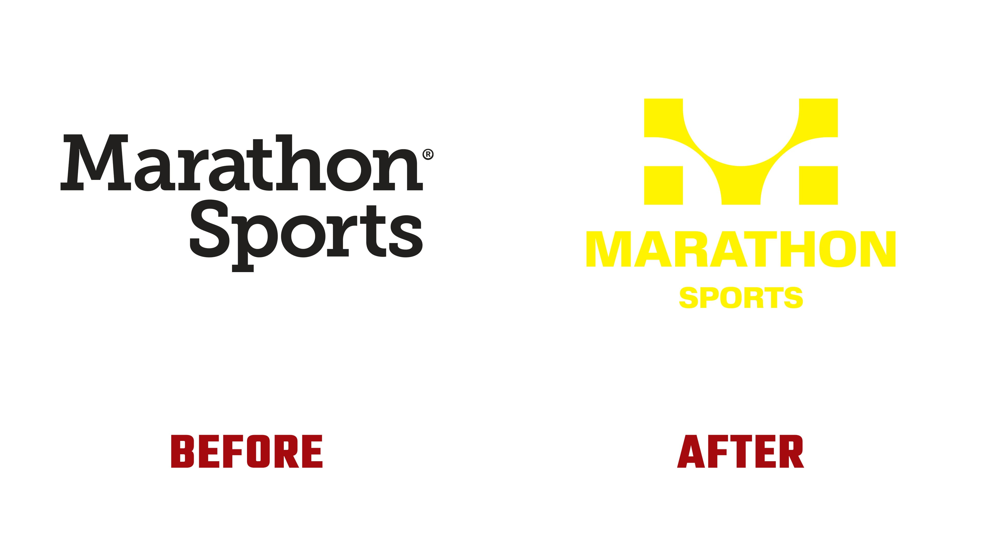
The old Marathon Sports marks no longer fit the brand’s new role. The first version, with a runner at the finish tape, kept a connection to races, but looked dated and did not work well at small sizes. The later serif wordmark was cleaner, but it did not give the brand a strong symbol and lost its connection with the living running scene.
The new logo is built around the letter “M,” made from the dots of a digital finish-line board. For a runner, the image is tied to distance, personal time, and crossing the finish line. Another idea is built into the “M.” It suggests the figure of an athlete crossing the finish line. A stylized reference to the first 1975 logo was preserved.
The strength of the symbol lies in the connection between brand memory and the familiar image of a race. The “M” works as the first letter of the name. The dots recall the numbers on a timing board. The inner form brings back the finish-line motif. The logo conveys the runner’s experience through the start, pace, time, effort, and personal result. For customers, the brand becomes more closely aligned with race culture. For Marathon Sports, the mark strengthens its connection with the region’s running community.
The wordmark is set in ABC Schengen. The calm sans serif supports the icon, keeping it in the main role. The secondary typeface, Material, with heavy serifs, adds a connection to New England and a sense of history. It makes the brand feel deeper and warmer while maintaining its connection to modern running culture.

Yellow became the main color anchor of the identity. It retains the connection to the previous Marathon Sports image, but feels fresher and more sports-focused. The new system draws on the culture of local races, club runs, homemade posters, and grassroots running activity.
In one logo, Marathon Sports brings together the letter “M,” a finish-line board, a runner, and the memory of 1975. For a brand that grew alongside runners, the anniversary became a shift from an equipment store to a participant in the region’s running culture.