The Marquette University logo has undergone three significant changes throughout the university’s history, and each version appeared presentable and striking. However, the latest version of the identity proved the most successful and remains used today. This version stands out for originality, where each logo element is carefully thought out and executed uniquely. The detailing and refinement of the elements, the harmonious color scheme, and the well-conceived background create the impression that the logo almost comes to life before you.
The logo exudes grandeur and is filled with information that can be interpreted on different levels. It gives the impression that the depicted building is nearly real, and the sound of the bells can almost be heard just by looking at the logo.
It is important to note that the logo represents a complex element where the image and text play equally important roles. The large, tall letters of the first row symbolize the strong foundation on which the university stands. In contrast, the second row complements and completes the overall composition, giving the logo a finished and harmonious appearance.
Marquette University: Brand overview
The Jesuit order established Marquette College in Milwaukee, Wisconsin, in 1881, marking the beginning of Marquette University’s existence. Jacques Marquette, a French Jesuit missionary who traveled throughout the Great Lakes region in the seventeenth century, is honored by the university’s name.
Originally housed in downtown Milwaukee, the college was a small liberal arts institution for males. The first class had just 35 pupils and five faculty members. Even though it started small, the founders had big aspirations for advancing higher education in the area.
The state of Wisconsin granted the college an official charter in 1887, enabling it to confer degrees. This enhanced the institution’s standing in the academic community and was a crucial milestone in its development.
The institution grew substantially in the early 20th century. The School of Medicine was established in 1907 and became one of the top medical schools in the area. The School of Pharmacy opened in 1910, while the School of Dentistry opened in 1908.
In 1909, the college became the first Catholic university to admit women on an equal footing with men. This historic move greatly increased access to higher education and was revolutionary.
The organization became a university in 1912, reflecting its expansion and improvement during the three decades prior. In tandem with this shift, new campus buildings were built, and academic programs were expanded even more.
The institution saw consistent expansion in the years between the two World Wars. The School of Journalism, founded in 1923, became one of the most prominent in the nation. First established in 1926, the School of Speech was the forerunner of the present-day College of Communication.
Due in large part to the GI Bill, the organization, along with many other American universities, saw a notable increase in student enrollment following World War II. As a result, the campus grew, and the number of faculty members rose.
Student demonstrations and societal shifts throughout the 1960s and 1970s also impacted the institution. In response to the changing circumstances, it expanded its social justice and community service programs.
After separating from the Jesuit order in 1970, the university became a stand-alone Catholic institution. This change increased its autonomy and access to more funding.
Campus infrastructure was heavily financed in the 1980s and 1990s. New academic buildings, residence halls, and sports facilities were built.
As one of the country’s top Jesuit universities, the organization grew throughout the 1990s. In 1991, a new student facility honoring former president Father John P. Raynor was inaugurated. This facility, which offered a venue for events, socializing, and extracurricular activities, developed into a hub for student life.
The institution’s 113th anniversary was commemorated in 1994. To commemorate the event, a fundraising effort was started to expand educational opportunities and upgrade school facilities. The campaign’s over $200 million financing enabled the institution to start several important initiatives.
The College of Communication moved into a new building in 1996. It furnished cutting-edge resources for teaching journalism, public relations, and other communication-related courses, greatly enhancing the institution’s standing as a leading place for training communication specialists.
In 2001, marking the turn of the century, the university launched a comprehensive development plan. The plan’s objectives were to increase research endeavors, strengthen its global footprint, and raise educational standards even further. New interdisciplinary curricula that combined several branches of expertise were developed as part of this plan.
The institution reopened Eckstein Hall Law School in 2003, bearing the name of benefactor and former student Ray Eckstein. This contemporary facility greatly enhanced the environment for legal study and preparing aspiring attorneys.
A major event for the athletic program occurred in 2005. The university’s sports teams, dubbed the “Golden Eagles,” gained national attention when admitted to the elite Big East Conference. This created new opportunities for student athletics to grow.
The organization introduced the creative “Engineering Hall” program in 2008 to update engineering education. This proposal included the construction of a new facility with state-of-the-art laboratories and classrooms, which greatly raised the standard of engineering education.
Opening a new complex for the School of Dentistry in 2011 marked an important milestone for the university. This state-of-the-art building increased dental care services to the surrounding community and improved educational possibilities for aspiring dentists.
In honor of its 132nd anniversary, the institution introduced “Beyond Boundaries,” a new initiative, in 2013. The objectives of this project were to raise academic standards even higher, increase research endeavors, and fortify relationships with domestic and international partners.
A new center for neurobiology and cognitive science research opened in 2015. This institute served as a hub for multidisciplinary research, bringing together experts from many scientific domains to investigate cognitive processes and brain function.
The Commons, a brand-new residential hall the university finished building in 2018, serves as both a place to live and a hub for student life, providing various options for education, entertainment, and social contact.
2020 presented the institution with both fresh opportunities and challenges. The university continued growing, preserving its essential Jesuit educational ideals while adjusting to shifting educational circumstances.
According to the university’s 2022 campus growth plan, a novel data and artificial intelligence research center was to be built. This initiative aims to position the institution as a leader in cutting-edge technology and better equip students for the demands of the digital age.
The organization continuously sought to raise the standard of instruction, increase its research endeavors, and enhance its standing as one of the top Catholic universities in the country during this time. The institution keeps expanding while upholding the customs and principles established over a century ago.
Meaning and History
What is Marquette University?
It is a private Jesuit research institution. It offers a wide range of graduate and undergraduate programs in several fields, including business, education, engineering, health sciences, law, and the arts and sciences. The university is well known for its academic offerings and commitment to volunteerism. It upholds the Jesuit tradition of educating everyone, including the intellectual, spiritual, and personal realms. Numerous internship and community involvement options are available to students at the university’s urban campus, located in downtown Milwaukee. Division I athletic programs, especially basketball, are another reason for recognition. The institution strives to prepare students to become ethical leaders in the community and profession.
Before 2001
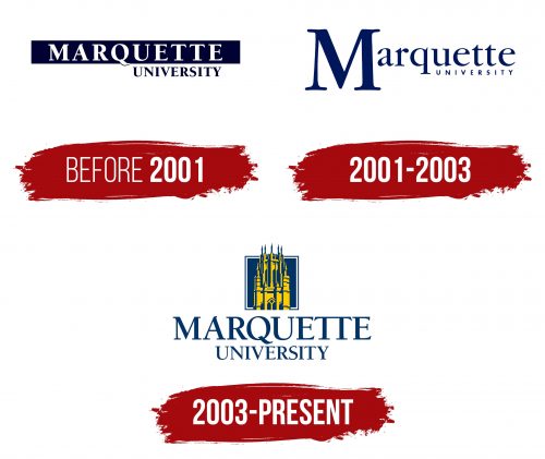
The Marquette University logo appeared sometime after the private Jesuit educational institution was established. The creators aimed to make it the organization’s calling card, and they succeeded: the carefully selected fonts and monochrome background effectively highlighted the text. The first logo employed two methods to attract attention: the contrast between the dark and light background and the differences in fonts and color schemes, which opposed each other. This gave the logo vibrancy and emphasized the uniqueness of the educational and research university.
Placing the university’s name in two rows was not an innovative decision, but separating the second word of the lower row by several spaces significantly improved the text’s readability and the logo’s overall appearance. This approach made the logo stand out, making it more expressive and easy to remember.
2001 – 2003
In 2001, minimalism became the foundation of the new identity, giving the logo a fresh and modern look. The university’s name is now on a solid, light background, making it visually appealing. The letters are arranged in two rows in blue, creating a harmonious and elegant image.
The capital letter “M” is highlighted on a large scale, emphasizing its significance and symbolizing the high status of the university, founded in Milwaukee, Wisconsin. The letter occupies the left part of the logo, connecting the two words into a unified name, giving the logo a sense of completeness.
Special attention is given to the font details: the letters gradually taper towards the edges, forming sharp, arrow-like endings. This design element adds dynamism and modernity to the logo. The unique approach to the design of certain letters, such as the “r,” where the edge resembles a comma, brings a touch of originality to the logo, making it easily memorable and recognizable.
2003 – today
By mid-2003, the university’s logo became a completely new, unique appearance, becoming a true masterpiece of identity. This new emblem was a visual update and a symbol that the university continues to grow, expand its potential, and affirm its high status. As a result, it became a representation of the university’s commitment to honoring traditions and helping students gain fundamental knowledge, reflecting the institution’s historical significance.
The designers succeeded in creating a stylish and elegant logo that highlighted Marquette University’s uniqueness. The logo’s prominent graphic depiction of Marquette Hall emphasizes that knowledge is timeless and remains a lasting value that never loses relevance.
The letters in the word “Marquette” are unusually designed. The upper parts of the letters are connected by a single element, symbolizing unity and integrity, which remain inseparable and eternal. This element adds profound meaning to the logo, underscoring the idea that the university’s knowledge and traditions are bound by strong ties that cannot be broken.
The Seal
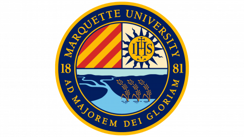
The Marquette University seal possesses undeniable vibrancy and presentability. Through carefully chosen symbols and signs, it conveys important information about the power and value of knowledge and emphasizes the university’s reliability. However, the primary aspect of this seal is its multifaceted nature and unique styling.
The university’s name is displayed in two yellow outlines on a blue background. The elegant, large letters arranged in a circle highlight the significance of the educational institution. Within the same space, the founding year of the university is presented in a mirrored format: on the left, the numbers 1 and 8, and on the right, 8 and 1. This mirroring of the numbers symbolizes infinity, and the two eights further emphasize this concept. At the bottom of the seal is the phrase “AD MAJOREM DEI GLORIAM,” which translates to “For the greater glory of God.”
The central part of the seal is divided into three zones, each with its unique narrative, displayed through illustrations. Diagonal lines symbolize the heroes of the majestic House of Onaz, and the sun points to the bright path of the traveler. A significant portion is dedicated to a graphic depiction of a landscape, including a field, a river, and wheat stalks. This scene embodies harmony and tranquility, conveying the essence of existence through nature and peacefulness.
