The Marvel Entertainment logo is a visual representation of everything associated with the Marvel universe, including comics, movies, games, and television series. It possesses hidden energy and dynamism, which are perfect for stories about superheroes. It is a recognizable symbol in the entertainment world and has become an integral part of the company’s branding.
Marvel: Brand overview
| Founded: | June 2, 1998 – March 29, 2023 |
| Headquarters: | 1290 Avenue of the Americas, New York City, New York, United States |
| Website: | marvel.com |
Marvel Entertainment appeared in 1998, but it has a long history. It all began in 1986 when the Marvel Entertainment Group was founded. It was involved in creating and marketing characters and later acquired the production of chewing gum, stickers, and toys. Sales declined in the 1990s, causing the company to nearly go bankrupt. As a result, the owners had to merge it with ToyBiz and relaunch it under a new name – Marvel Enterprises. The company was renamed in 2005 and became Disney’s property four years later. It existed in this status until March 29, 2023, when it was closed.
Meaning and History
The evolution of Marvel Entertainment logos reflected the company’s renaming, as it used to be known under a different name. However, the concept of the logo remained unchanged: the iconic white “MARVEL” inscription on a red rectangle became a symbol of an era of entertainment products such as comics, video games, television shows, movies, and series. The emblem is associated with bold superheroes, cunning villains, and thrilling plot twists.
The logo has been modified several times, but the overall design has remained unchanged – it is energetic and dynamic graphics that resemble the style of comics. Its distinctive features include bold outlines, angular letters, and bright colors. Even after the closure of Marvel Entertainment in 2023, its logo continues to be a timeless symbol of superhero stories.
What is Marvel Entertainment?
Marvel Entertainment is an American entertainment company that emerged after the merger of Toy Biz and Marvel Entertainment Group. It was founded in 1998. The company was engaged in the distribution of products based on the heroes of the eponymous comic book magazine. The brand existed until March 2023, after which it was liquidated. Its owner, The Walt Disney Company, made this decision.
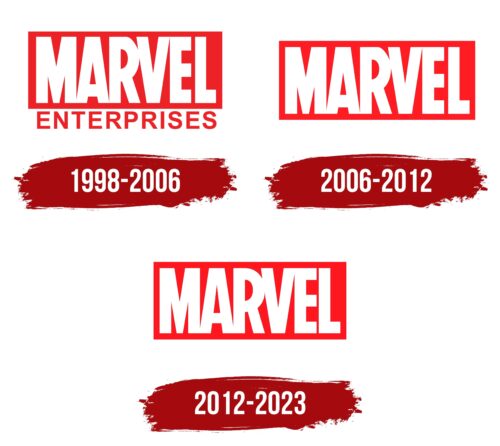
1998 – 2006
Marvel Enterprises was created in 1998 based on the almost-bankrupt Marvel Entertainment Group. Its logo consisted of the company name divided into two lines. The first part was written in large white letters that touched each other. Only the “L” was at a short distance from the “E.” Even then, the word “MARVEL” used a bold sans-serif font, stretched vertically, with a bright red rectangle as the base.
The word “ENTERPRISES” was placed below. For better contrast, designers made it red on a white background. It also consisted of bold glyphs without serifs, but in this case, the font was similar to NeoGram Bold by The Northern Block.
2006 – 2012
In September 2005, the company was renamed Marvel Entertainment. Consequently, the word “ENTERPRISES” disappeared from its logo. Only the upper part remained – a white inscription placed in a red rectangle. Its design did not change at all because it is a cult symbol of the brand.
2012 – 2023
In 2012, Marvel Entertainment introduced a new emblem with modern design elements. The characteristic comic book style was retained, recognizable by the bright colors and clear stylized font. However, the red acquired a darker shade. The shape of the glyphs also changed slightly. Designers narrowed some strokes, which allowed them to expand the spaces within the letters and make the inscription visually lighter. At the same time, the distance between the letters was reduced. This logo was used until the company closed in March 2023.
Marvel Entertainment: Interesting Facts
In 1998, Marvel Entertainment was formed through a merger between Toy Biz and the Marvel Entertainment Group, marking a major shift towards a broader focus on entertainment and merchandising.
- Merger Purpose: The 1998 merger helped Marvel recover from bankruptcy, combining Toy Biz’s toy success with Marvel’s entertainment potential.
- New Leadership: Isaac Perlmutter took charge, focusing on profitability and expanding Marvel’s intellectual property (IP) across various media.
- Marvel Studios: Created in 1996, Marvel Studios laid the foundation for the Marvel Cinematic Universe (MCU), a major part of Marvel’s strategy to bring its characters to the big screen.
- Rights Management: Early 2000s efforts focused on regaining film rights to Marvel characters or securing deals for greater creative control over their movie portrayals.
- Disney Acquisition: In 2009, Disney bought Marvel Entertainment for $4 billion, aiming to expand Marvel’s IP across Disney’s platforms, including theme parks and merchandise.
- Beyond Comics: Marvel expanded into video games, TV series, and digital content, launching Marvel Television for small-screen projects.
- Digital Media: Marvel invested in digital platforms, creating content for websites and podcasts, and introduced Marvel Unlimited, a digital comic subscription service.
- Publishing Innovation: Marvel continued to innovate in comics with new formats, digital comics, and interactive storytelling.
- Global Reach: Efforts were made to engage international audiences through localized content and partnerships for content distribution in local markets.
- Philanthropy: Marvel uses its characters in educational and health-focused initiatives, partnering with organizations to address social issues.
Since its 1998 reformation, Marvel has transitioned from a comic book publisher to a global entertainment powerhouse, leveraging its characters and stories across multiple platforms.
Font and Colors
As a personal mark, the MCU uses the same logo that the magazine had from the very beginning. The modifications concern only small specifying details. The base mark contains the original “Marvel” lettering on a red rectangle.
The typeface is close to Benton Sans Extra Comp Black. Its authors are Cyrus Highsmith and Tobias Frere-Jones. The Marvel logo has always featured red, which serves as a beneficial backdrop for the white lettering.
Marvels color codes
| Pigment Red | Hex color: | #f0131e |
|---|---|---|
| RGB: | 240 19 30 | |
| CMYK: | 0 92 88 6 | |
| Pantone: | PMS Bright Red C |
