


 Marvel Studios Logo PNG
The Marvel Studios logo has delighted fans for many years, signaling the start of new movies. It embodies the spirit of the cinematic universe drawn from superhero comics. The emblem is filled with an inner strength that reflects the brand’s importance.
Marvel Studios began on December 7, 1993, when Avi Arad founded Marvel Films with support from Marvel Entertainment Group and ToyBiz. As the U.S. comics market contracted, the parent company faced pressure and sold film rights to major characters to outside studios. Sony Pictures received Spider-Man; 20th Century Fox took X-Men, Fantastic Four, and Daredevil; Lionsgate acquired Punisher; Universal Pictures took Hulk; and New Line Cinema received Blade.
In 1996, Marvel Films was renamed Marvel Studios. The late 1990s remained unstable: Arad left the CEO role in October 1998 and continued as an executive producer. DC Films, backed by Warner Bros., remained the main rival in superhero cinema and had a stronger financial base.
A turn came in 2004, when Marvel Studios secured up to $525 million in financing from Merrill Lynch and arranged distribution through Paramount Pictures. Marvel regained the rights to Iron Man from New Line Cinema in 2004, followed by Black Panther in 2005. In March 2007, Kevin Feige became president of production. Jon Favreau directed Iron Man, starring Robert Downey Jr., which opened in 2008 and earned over $585 million worldwide, launching the Marvel Cinematic Universe.
On December 31, 2009, The Walt Disney Company bought Marvel Entertainment for $4 billion. In 2012, with The Avengers, Walt Disney Studios Motion Pictures replaced Paramount as the MCU distributor. During the 2010s, Marvel expanded with Thor, Captain America, and Doctor Strange. Guardians of the Galaxy followed in 2014. Avengers: Endgame grossed about $2.8 billion in 2019, the same year Disney bought 21st Century Fox and brought X-Men and Fantastic Four back to Marvel Studios.
Meaning and History
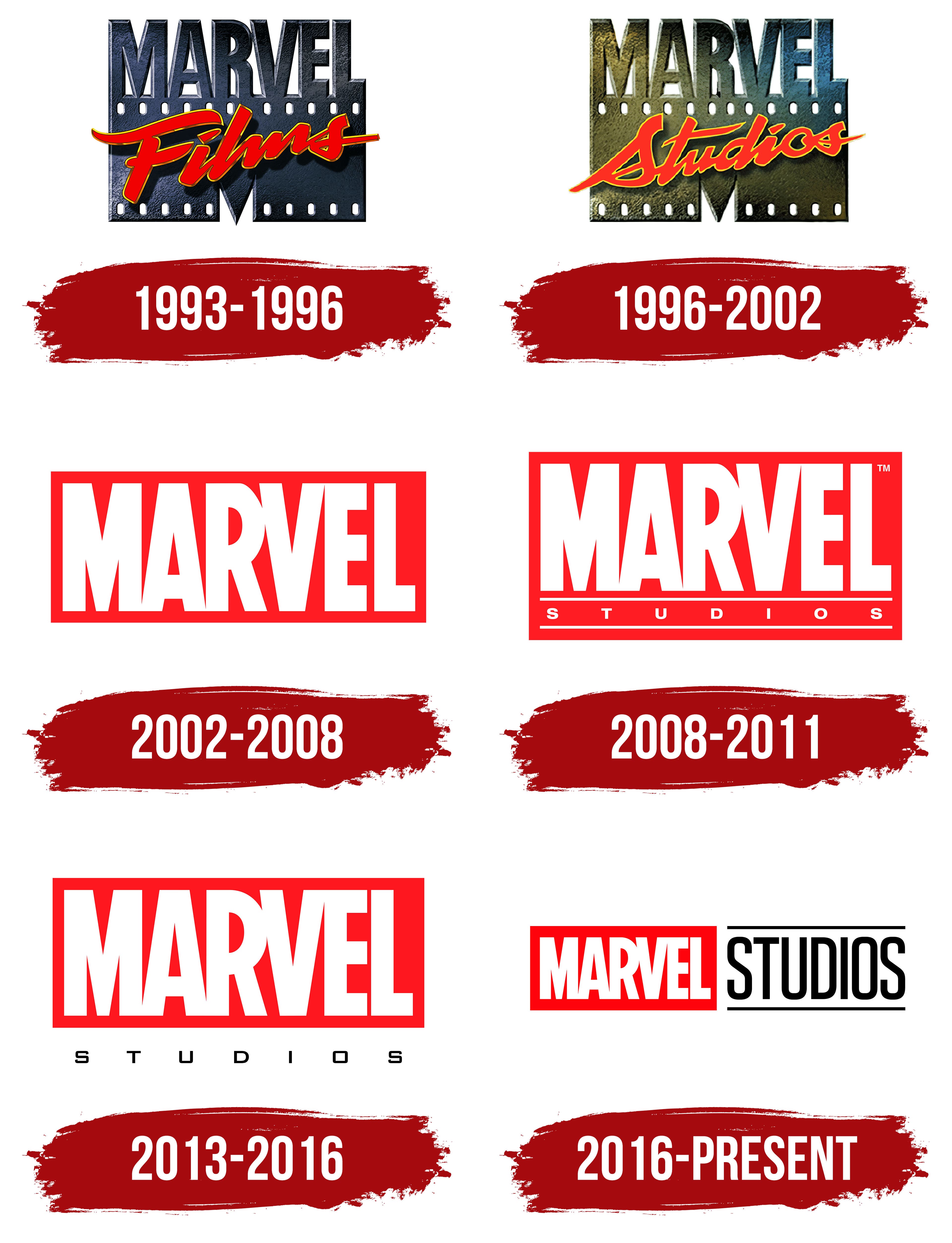
When Marvel Studios was known as Marvel Films, its logo closely resembled the Marvel Comics emblem from the 1990s. This design showed a close connection between the two companies, as both create entertainment featuring the same characters. Only the film and series producers’ logo had the letter “M” stylized as a filmstrip. In 1996, the film studio was renamed, which had a minor impact on its emblem: one word was replaced with another.
The famous red-and-white symbol with the inscription “MARVEL,” created by Imaginary Forces and Prologue Films, debuted in 2002. It debuted at the world premiere of “Spider-Man” and drew thunderous applause. Later, this emblem, in one form or another, appeared in all TV shows, films, and games based on Marvel stories. It inspired future logos, which were also rectangular and red-and-white. Until 2016, the word “STUDIOS” played a secondary role: it sat at the bottom in small letters. But then, Perception corrected this omission, placing both parts of the Marvel Studios name in one line and making them equally large.
What is Marvel Studios?
Marvel Studios is a movie and series studio based on Marvel Comics and is part of The Walt Disney Company media conglomerate. Its superhero fiction forms the foundation of the Marvel Cinematic Universe, which connects many characters. Among the studio’s most popular hits are “Guardians of the Galaxy,” “Captain America,” “X-Men,” and more.
1993 – 1996
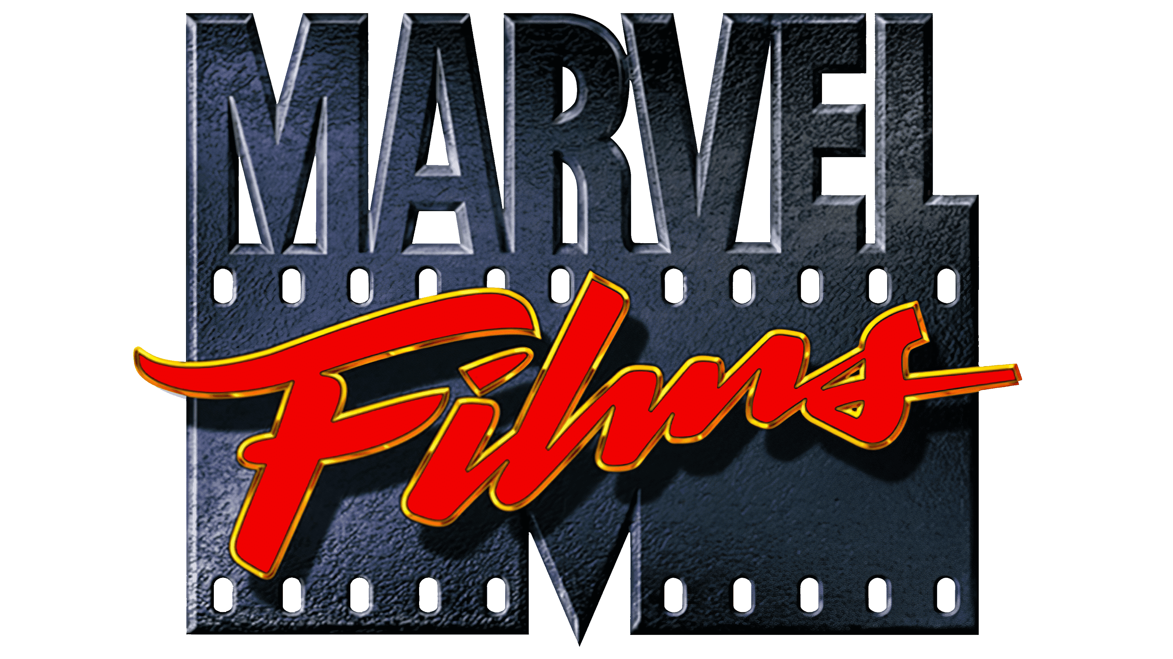
The Marvel Film Corporation began with a monumental logo. Moreover, “monumental” can be interpreted literally, as the visual identity sign features a wide, massive “M.” The emblem emphasized this as its foundation.
A standard film with perforations on the sides formed the letter. The bottom center was formed by a narrow, sharp element that replaced a fragment of the printed symbol. Above, the first word of the name, “Marvel,” seemed to “grow” out of it. It matched the film’s color and had the same steel sheen. The signs were straight and smooth, with a faceted edge. In the foreground (actually on top of everything), there was a red cursive “Films.” It was handwritten in fluent cursive.
1996 – 2002

After the rebranding, the film company changed the visual identity, using the previous version as a basis. She received a new name, which she wanted to reflect in the same logo. But certain changes have taken place. For example, the developers improved the color of the large “M “and the words “Marvel.” This added lightness and visual appeal through a gradient transition from black and steel to olive-gray. “Films” was replaced by “Studios.” It had the same style as the first text: handwritten, cursive, red, with thin yellow lettering.
2002 – 2008

2002 was a turning point in Marvel’s identity because the film adopted a red rectangle with a white inscription inside. To do this, the designers removed the massive “M” made of film, lightened the letters, and enlarged them. As a result, the emblem became incredibly catchy and widely recognized. The upwardly elongated signs touched, except the “L,” which was set apart from the rest. A narrow space separated it from the first fragment of the title.
2008 – 2011

This period marks the launch of the Marvel Cinematic Universe. Then, the word “Studios” appeared in the logo. This variant appeared in the first film from the newly formed Iron Man Studios and was last used in the fifth Captain America film. The inscription is white and outlined with two thin, parallel lines.
2013 – 2016
In 2013, the designers took Studios outside of the main logo and placed it at the bottom.
2016 – today

In the current version, the phrase “Marvel Studios” is arranged on a single line. Words are separated by color and background type. This version debuted in the film Doctor Strange.
Font and Colors
The font used in the Marvel Studios logo resembles Bebas Neue Bold or Benton Sans. It is a bold sans-serif typeface with a clean, modern look. It is ideal for the logo because it conveys energy and power. The large, clear letters are also easy to read at any scale. Since 2016, the word “STUDIOS” has been set in large, thin, sans-serif glyphs. This elongated font roughly resembles Marianina Cn FY Medium by FONTYOU.
The colors of the emblem represent various aspects of Marvel Studios:
- Red symbolizes energy, passion, and danger. It can also represent Marvel Cinematic Universe heroes such as Iron Man and Spider-Man.
- White represents a new beginning and rebirth.
- Black embodies mystery, mystique, and hidden forces.