


![]() Media Markt Logo PNG
Media Markt Logo PNG
The emblem captivates the user and, like a funnel, pulls them inside the store. Here are easy-to-use, useful, and beautiful appliances for the home. Getting to know them, which the Media Markt logo offers, always ends with a purchase.
Media Markt began on November 24, 1979, in Munich. Leopold Stiefel, Walter Gunz, and Helga and Erich Kellerhals opened the first store as a large-format consumer electronics outlet. It offered branded goods, low shelf prices, professional advice, and a promise to refund if a customer found the same product cheaper elsewhere.
The format differed from the small specialist shops common at the time. Around 3,000 square meters of sales space brought televisions, stereo systems, and household appliances under one roof, with the store placed near a major transport hub and parking area. By 1985, Media Markt had ten stores around Munich. By 1988, it had about twenty across Germany, and the founders sold 54% of the holding company to Kaufhof Warenhaus AG to finance expansion.
In 1989, Media Markt opened its first foreign store in France. In 1990, it absorbed the rival chain Saturn, creating Media-Saturn. Both brands remained separate: Saturn focused on city shopping centers, while Media Markt kept larger roadside formats. The company also used a decentralized model, with each store manager owning 10% of the location and controlling assortment, pricing, and staff.
The chain expanded to Switzerland in 1994, Spain and the Netherlands in 1999, Poland in 2004, and Turkey in 2007. Its advertising became known for the slogan “Ich bin doch nicht blöd,” linked to co-founder Walter Gunz, who left in 1999. In 2010, Media Markt entered China with Foxconn, but exited in 2013. In 2017, Metro separated consumer electronics into Ceconomy AG. In July 2025, JD.com agreed to acquire Ceconomy for 2.2 billion euros.
Meaning and History
![]()
What is Media Markt?
It is an international hardware and electronics hypermarket brand that appeared in Germany in 1979. Introduced in Turkey and European countries and is owned by Metro Corporation.
Media Markt is the first German hypermarket to combine home appliances and electronics in a single store. The idea came to the owners of a small retail outlet, a married couple named Kellerhals. They carried out the plan together with two partners. The first store opened before Christmas 1979. The revenue exceeded expectations, and over the next eight years, the team developed a network of 10 stores across the country. This attracted a large company, Kaufhof (later Metro), which bought a promising business in 1988. She distributed the markets worldwide.
The brand’s first logo proved successful, and for 40 years it has hardly changed, apart from small touches added in 2006.
1979 – 2006
![]()
The development of the logo, like most of the marketing moves, was supervised by Walter Gunz (one of the four partners). The emblem consisted of an alphabetic part: the words Media Markt and an image, around a sign between the words. He united the two parts of the name and connected the technique and the market. For the 79th year, this was a revolutionary proposal.
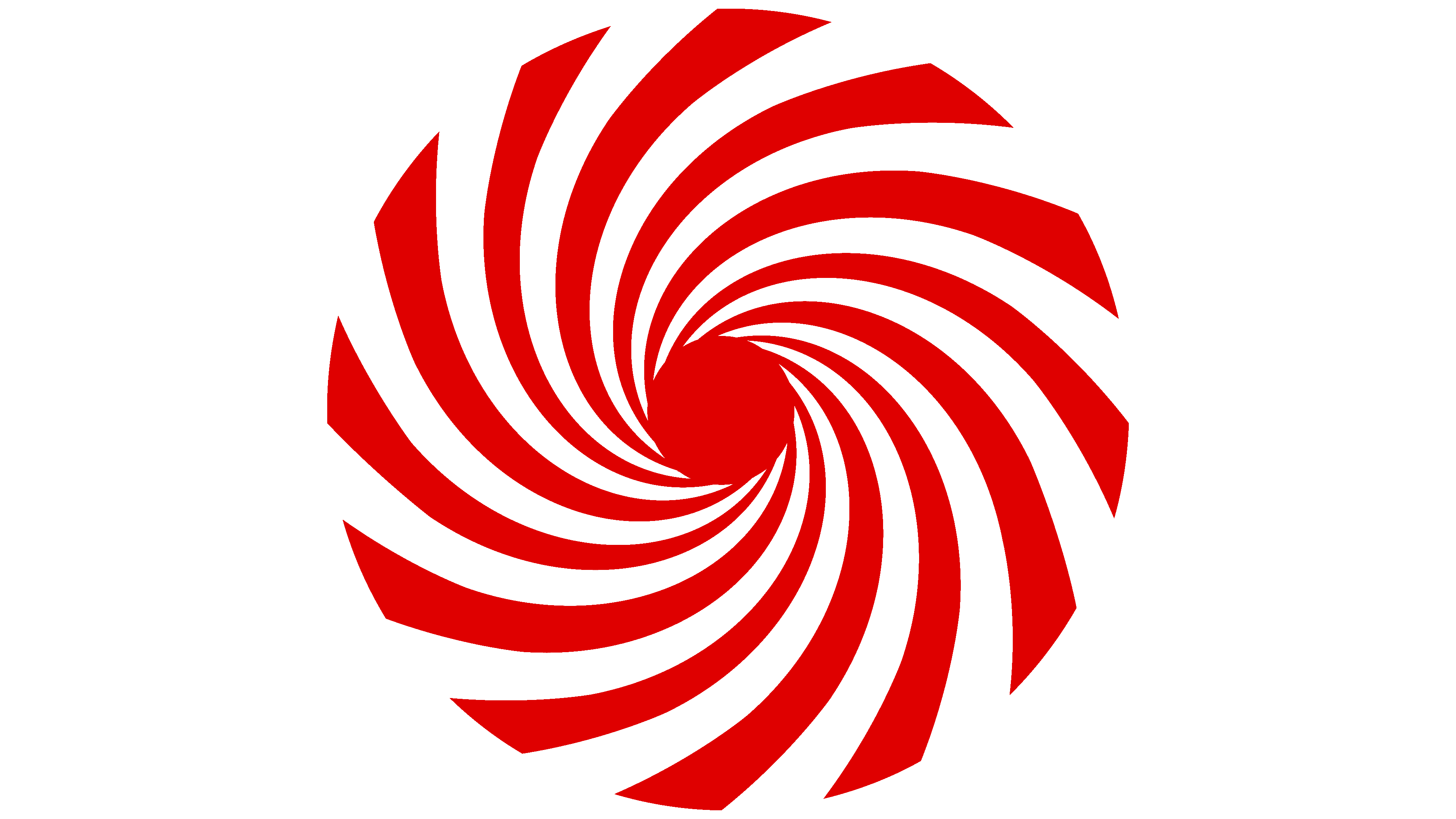
Visually, the sign resembles:
- A large spiral funnel in which individual strips flow into (or out of) the center. She symbolized dynamics and movement. She embodied the store’s main idea: appliances from different manufacturers and countries under one roof. The equipment was placed on special mobile pallets for direct transport from the hall. Goods from all over the world were first collected in the store and then distributed, creating an endless stream.
- Lollipop is a nice, sweet offer for customers. It was profitable to buy electronics in the market. Before buying, it was allowed to test. And if the buyer found the price lower, the product was taken back, and the money returned.
- Whirlwind is a sign of surprise and joy at the success of purchases in an unusual store.
- Hypnotic spiral: when customers visited the store, their eyes widened; they were fascinated by the sheer number of products and kept coming back.
The combination of white and red in the spiral signified two main areas: technology and electronics.
2006 – today
![]()
When the 300th market was opened, the logo was slightly updated. The color scheme has become more saturated, marking globality and international expansion. The central element merged with the two parts of the inscription, turning into a stylized dash between Media and Markt. Now the words indicate not just the direction of the stores but also the brand’s name. The letters in the words are also placed closer together, emphasizing unification and merging into one name. The grouping made the logo more compact, making it easier to place it on signs and in printed publications.
In the updated logo, the funnel illustrates the interweaving of different sales channels, making it flexible and convenient for customers. In addition, the spiral indicates the unification of independent stores into one network. Each store is 10% owned by the manager. He decides which assortment will interest his consumers and forms an offer in his field. The whirlwind also indicates many of the services that markets provide, except for sales (delivery, maintenance, repair, and disposal of goods).
In 2018-2020, Saturn stores, acquired by Media Markt in 1990, were renamed Media Markt.
Font and Colors
The main color of the emblem is red. Its appearance in the first logo was part of a marketing move and worked in tandem with bright advertising slogans and promotions.
Red symbolizes a progressive idea, hot offers, and the lowest prices. It indicates a large accumulation of goods and personifies the constant renewal of the assortment. All technological innovations appear at Media Markt immediately.
The saturated shade of the updated logo reflects the leadership’s active expansion into other countries. It is in tune with the red stripe on the German flag, indicating the brand’s country of origin. It conveys customers’ love because in a hypermarket you can get acquainted with technology, compare, test, and choose the best option for yourself.
The font corresponds to ITC Avant Garde Gothic Paneuropean Demi Oblique, tilted to the right, with a stylized letter M.