


![]() Meetup Logo PNG
Meetup Logo PNG
The Meetup logo is fun and friendly. The emblem is associated with groups passionate about a common cause. Everyone can join and become part of the chosen platform. The symbol indicates free communication and interesting activities.
Meetup began after September 11, 2001, when New York entrepreneur Scott Heiferman, living near the World Trade Center, saw neighbors speak to each other for the first time. Influenced by Robert Putnam’s Bowling Alone, he wanted to use the internet to bring people into real-world communities.
On June 14, 2002, Heiferman and four co-founders launched Meetup.com with a team of 10. Users entered a ZIP code and interests, then the site matched them with nearby groups and suggested local venues. The system relied on the web and email, not apps.
The service reached 1 million users in less than two years. In 2004, Howard Dean’s presidential campaign used Meetup for supporter gatherings, making it a tool for political organizing. Barack Obama later used it in his Senate campaign. In 2005, Meetup introduced fees for group organizers. Activity fell by 95%, and some users moved to free options such as Facebook Groups. Heiferman kept the model, arguing it would leave more committed organizers.
By 2009, Meetup had become profitable and reached 32 million users across 182 countries. In 2013, it acquired Dispatch, an email communication startup. In 2014, the site was hit by a DDoS attack. In 2017, Meetup created about 1,000 #resist groups in response to the Trump administration’s immigration order, drawing political backlash. That November, WeWork bought Meetup for about $156 million. Heiferman stepped down as CEO in 2018. After WeWork’s failed IPO push in 2019, Meetup was sold in 2020 to AlleyCorp and co-investors. In January 2024, Bending Spoons acquired the platform.
Meaning and History
![]()
The online platform’s formation was triggered by the sad events of September 11, 2001, when the terrorist attack on the Twin Towers was carried out. Six months after the incident, influenced by Robert D. Putnam’s “Bowling Alone,” an Internet entrepreneur decided to create a unique service. Its purpose is to unite people with similar interests and to organize joint meetings to solve thematic issues. Meetings can be held in person or virtually.
Now it is a branched service with over thirty categories and a recognizable logo. The most sought-after destinations are adventure and outdoor activities, career and business, parents and family. Particular growth in the site’s popularity was observed in 2004, when the US presidential candidate Howard Dean used it for his campaign. He repeatedly used it and advertised it on his website, so the logo became recognizable everywhere.
After gaining sufficient prominence, the online service was monetized: in 2005, it began charging fees to interest-group organizers. And in 2009, the Internet platform used a Hackathon for the first time to introduce new features, subject to unanimous support from colleagues. In 2013, Meetup expanded with the acquisition of Dispatch, and in 2014, it suffered a massive DDoS attack sponsored by competitors.
In 2017, the service and its logo became part of WeWork, which resold the AlleyCorp venture fund project in early 2020. Having passed to a new owner, the service has not lost its identity and main function, remaining a platform for virtual or personal events under an authentic logo. In the context of the Covid-19 pandemic, its popularity increased further: from March to October 2020 alone, it hosted over 1 million online meetings and discussions.
What is Meetup?
Meetup is a social network that helps people find like-minded individuals. It connects people passionate about travel, sports, cooking, programming, and other activities. Users can join interest groups to meet in real life at various events. The online service was launched in 2002 and was acquired by coworking space provider WeWork in 2017.
2002 – 2016
![]()
The debut logo consisted of the “meetup” lettering, in mixed case: the first letter in uppercase, the rest in lowercase, despite being the same size. The symbols were uneven, as if drawn by hand: the sides of the same sign varied greatly in height. For example, “M” had the right side longer and taller than the left. Also, the “t” resembled an extended plus sign (+), and the “u” lacked a tail, making it resemble “v.” The name of the service was written in black letters on a white background.
2016 – today
![]()
After the 2016 redesign, the online platform’s logo has become much friendlier. To emphasize customer focus, the service started using a pastel pink logo. Not only has the color changed, but also the style of the text. Now all letters are in lowercase, and “meetup” looks like a sloppy handwritten word. In this way, the emblem emphasizes the service’s general availability for professional and hobby use. The characters are still chaotic, as if in fast or hesitant handwriting. Moreover, each of them has a different slope: “m” is shifted to the right, “p” is only slightly tilted, “t” and “u” are aligned, and the two “e” are directed to the left.
Font and Colors
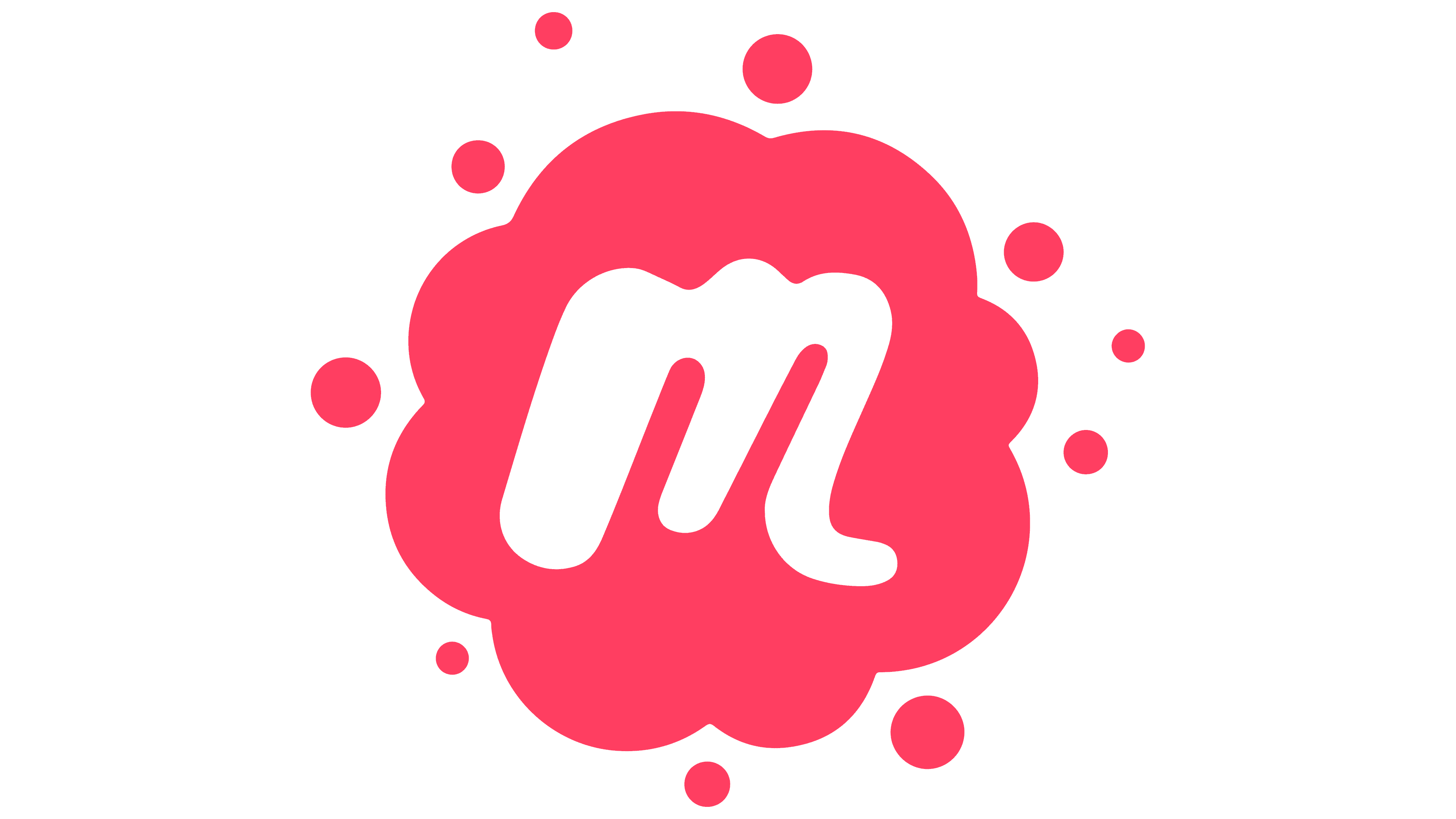
The first letter of the “meetup” caption also forms an individual icon, with all colors reversed: pink becomes white, and vice versa. The icon looks exactly like the main logo, only in a single format. The thickness of the lowercase “m” leg is not uniform, and its end sits much lower than the main border. The letter’s background is a cloud-shaped spot with semicircular protrusions along its edges, surrounded by many points of varying diameters.
For the commercial service’s emblem, the owners chose a custom font. The first version resembles brushstrokes; the second, an imitation of handwritten text. In both cases, the letters have a unique style. This is especially true for “m” (it has different leg thicknesses and tilt to the right), “ee” (they are not identical and directed to the left), “t” (resembles a plus sign or a cross with a low crossbar), and “u” (looks like a Roman figure “v”).

The corporate palette consists of black (used for the debut logo) and pastel pink (# f63e60; used for the icon and the current emblem).