Menards logo offers to refresh the interior and let it sparkle with new colors. Hypermarket products help eliminate all the shortcomings of the premises and create an attractive and eye-catching design.
Menards: Brand overview
| Founded: | 1960 |
| Founder: | John Menard Jr. |
| Headquarters: | Eau Claire, Wisconsin, U.S. |
| Website: | menards.com |
Meaning and History
The business that made John Menard, a billionaire began by constructing agricultural buildings in 1958. An enterprising young man gathered a team of builders and erected hangars for animals to pay for college. Working in the suburbs gave money for studies and brought a new business idea – residents needed boards. In 1960, John registered the Menard Cashway Lumber Company and, after graduation, devoted all his time to working in it. In 1964, he opened a sawmill with a store, gradually growing into a whole network with 12 distribution centers.
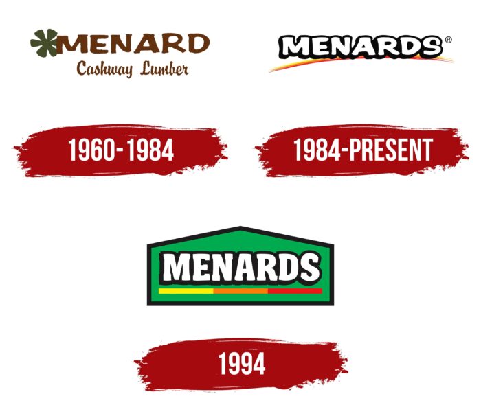
The company logo was updated when the brand “grew” from the previous visual sign. This happened twice as a result of network growth and assortment expansion. However, after an unsuccessful attempt in 1994, the emblem was no longer changed.
What is Menards?
John Menard’s major chain of construction hypermarkets is located in the Midwest of the United States. Includes 335 stores with an area of up to 10,000 sq. m, which employs 35 thousand people.
1960 – 1984
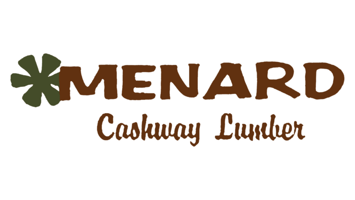
The first logo was dedicated to a sawmill and a lumber store. The company’s name was used for it: Menard Cashway Lumber, which is located on two levels.
At the top, in large letters, is the word, Menard. It was common to name small private companies after the founder’s last name. The business became a family business and passed from father to son. The surname was associated with a certain type of activity among local residents. By the time the company was registered, Menard was already known in Wisconsin for his buildings, and his name was a kind of brand. People recognized the name and bought the product more willingly.
Below the main name, in smaller letters, -Cashway Lumber is added in cursive. The inscription said what exactly the company was offering – lumber for cash. Building structures in the suburbs, Menard noticed the demand for building materials and responded to it.
Next to the letter M, slightly hiding behind it, is a six-bladed green propeller. It was a symbol of woodworking and resembled the beams of a band sawmill wheel or a schematic representation of a saw blade. The blades seemed to crash into the letter M, plunging into it. The green color of the badge was associated with greenery, forest, and trees.
Three lines bordered the top and bottom of the logo: yellow, light brown, and brown. They were a symbol of processed and unprocessed boards, wood of different species.
1984 – today
By 1984, the business had grown out of the previous logo. It has expanded, and the list of goods has changed. The company was engaged in manufacturing tiles, metal products, nails, and wood products. John registered a new company – Menards Inc., and his store turned into a popular do-it-yourself outlet at the time.
So the logo has been updated. A new visual sign is the large white Menards inscription. His brothers worked with John, and the plural was added to the name. The mention of lumber has been removed. The three stripes at the top and bottom have shrunk to the bottom, arching the name. It consisted of three strokes: red, yellow, and orange in the form of a rainbow. The rainbow lifted the company up, showing its heyday and rise.
1994 (unused)
In 1994, the company’s construction division was sold, and the business-focused solely on home improvement stores. In this regard, the company attempted to rebrand. However, she was not successful. The new logo did not catch on and is practically not used.
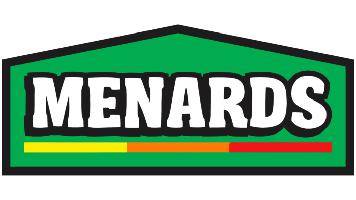
Its basis was a green schematic house, which resembled the large buildings of the company’s stores. He pointed out that in retail outlets, you can buy everything for the house. And the green color personified the new life and prosperity of the renovated housing. Inside the house, in the center, is the white name Menards, underlined by a line consisting of three sections: yellow, orange, and red.
The white color of the name is a symbol of brand concept renewal. The line symbolized the boards from which the enterprise began. The change of colors represented the gradual development into an ever-larger network, from a home country business (yellow section) to a big sales giant (red section).
Font and Colors
The main colors of the logo used are white, black, red, orange, and yellow.
The white letters of the name were a symbol of the renewal of the range. In addition, they symbolized a clean sheet and white walls, alluding to home improvement from scratch, repairs, and materials that can be bought at the store. Black bold strokes and shadow made the inscription voluminous. They showed the purposefulness of Menards in this matter – to provide everything that the buyer needs for repair and improvement.
The colors of the rainbow indicated the principles of the company:
- Red – dedication to your work. Menard does business himself and is very demanding of his employees. Does not recognize trade unions and fire everyone who supports them. Employees should be dedicated to working and serving customers better, not going on strike and seeking benefits. To achieve the goal, the businessman breaks any rules.
- Orange – everything you need for home and comfort. The range of stores is constantly expanding so that customers can purchase what they need without looking at competitors.
- Yellow – the lowest possible prices to bring joy to customers. Thanks to its production and the absence of intermediaries, Menard can reduce the prices of most goods. His managers constantly monitor competitors and even for a penny, but lower the price.
Orange is obtained by mixing yellow and red. Therefore, their sequential arrangement in the rainbow also indicated building paints, the choice of colors, and materials for housing renovation.
The title font is similar to Summer Fling Regular but has individual unique features.
Menards color codes
| Neon Yellow | Hex color: | #fef201 |
|---|---|---|
| RGB: | 254 242 1 | |
| CMYK: | 0 5 100 0 | |
| Pantone: | PMS 3955 C |
| Cadmium Orange | Hex color: | #f58120 |
|---|---|---|
| RGB: | 246 129 32 | |
| CMYK: | 0 47 87 4 | |
| Pantone: | PMS 151 C |
| Pigment Red | Hex color: | #ee1c24 |
|---|---|---|
| RGB: | 238 28 36 | |
| CMYK: | 0 88 85 7 | |
| Pantone: | PMS Bright Red C |
| Black | Hex color: | #0b0a0b |
|---|---|---|
| RGB: | 11 10 11 | |
| CMYK: | 0 9 0 96 | |
| Pantone: | PMS Black 6 C |
