Visitors always leave from a store where the Mercadona logo is present with a full shopping cart. The emblem broadcasts a wide range of delicious and natural products. Every day the stock is replenished, and customers are waiting for the freshest goods.
Mercadona: Brand overview
| Founded: | 1977 |
| Founder: | Francisco Roig Ballester |
| Headquarters: | Tavernes Blanques, Valencian Community, Spain |
| Website: | mercadona.com |
Meaning and History
The history of famous Spanish grocery supermarkets began with a small butcher shop Cárnicas Roig (Roig meat products), founded by Francisco Roig Ballester and his wife, Trinidad. Its peculiarity was in the hollow production cycle: raising livestock to the counter. Mercadona SA has managed eight stores selling products since 1977. The head of the family also founded other businesses: Grupo Corporativo Roig and Pamesa Cerámica. When the father retired in 1981, each direction was headed by one of the sons, Mercadono – Juan Roig. It is to him that the company owes its global growth.
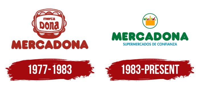
The company logo has changed only once due to the expansion of the range. At the same time, the main arrangement of elements, the name, and its font remained the same. This helped former customers to recognize the brand’s stores accurately.
What is Mercadona?
$28 billion family-owned grocery chain spanning all of Spain (1,640 stores) and parts of Portugal (20). The company, run by the founder’s son, Juan Roig, employs 86,000 people.
1977 – 1983
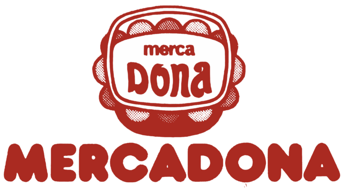
The first logo uses the word Mercadona twice: on the visual mark at the top and as a word logo below the image.
At the head of the emblem is a basket that is “filled” with the company’s name. Her image corresponds to a wicker basket for products, covered on top with a lacy white napkin. With such village mistresses of Spain went shopping. The image created an atmosphere of family, making the store closer to the customers. And the lace around the edges looked elegant and evoked a feeling of cleanliness and neatness.
The name of the company in the basket is divided into two parts, revealing the essence of the offer: “Merca” (purchase) and “dona” (woman), that is, “women’s purchases.” In Spain, it is predominantly women who cook and buy food. Therefore, the seller of meat appeals to them in the title.
Below the basket is the full name of the brand, which was visible from afar.
1983 – today
In 1981, the founder’s son took over the management of the brand. Huang had a global vision for the future and began a rapid expansion by purchasing seven competitor chains in succession. The range of products has expanded significantly, and the stores have turned into large markets. Therefore, the concept of the logo has been slightly revised.
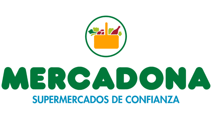
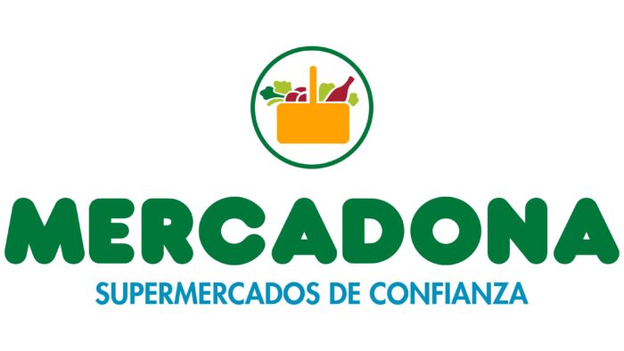
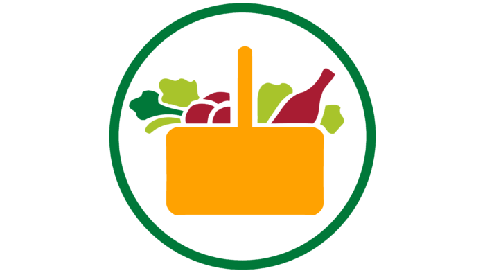
The purse at the head of the emblem has been redrawn. In appearance, it now corresponds to supermarket baskets. Inside, fruits, vegetables, and a glass bottle are visible, symbolizing olive oil or wine. The idea of natural and healthy products can be traced in this set. Therefore, the basket is placed in a circle with a green outline.
The image resembles a seal, reflecting the store’s main direction (products) and its principles (naturalness, safety, benefit). The circle also symbolizes completeness. There is everything you need for cooking on the shelves, the entire grocery set.
The brand’s name is under the circle in large “well-fed” green letters. It radiates health and complements the message of the visual part of the logo.
Under the name appeared a blue inscription in Spanish, “supermercados de confianza,” which means “tested supermarkets.” With this phrase, the company hints at 45 years of experience during which Spaniards could make sure that Mercadona supermarkets always sell fresh products at affordable prices.
Font and Colors
The main color of the first logo is red. It matched the hue of the raw meat and visually conveyed information about the direction of the store.
The green color dominates the modern logo – as a symbol of fresh products and greenery. It embodies the idea of the naturalness and safety of the store’s goods. Green is the color of life, health, and vitality. When buying supermarket products, you can expect excellent well-being.
The basket and its filling are distinguished by natural colors: purple, yellow, red, light green, and green. These are natural shades of fruits and vegetables that complement the idea of the naturalness of the modern logo.
The inscription supermercados de confianza is in childish blue. She subconsciously informs the women that the supermarket’s products are so safe that they can be used to cook for small children. Blue is also associated with money and indicates low prices.
Mercadona color codes
| Japanese Carmine | Hex color: | #a81d32 |
|---|---|---|
| RGB: | 168 29 50 | |
| CMYK: | 0 83 70 34 | |
| Pantone: | PMS 200 C |
| Orange Peel | Hex color: | #ffa202 |
|---|---|---|
| RGB: | 255 162 2 | |
| CMYK: | 0 36 99 0 | |
| Pantone: | PMS 137 C |
| Acid Green | Hex color: | #a9c32c |
|---|---|---|
| RGB: | 169 195 44 | |
| CMYK: | 13 0 77 24 | |
| Pantone: | PMS 376 C |
| La Salle Green | Hex color: | #00783a |
|---|---|---|
| RGB: | 0 120 58 | |
| CMYK: | 100 0 52 53 | |
| Pantone: | PMS 355 C |
| Blue | Hex color: | #0390bd |
|---|---|---|
| RGB: | 3 144 189 | |
| CMYK: | 98 24 0 26 | |
| Pantone: | PMS 639 C |
