Messerschmitt: Brand overview
In 1938, Messerschmitt, led by Willy Messerschmitt, began as a visionary German aircraft manufacturer. The company quickly gained notoriety for its revolutionary fighter aircraft, including the iconic Bf 109 and the revolutionary Me 262, created during World War II. Despite the difficulties of the post-war era, Messerschmitt persevered through mergers and eventually became Messerschmitt-Bölkow-Blohm.
The Messerschmitt Company’s journey began with Willi Messerschmitt’s passion for aviation and his desire to create innovative aircraft for the German Luftwaffe.
Introduced in 1937, the Messerschmitt Bf 109 revolutionized aviation with its advanced features and exceptional performance.
Reaching new heights in the early 1940s, Messerschmitt introduced the Me 262, the world’s first operational jet-powered fighter.
In 1968, Messerschmitt merged with Bölkow and Blohm to form Messerschmitt-Bölkow-Blohm (MBB). This strategic merger allowed the company to expand its portfolio and establish a strong position in the European aerospace sector.
Meaning and History
What is Messerschmitt?
It is a legendary German aircraft manufacturing company that played a significant role in the development of aviation in the first half of the 20th century. Founded by the renowned aircraft designer Willy Messerschmitt, the company gained fame for developing innovative and highly efficient military aircraft, such as the Bf 109 fighter, which became a cornerstone of the Luftwaffe during World War II. Messerschmitt produced advanced bombers, transport aircraft, and gliders, showcasing exceptional expertise in aerodynamics, airframe design, and powerplants.
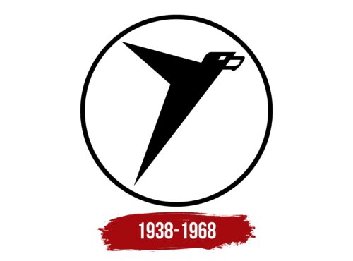
1938 – 1968
The company, which produced military aircraft for Nazi Germany, used an unsettling logo featuring a flying bird. It looked menacing due to its many angles and disproportionate shape. The eagle’s wing and torso were formed by sharp triangles pointing in different directions. They were connected to the head, which had a quadrangular eye with no pupil. The beak resembled the sharp mandibles of an insect. All elements were black, and the eye was represented by a white hole. The emblem was enclosed in a circular frame.
The use of hard angles and dark colors in the emblem was intended to evoke a sense of fear and intimidation, in keeping with the military orientation of the company at the time. The absence of a pupil in the eye symbolizes the lack of humanity and empathy, further adding to the unsettling effect of the design.


