


![]() Miami Dolphins Logo PNG
Miami Dolphins Logo PNG
The Miami Dolphins, a multiple-Super Bowl-winning American football club based in Miami, received a bright, informative emblem. The identity reflects the mascot, the essence of the name, the victorious nature, and the aspiration for new heights, making the Miami Dolphins logo informative and memorable.
The Miami Dolphins are a professional football team. In the 1970s, they joined the AFC Eastern Division. The Miami Dolphins are also members of the NFL and the oldest regional club in the Southern Wing. They are located in Miami, Florida. The team was founded in 1965.
The official history of the “Miami Dolphins” began when they received an AFL franchise extension worth about $8.1 million. Actors Danny Thomas and lawyer Joseph Robbie acquired it. Initially, they planned to keep it in Philadelphia, but Joe Floss, the league manager, recommended moving to Miami. There was a larger population there, but no team. However, Thomas disagreed and sold his share to his partner. Thus, from 1966 to 1990, Robbie was the club’s sole manager.
The situation changed in the 1990s when Wayne Huizenga acquired a stake in the shares. He led the team from 1993 to 2008. In February, Stephen M. Ross bought 50% of the franchise and adjacent territories. The deal cost him $550 million and allowed him to become a general partner. On January 20, 2009, he acquired another 45% of the shares. The total price was about one billion US dollars. Since then, Ross has owned 95% of the shares and is the sole manager of the Miami Dolphins.
In the year of its founding, the team received its name through a contest. Nineteen thousand eight hundred forty-three participants proposed over 1000 names. 662 people sent the winning name. Joseph Robbie approved it because the dolphin symbolizes the club’s location and the smartest and fastest sea creature. He also explained that dolphins are very brave and can even make a deadly attack on a shark.
Meaning and History
![]()
The Miami Dolphins team logos reflect their name, which Joseph Robbie approved. The franchise owner believed it was related to the location and that it symbolized courage, speed, and intelligence. Accordingly, a dolphin is the central image of all emblems. It is depicted in several variants against a stylized sun.
For the first 46 years of its existence, the logo featured the letter “M” on the football helmet. A global redesign in 2013 changed everything. The colors also did not remain unchanged: sticking to one palette, the artists experimented with various shades.
What is Miami Dolphins?
The Miami Dolphins are the only team in the AFC Eastern region that never joined the AFL. It is Florida’s oldest professional team, formed in 1965 and playing its first match in 1966. From its foundation until 2008, the team won two Super Bowls and 13 division championships.
1966 – 1973
![]()
The original “Miami Dolphins” logo consisted of a muted orange circle and a dolphin standing on its tail. The latter was dressed in a sports helmet with the letter “M,” symbolizing the team’s short name. The dolphin’s body was painted white with orange specks, as if it had just jumped out of the water, its skin sparkling with water. The sun was drawn with alternating thin and wide conical rays.
1974 – 1989
![]()
In 1974, the dolphin’s silhouette on the Miami Dolphins logo was shifted upward and to the right. It overlapped the sun’s outline, and its head was behind the circle. The logo was complemented by a large white-and-light-blue football helmet, with the letter “M” in the middle. The orange shade was also changed to a more powdery one. Coral particles were removed from the dolphin’s body, leaving only white. The sun’s rays remained the same.
1989 – 1996
![]()
During this period, the Miami Dolphins’ logo color palette was updated to become more saturated. The helmet lines were widened. The dolphin’s body became longer and slimmer, and the tails, on the contrary, were longer and more powerful. This allowed for visual balance in the image. White speckles appeared on the side of the dolphin, and the shape and size of the sun’s rays remained the same.
1997 – 2012
![]()
In 1997, the club received a completely new logo. The dolphin became more balanced and elongated. The speckles were removed, leaving only light strokes on the tails and around the eyes. A horizontal, wide white line appeared on the belly. The artistic style also changed: the designers replaced schematic outlines with precise, confident strokes, making the animal silhouette more realistic.
The helmet became more nuanced and realistic. Eyebrows were added, and the lines became thinner. The small sun rays were removed, leaving only wide, sharp protrusions evenly distributed around the circle. The colors on the Miami Dolphins logo became more saturated. In addition, the blue color palette was expanded to include the shade of aquamarine.
2013 – 2017
![]()
In 2013, the Miami Dolphins’ logo was updated. The dolphin changed its position: it was no longer jumping out of the water but swimming along a wave. It was turned upside down and drawn with a slight tilt: the tail became horizontal, and the head was directed upwards. The dolphin’s stern facial expression became friendly and neutral. The tail became streamlined and smooth.
The animal’s shape became less cumbersome and more elegant. White, blue, and aquamarine lines were drawn on the sides. They were also drawn on the fins and near the eyes. The dolphin closed the sun in the center. Uniform triangular rays were replaced by three types, each of a different length. The shades were muted, so the sun circle became yellow.
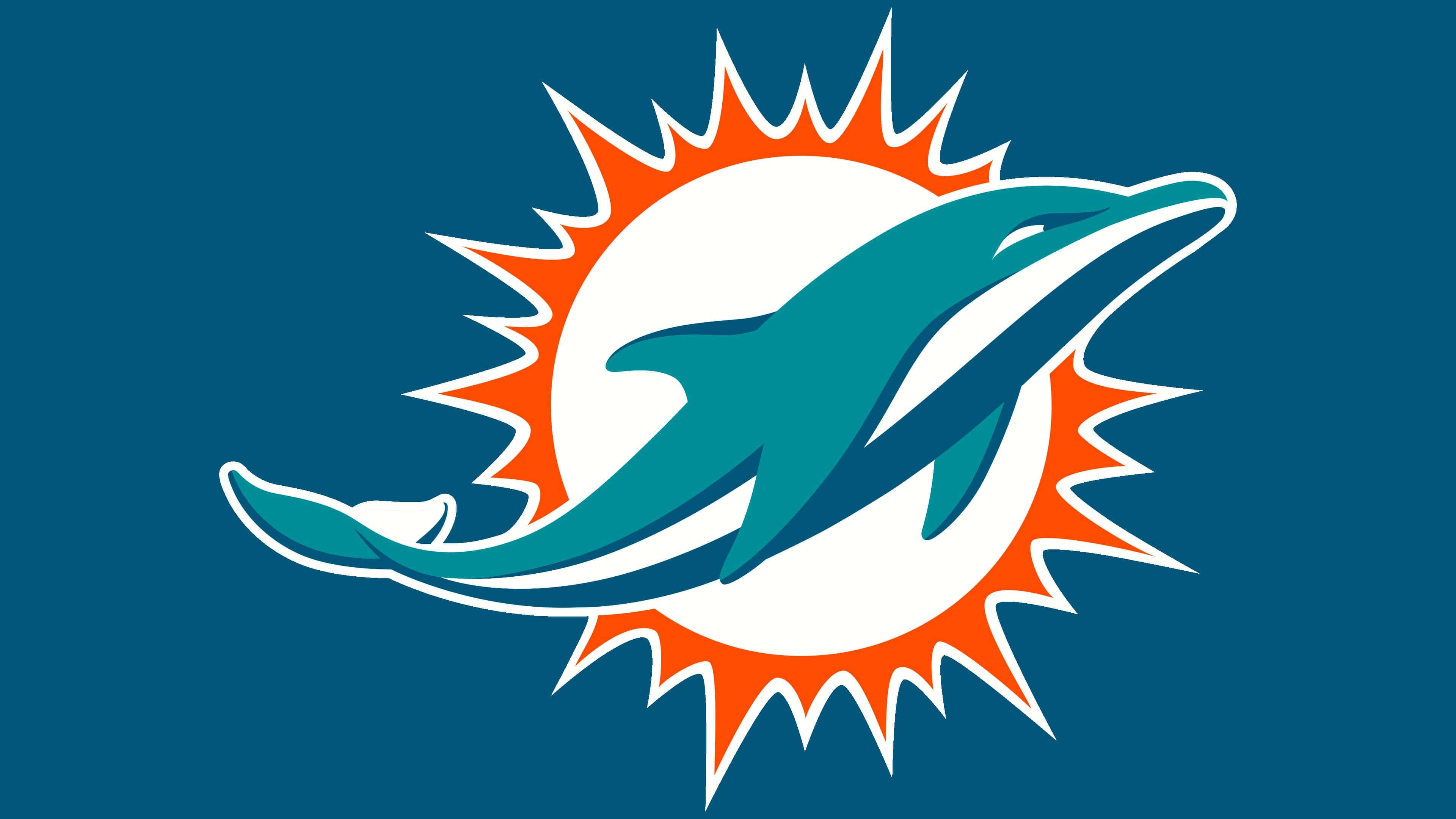
2018 – today
![]()
The current version of the logo builds on the previous one. The designers made the sun circle dark orange and removed part of the tail fin to make it appear curved. The dolphin no longer has the helmet it had before. The designers deemed the logo quite recognizable without the letter “M,” denoting the city of Miami. The other elements remained the same, preserving the original shape, location, and size.
The current dolphin is more elegant than previous versions. In addition, the elongated shape of the body gives it a dynamism that other emblems lack. It looks strong, fast, and agile, embodying the main qualities of a football team. It symbolizes speed, quickness of reaction, striving for achievement, intelligence, and the ability to overcome difficulties.
Font and Colors
The background is a white sun disk surrounded by an orange ring with sharp, triangular rays of different sizes. It serves as the backdrop for the main figure – a light blue dolphin positioned precisely in the center. From a compositional point of view, the logo looks the same as it did 50 years ago. Only the design details have changed. In the first versions, the dolphin “stood” on its tail; now it swims up swiftly. The lines became clearer and more elongated.
The emblem contains only a graphic element, with no inscriptions, so the artists paid special attention to the color palette. Sticking to the original palette, they changed the shades several times. In the current version, coral red is used for the rays, blue for the dolphin, and white for the sun disk and decorative details.
FAQ
Have the “Miami Dolphins” Returned to the Old Logo?
No, the “Miami Dolphins” have not returned to their original logo with the dolphin in a helmet adorned with an orange letter M. They still use the version without the helmet.
What Dolphin is Depicted on the “Miami Dolphins” Logo?
The football club’s “Miami” logo depicts a turquoise dolphin. This is more of a collective image rather than a representative of any specific biological species.
Is the “Miami Dolphins” Mascot a Real Dolphin?
The “Miami Dolphins” mascot is an anthropomorphic character named TD – a person dressed as a dolphin. A live dolphin was with the team for two years, from 1966 to 1968. He performed tricks after every successful ball hit into the opponent’s goal. The football club had to spend money on maintenance; moreover, the animal was stressed, so it was no longer considered a mascot.
Why are the “Miami Dolphins” Delayed?
During one of the 2020 matches between the “Miami Dolphins” and the “Buffalo Bills,” the game was delayed due to adverse weather conditions. The storm forced both teams’ players to spend an additional 30 minutes in the locker room.