


![]() Miami Vice Logo PNG
Miami Vice Logo PNG
The Miami Vice logo contradicts the crime drama, thriller, and detective story genres in which the series is filmed, but accurately conveys its concept. The film tells the story of two undercover police officers’ adventures in neon noir. Therefore, the discrepancy between the emblem’s appearance and the show’s internal content is quite explainable.
Miami Vice is an American television series in the detective genre, created for NBC by producer Michael Mann and writer-screenwriter Anthony Yerkovich. It tells the story of two officers from the Metro-Dade Police Department working undercover. The main roles were played by Philip M. Thomas (Ricardo “Rico” Tubbs) and Don Johnson (James “Sonny” Crockett). The film consists of five seasons, which include 114 episodes. They were broadcast on television from 1984 to 1989. According to People, the series brought novelty to the crime drama genre and all of color television since its invention.
In the 1980s, Miami, the TV show Miami Vice, became a game-changer in crime dramas. Created by Anthony Yerkovich and produced by Michael Mann, it told the story of two undercover cops, James “Sonny” Crockett and Ricardo “Rico” Tubbs, who fought drug crime and organized crime in the city.
Miami Vice was a hit known for its unique style, thrilling music, and movie-like storytelling. It made 80s fashion cool with its pastel suits and linen blazers, and its soundtrack featured the biggest rock and pop songs.
The show wasn’t just about looks; it tackled serious issues like corruption and violence, using advanced filming techniques to enhance its stories.
Over five seasons, Miami Vice won critical acclaim and several awards, including Emmys and a Golden Globe for Don Johnson’s performance.
Beyond its TV success, Miami Vice had a big impact on fashion and made Miami a popular setting for movies and TV shows.
After ending in 1990, efforts were made to bring it back, including a 2006 Michael Mann movie starring Jamie Foxx and Colin Farrell that received mixed reviews.
Today, Miami Vice remains a beloved classic, admired for its style, storytelling, and impact on pop culture. It continues to win over new fans.
Meaning and History
![]()
The NBC broadcasting company wanted to shoot a modern detective drama and sought help from Anthony Yerkovich, who already had experience with such themes, as he is the author of Hill Street Blues. The producer-writer presented a pilot script with the main characters being police officers from Miami. The pilot project was called Gold Coast but was later renamed Miami Vice. The title of the television series fully reflects its content, as it is dedicated to combating the vices of this southern city. The film’s success is explained not only by the issues it addresses but also by its fabulous style. The creators ensured everything was maintained in an exclusive design: costumes, settings, music, and the logo, which served as a movie poster and an intro to the series.
What is Miami Vice?
Miami Vice is an American crime drama created by Michael Mann and Anthony Yerkovich. Work on it began in 1984 and ended in 1989. The series consists of 114 episodes, divided into five seasons. It was broadcast by NBC, which commissioned the film. The main police officer characters were played by actors Philip M. Thomas and Don Johnson.
1984 – 1989
![]()
The sophistication, duality, and chic inherent in this crime drama are optimally conveyed in its visual identity. Both the intro and the series poster are adorned with an exquisite inscription that complements the show’s luxurious atmosphere. It occupies two levels with individual styling despite using the same font. The letters consist of a combination of wide and thin strokes, which additionally adds to their elegance.
The pastel shades of blue and pink beautifully accentuate it – noble, calm, slightly powdered. At the same time, they symbolize undercover work because the glyphs in the second line cast black shadows that repeat the shape of the letters. It turns out that the name of the city where the detective story unfolds is duplicated. This hints at the criminal nature of Miami, the multitude of negative factors, high crime, and the shadowy side of its life. Additionally, the stencil effect creates a sense of trembling and excitement, highlighting the tension and danger that play a key role in the TV series’ plot.
As many experts note, the Miami Vice logo is a work of art and an exact reflection of the psychology of the southern city, which, at first glance, seems carefree but, in reality, has a tar-like side that attracts negativity. Smooth lines balance sharp angles in the emblem, and a pleasant color palette adds excitement and fun. The white background reflects the identity’s expressiveness, and the black color adds a classic, sophisticated element. In the end, the minimalist inscription maximally reveals the essence of the crime drama.
Font and Colors

The Miami Vice logo’s top and bottom lines may appear to be in the same font. However, this is not the case: the typeface is the same, but the subtypes differ. For example, the word in the first row is set in Broadway Regular, and in the second row, it is set in Broadway Stencil. Such a strategy in text design helps to breathe dynamism into it. This makes the emblem deep and ambiguous. The font is distinguished by the absence of serifs, an Art Deco style, and a combination of wide and thin strokes.
The typeface’s creator is graphic designer and typographer Morris Fuller Benton. He created it in 1927 while working at the American Type Founders corporation and named it after his hometown, New York, missing it while living in Milwaukee. The Broadway font has a close analog that appeared after the TV series aired. Miami Vice inspired it and was hence named Miami Heat. Nike developed this typeface for the NBA City Edition T-shirt line.
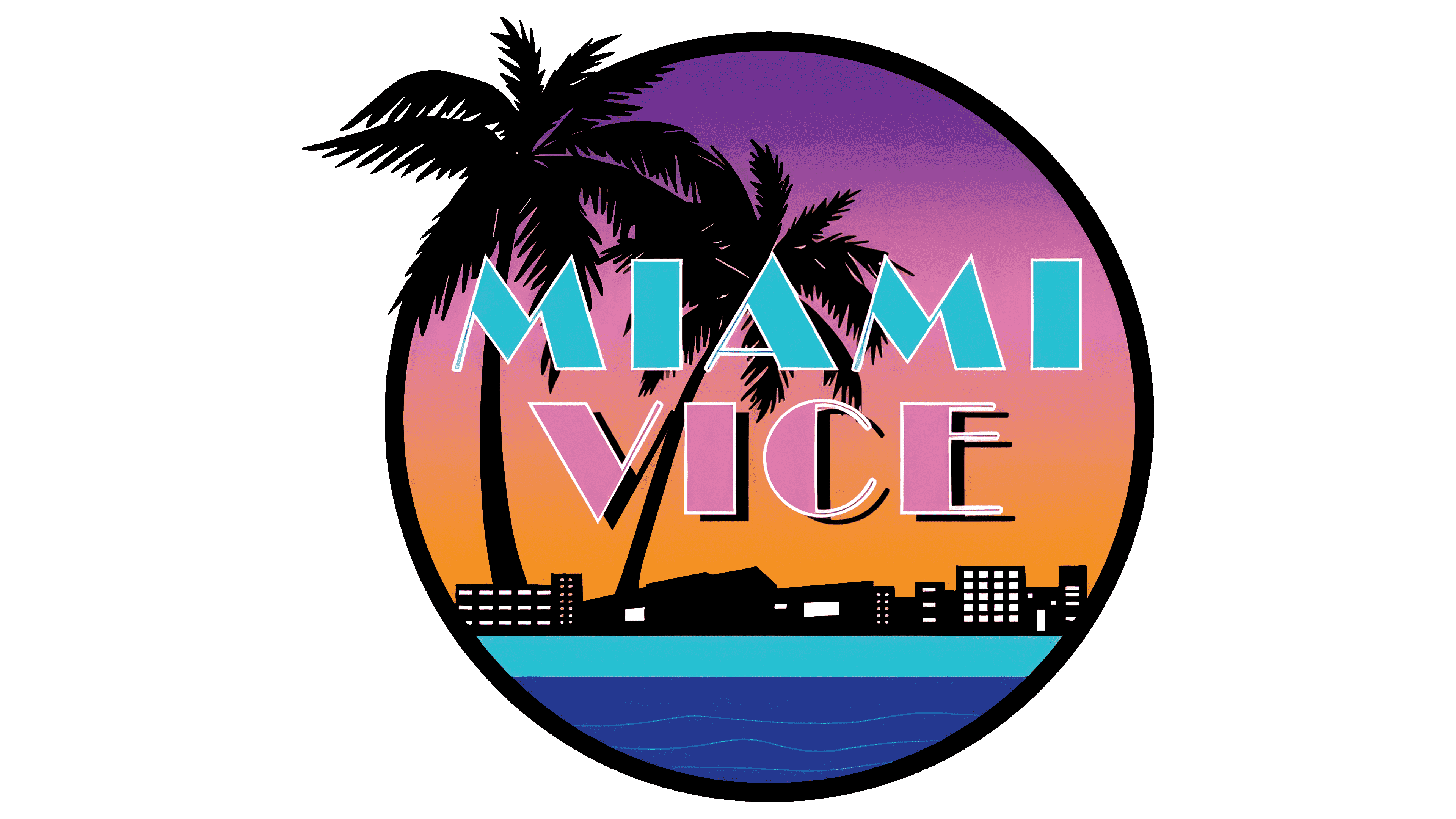
The original palette, maintained in pastel shades, emphasizes the luxurious setting of the TV show. Blue and pink add elegance to the logo, creating a sense of sophistication. White gives it expressiveness, and black enhances the atmosphere of mystery. Each plays a special role: blue symbolizes the ocean and sky, pink represents carefreeness and heat, white represents beach sand, and black represents secrets and hidden motives.
FAQ
Why did Miami Vice get canceled?
Miami Vice ended after five seasons, from 1988 to 1989, mainly because fewer people were watching it. At first, the show was a big hit, known for its cool style, great music, and unique storytelling. But over time, its audience started to shrink. This was because the show changed a bit; there was more competition, and viewers got tired of it. Even though it was popular and left a mark on TV by influencing fashion and music and showing stories in a new way, its lower ratings led NBC to cancel it after the fifth season. Yet, Miami Vice is still remembered as an important TV show.
Was Miami Vice filmed in Miami?
Yes, Miami Vice was filmed in Miami, Florida, which was key to its unique style and feel. The creators, including Michael Mann, saw Miami as a setting and a character essential to the story. This approach was different from many shows of that era. By filming in Miami, the show captured the city’s mix of cultures, architecture, and colors, which added to its distinct look. The real Miami locations brought authenticity and a vivid sense of place that studio sets just couldn’t match. The series featured many parts of the city, from the Art Deco buildings of South Beach to downtown Miami’s bright streets, showing off its various landscapes and spots.
Miami Vice didn’t just use Miami’s scenery for its own benefit; it also boosted its image. It helped make Miami seem glamorous, increasing tourism and popularizing the South Florida look of pastel colors and palm trees. The show also helped the local economy by hiring local people and using local services.
In short, Miami Vice truly embraced Miami, making it a central part of the show’s groundbreaking look and atmosphere. The series changed how TV shows could use their locations in storytelling and significantly reshaped Miami’s image worldwide.
How realistic is Miami Vice?
Miami Vice was a show that mixed real-life elements with drama to capture the essence of Miami in the 1980s. It showed the city’s fight against drugs and crime, making it look gritty and glamorous. The show was filmed in real Miami locations, like the Art Deco district and downtown, making it feel authentic and giving viewers a true sense of the city’s culture and vibe.
The show depicted actual police tactics, such as undercover operations and surveillance, though sometimes these were dramatized for added excitement. Despite its focus on style, like fast cars and trendy clothes, which weren’t what real detectives typically wore, it also touched on serious issues like corruption and drug addiction. However, to keep the show entertaining, it didn’t always dive deep into these problems.
Miami Vice greatly impacted how people saw Miami and crime-fighting in general. It made the undercover lifestyle seem appealing to some while also showing the hard reality of fighting crime in the city.
In the end, Miami Vice balanced realism with entertainment. It brought 1980s Miami to life, showing off its culture and challenges while keeping viewers hooked with its dramatic storytelling and visual flair.