Romantic and highly creative, the Michaels logo shows users’ inspiration with which they engage in their favorite hobbies. The store sells things that kindle this fire and help it burn constantly.
Michaels: Brand overview
| Founded: | 1973 |
| Founder: | Michael J. Dupey |
| Headquarters: | Irving, Texas, U.S. |
| Website: | michaels.com |
Meaning and History
When Michael Dupy started selling art supplies, he gave the store his name, Michaels. The shop was a success, and over the next nine years, ten more outlets were opened. Dupy sold the business in 1982 for a good price and started another business. The new owner, millionaire, and experienced businessman Sam Wylie helped the company reach great heights: he brought the company to the stock exchange. He organized the acquisition of competitors, which constantly increased the number of stores. In 2006, private investors paid attention to the “tidbit” who bought the company and continued to develop the brand.
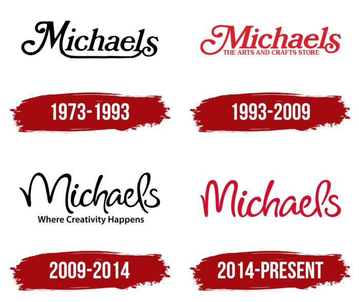
The company logo was updated three times. Each rebranding was associated with the next stage of growth. At the same time, black and red motifs alternately replaced each other.
What is Michaels?
Shops and online platforms for handmade goods in North America and founded in 1973 and owned by Apollo Global Management. Offers products for sewing, knitting, embroidery, felting, ikebana, origami, decorating, painting, sculpture, etc.
1973 – 1993
The appeal of the first logo was built on the contrast of white and black. The rectangular black background resembled a sign with the title and author next to the artworks in the exhibition. On the emblem, the inscription consisted of the word Michaels. The store’s merchandise will form the basis of many products, and Michaels is, to some extent, their author. Creative curls distinguished the first and last letters of the word. The leg of the capital M continued under the word as if embracing the inscription. The name was self-supporting and cohesive, alluding to the DIY type of store.
1993 – 2009
After selling shares on the stock exchange (1984), Michaels used the capital to buy competitors. This gradually increased the number of stores from 16 to 450. To ensure that customers in the new states immediately understand what the brand offers, the logo was changed to add more clarity to it. The name was given a romantic red color, bright, attractive, and creative. The arcuate underlining has been removed. Instead, an inscription appeared at the bottom between M and S, indicating the direction of activity: arts and crafts stores (arts and crafts stores).
2009 – 2014
The opening of the 1000th store in 2008 was celebrated with a rebranding. The original font was used for the updated logo. It seems that the letters are made of threads. This feeling is especially enhanced by the capital letter M and the loop of the letter L. The composition is complemented by the inscription Where Creativity Happens (Where creativity happens). In general, the created image quite accurately corresponds to the direction of the stores. The overall impression is complemented by the black color of the inscription, which reflects the motif of blanks, drafts, and details that require design, cutting, and coloring.
2014 – today
Starting in 2014, all the brands owned by the company (Artistree, Aaron Brothers Custom Framing, Recollections, Studio Décor, and others) have been merged under the new entity, The Michaels Companies. This entailed updating the visual identity.
The new logo reflected Michaels’ central leadership position among other holding brands. This is indicated by changing the color of the name to red. The change in hue gave the logo a pop of color, reflecting the creative fire that Michaels’s products ignited in shoppers. At the same time, the uniqueness of the handmade font, which is the hallmark of the stores, has been preserved. Although a few adjustments have been made. The capital letter M has already been done, and the tails of the letters that are too protruding down have been removed. This gave the inscription a neater and more compact look, added softness and roundness, and a sense of completeness and harmony.
Font and Colors
Michaels’ “color” story is a combination of red, black, and white. The combination of opposites and contrast makes the logo bright and emphasizes the brand’s artistry, originality, and creativity.
- White – novelty, fresh ideas, blanks, production from scratch.
- Black – the company’s power (the brand absorbed most of the competitors).
- Red – creative impulse, emotions, inspiration, bright details.
The font has no exact analog. But close to Rose Colored Regular and Bostroom Regular.
Michaels color codes
| Fire Engine Red | Hex color: | #d30e2c |
|---|---|---|
| RGB: | 211 14 44 | |
| CMYK: | 0 93 79 17 | |
| Pantone: | PMS 185 C |
