The Michigan Wolverines logo has a simple and concise design that evokes associations with university teams and their achievements. It is a timeless symbol that has become the cultural heritage of the state. The emblem looks life-affirming and optimistic, highlighting the athletes’ positive image.
Michigan Wolverines: Brand overview
| Headquarters: | Ann Arbor, Michigan |
| Website: | mgoblue.com |
The history of the Michigan Wolverines dates back to the mid-19th century. The University of Michigan (or UMich) was established in 1817, and its men’s baseball team began playing in 1866. Thirteen years later, the university’s students started participating in football competitions: the first season took place in 1879. Basketball players debuted in 1909. Later, the university began developing other sports, including volleyball, tennis, swimming, softball, and lacrosse. The success of the teams allowed UMich to consistently rank in the top 5 in the NACDA Directors’ Cup standings for many years.
Meaning and History
The university’s sports teams have adopted the state’s nickname, which is more than two centuries old. According to one version, the wolverine is associated with endurance and strength. Others believe that the inhabitants of Michigan were called so by their neighbors, dissatisfied with the border between the states. They compared the Michigans to greedy wolverines. Either way, the Michigan Wolverines proudly carry their name and have even used the animal logo in the past.
At the same time, the main symbol of the department is Block “M.” It appeared as early as the late 1800s but only became popular in 1907 when football fans displayed it during a match of several hundred yellow and blue flags.
What is Michigan Wolverines?
Michigan Wolverines comprises over 20 sports teams from the University of Michigan, a member of NCAA Division I. Most of them play in the Big Ten. It is known that football players joined this conference at its founding in 1896. The only exception is the women’s team, which is part of the Collegiate Water Polo Association.
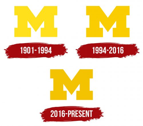
1901 – 1994
From archival materials, it is known that this logo began to be used in 1901. It contains a light yellow letter “M” with rectangular serifs and dates back to the emblem that appeared in the 1880s. This is an abbreviated designation for the state of Michigan, where the university and its sports teams are located.
1994 – 2016
In 1994, Michigan Wolverines began cooperating with Nike. They decided not to change the shape of their emblem but only to darken it slightly. This is still the shade of Maize but more expressive.
2016 – today
For several years, the official equipment supplier for the University of Michigan teams was Adidas. In 2016, Nike took its place. The athletes switched from the three stripes to the familiar swoosh and received a new logo. It still contains the letter “M” composed of rectangular lines. However, the shade of yellow has become slightly darker.
Font and Colors
Michigan Wolverines have a custom font called Valiant, created in collaboration with Nike. It was inspired by the architecture of the UMich campus, which consists of sturdy and durable bricks. This building material symbolizes endurance and strength. The rectangular elements of the letters are associated with bricks, or more precisely, with different types of masonry: vertical and horizontal.
As for the color palette, the sports teams have long used Maize (#FFCB05) in their emblem. It is a joyful and optimistic shade of yellow that goes well with the university’s second official color – blue (#00274C). A committee formed in 1912 clarified that the blue should be dark (e.g., cobalt), and the yellow should be brighter than pale lemon. Later, the current shades were chosen.
Michigan Wolverines color codes
| Saffron | Hex color: | #f3c300 |
|---|---|---|
| RGB: | 243 195 0 | |
| CMYK: | 0 20 100 5 | |
| Pantone: | PMS 116 C |


