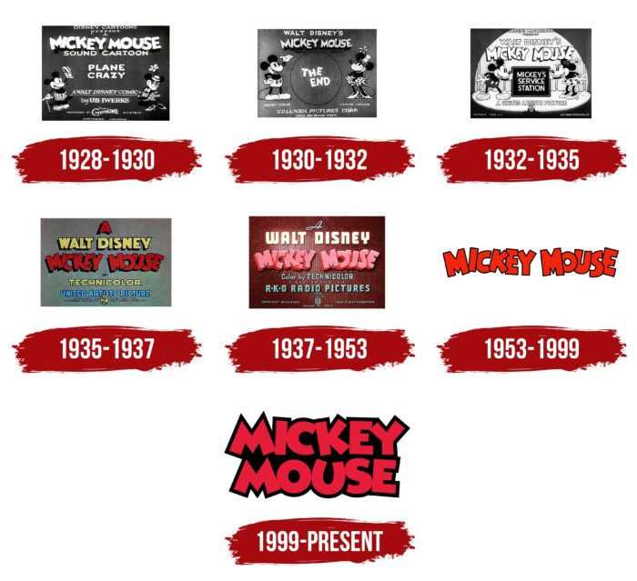
The Mickey Mouse logo conveys the cartoon character’s bright and charismatic character- the adventure’s main character. The emblem is made in the tone of the color scheme of the mouse, and the elements depict his cheerful, bouncing gait.
Mickey Mouse: Brand overview
| Founded: | 1928 |
| Founder: | Walt Disney Productions |
| Headquarters: | United States |
Meaning and History
The name Mickey Mouse debuted in the credits as a designation for the main protagonist, but it was later used as a generic name for the animated series. This first happened in 1935. Since then, all Disney cartoons, which featured this character, got his name. And it is he who ties all the releases together because the plot in each episode is different, as well as the accompanying characters.
Production of the animation about the merry anthropomorphic mouse began in the spring of 1928 after the studio lost the copyright to Oswald the Lucky Rabbit. Mickey was his replacement. The first two animated works were shown in cinemas, but for the wide distribution of funds for them could not find. In the third film, Walt Disney, for the first time, used the method of synchronization of the soundtrack with the picture, which no one had done before. It was the sensational Steamboat Willie. It was shown in autumn in New York, and he instantly got a resounding success. Thanks to this, the studio began to make a profit. Thus was laid the foundation of the Mickey Mouse stories.
In 1953, the series was suspended and unofficially closed. His revival began in 1983. In total, the creation of the animated adventures of resourceful mouse worked twenty employees. And Mickey was speaking in the voice of Disney himself. In the first releases, the author was also complemented by Clarence Nash and Carl Stalling. In 1948, the main character was voiced by Jimmy MacDonald. Another three films featured Wayne Allwine as the actor. Each major milestone in the cinematography of the landmark cartoon was accompanied by a redesign of its screensaver and logo. There are a total of seven variations.
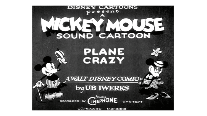
1928 – 1930
The debut emblem contains individual sans serif lettering. The letters are large, bold, and slightly overlapping. The distance between them is extremely small. There is a shadow under each sign, so it appears that they are elevated above the background. The shape of the characters is straight and sharp, and the cuts and angles are severe. However, this does not prevent them from being “fun.” The wrong positioning of the letters creates this impression: they are not linear but scattered, which gives reason to perceive the name as friendly and playful. The logo also features a lot of other data, from the name and creators of the cartoon to the technology and the copyright mark. Mickey Mouse and Minnie Mouse are to the right and left of the lettering, occupying several rows. The background is painted black, and all elements are white.
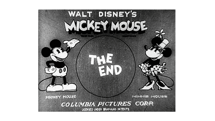
1930 – 1932
After the redesign, the shadows of the letters became stronger and clearer. A lot of additional information disappeared from the emblem. The developers left only the most important information, also divided into several lines. The first is “Columbia Pictures Corp.”, the second – “Presents,” the third – “Walt Disney’s,” the fourth – “Mickey Mouse,” the fifth – “in” and then comes the indication of the episode. The name of the key character is still in large, upper-case type. The letters are broad, coherent, and complemented by shadows. The main characters are in a rectangular frame to the right and left. The upper text is in a unified style.
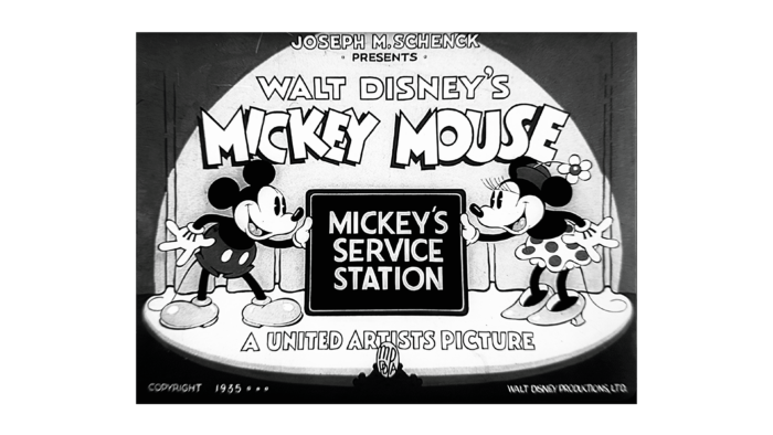
1932 – 1935
The entire information part of the logo has been redesigned, both content and design. The author of the series, the name of the studio, and the name of the issue are now listed there. The letters in the phrase “Mickey Mouse” are narrow and surrounded by a wide black outline. This prevents the lettering from merging, as the artists overlapped the signs even more. They also painted the stage, the curtain, and the domed light from the footlights.
1935 – 1937
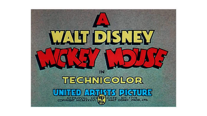
The era of the color film had arrived, so the cartoon splash screen became colorful. This was a major, but not the only, change to the emblem of the time. The designers removed the images of the key characters and left only the frame and inscriptions. Half of them made large letters that cast a shadow to the left side. The main palette consists of yellow, red, and blue. There are also black characters in small print at the bottom of the gray rectangle.
1937 – 1953
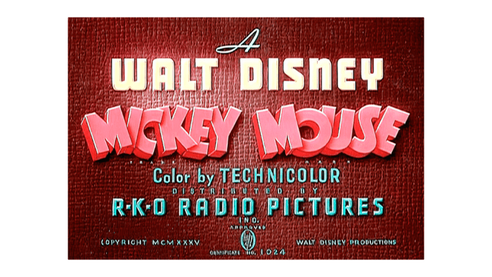
The emblem has become unimaginably colorful – it is now brick red with contrasting white letters. The font of “Walt Disney” is bold, wide, and streamlined. The large characters are flat and sans serif. Below is the “bouncing” word combination “Mickey Mouse” in pink. It is made in a 3D version, as the artists reworked the shadows into wide sidewalls, so the text became three-dimensional. The background surface is no less textured: it looks like a fluted backing, resembling a piece of cloth or leather.
1953 – 1999
After a major reboot of the identity, the animated series now have as simple a logo as possible. Everything disappeared from it except the name. The letters became flat, red, with a black outline.
1999 – today
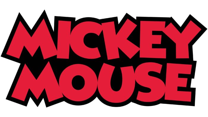
Designers enlarged the lettering, divided the words, and placed them in two lines. They kept the red color of the letters but placed them evenly, so the characters are now less “bouncy.” They have sharpness on the ends and straight lines. The authors also added a dark background in the middle, keeping the black outline on the edges.
Mickey Mouse: Interesting Facts
Mickey Mouse symbolizes the Walt Disney Company and the animation industry.
- Creation and First Appearance: Walt Disney and Ub Iwerks created Mickey Mouse in 1928. He first appeared in “Steamboat Willie” at the Colony Theatre in New York City on November 18, 1928. This date is now known as Mickey Mouse’s birthday.
- Walt Disney as the Voice: Walt Disney voiced Mickey Mouse from 1928 to 1947 and returned for some projects until 1959.
- First Words: In 1929, Mickey Mouse spoke in “The Karnival Kid,” saying, “Hot dogs!” Before this, he appeared in silent films or made sounds like laughing and crying.
- Awards: Mickey Mouse has been nominated for the Academy Award 10 times and won an Honorary Oscar in 1932 for Walt Disney. “Lend a Paw” won the Academy Award for Best Animated Short Film in 1942.
- Color and Technology: Mickey’s first color cartoon was “The Band Concert” (1935). His cartoons were among the first to use Technicolor.
- The Mickey Mouse Club: This TV show, created by Walt Disney and first aired in 1955, introduced young talents to American audiences. It was revived several times.
- Global Recognition: Mickey Mouse is known worldwide, appearing in comics, video games, and merchandise, and has been a balloon in Macy’s Thanksgiving Day Parade since 1934.
- Hollywood Walk of Fame: In 1978, Mickey Mouse became the first cartoon character to receive a star on the Hollywood Walk of Fame, marking his 50th anniversary.
- Cultural Role: Mickey Mouse appeared on military insignia and war bonds during World War II and has also been featured in educational films.
- Evolving Design: Mickey’s design has changed over time, with significant updates like Fred Moore’s redesign in the late 1930s, which made him more pear-shaped with pupils, enhancing his friendly and expressive look.
Mickey Mouse continues to be a figure of happiness, creativity, and the lasting impact of animation, captivating people globally for nearly 100 years.
Font and Colors
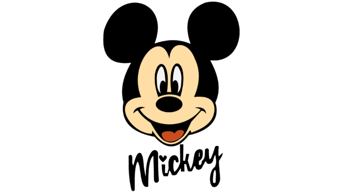
In 1937, an additional logo appeared in addition to the main logo. It was a small icon with a schematic representation of the head of the studio’s mascot, Mickey Mouse. It exists in several versions: the first – completely black, the second – with the smiling face of the main character. The basis of the visual identity mark is made up of three circles: one large one in the center (the face) and two smaller ones on the sides (the ears). There are two smiling versions: with a red tongue and completely black eyes and a white tongue and black pupils on a white background.
The main lettering is hand-drawn and has nothing to do with fonts. It is a graphic drawing. However, there are similarities with some types of typefaces: such as Xavier Sans Bold (by Jason Castle) and Aarde Black (by Anton Scholtz). But most of all, the design resonates with the Mickey font of the same name, which exists in two versions: with painted letters (Mickey) and with hollow letters (Minnie).
The corporate colors on the logo are now bright and are mostly red, black, and white. In the earliest logos (before color television), the palette was much more modest and consisted of monochromes. The later inscriptions, like the characters, were colored in yellow, brick red, and blue with the addition of black and white tones.
Mickey Mouse color codes
| Alizarin Crimson | Hex color: | #e51d39 |
|---|---|---|
| RGB: | 229 29 57 | |
| CMYK: | 0 87 75 10 | |
| Pantone: | PMS 185 C |
| Black | Hex color: | #010101 |
|---|---|---|
| RGB: | 1 1 1 | |
| CMYK: | 0 0 0 100 | |
| Pantone: | PMS Black 6 C |

