The Microsoft-style emblem promises the user the high quality and reliability that distinguishes all the company’s services. The Microsoft Azure logo opens up the multitasking of the cloud service and invites people in business, creative people, and individuals to use it.
Microsoft Azure: Brand overview
| Founded: | October 27, 2008 |
| Founder: | Microsoft |
| Headquarters: | United States |
| Website: | azure.microsoft.com |
Meaning and History
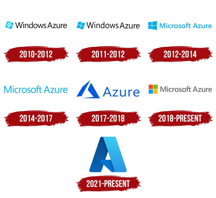
During its existence, the cloud platform has changed several names. She was initially known as Project Red Dog, but that was only a codename. The official name, introduced after the 2010 release, became much simpler: Windows Azure. The startup was finally renamed in 2014. This is how Microsoft Azure appeared in the form in which it is now known.
It is worth noting that the cloud changed not only names but also logos. They are all in line with Microsoft products’ style because the parent company cares about personal identity integrity.
What is the Microsoft Azure?
It is a cloud-based platform. It allows you to develop, interact with applications, and store information on remote servers. The service supports a wide variety of programming languages. She first appeared in 2008 as Project Red Dog. In 2010, the service changed its name to Windows Azure and was opened for access. It received its current name in 2014.
2010 – 2011
The newly created platform used the Windows wave-shaped flag icon as its logo. It was light blue and had a radial gradient to white. On the right were the words “Windows Azure,” and the words looked like they were written together. The black round sans serif font was the same as other Microsoft services.
2011 – 2012
The cloud computing service logo was designed in the style of the parent company – strict, practical, without unnecessary details. The only element was the corporate flag, made up of a window with four compartments. A wavy shape distinguished it with winding edges. The rectangles on the left side were curved upward, on the right – downward, which created the “wave” effect. The icon was painted sky blue, while the adjacent text was black. The designers used a sleek and subtle grotesque for her.
2012 – 2014
In 2012, the logo began to look more modern. The designers made the flag three-dimensional and shaped it into a four-trapezoidal window. The light blue color has not changed – on the contrary; it has switched to the inscription. At the same time, the space between words increased slightly.
2014 – 2017
When the cloud services set was renamed to Microsoft Azure, the checkbox (the main symbol of Windows) disappeared. Only the name remained, which was written in the traditional grotesque using blue.
2017 – 2018
In 2017, a new platform manifesto was released, and along with it – a modified logo, an image of two asymmetric figures. On the right, as before, is the cloud’s name, but now it is abbreviated to the word “Azure.” The color has become much darker.
The Microsoft Azure collection of services can be recognized by the logo, consisting of two complex polygons. Its design is very similar to the style of Microsoft Office icons. Also, the graphic element vaguely resembles the capital letter “A.” But this is not an obvious association: in most cases, figures are perceived as an unusual and meaningless abstraction.
Typography choices follow Microsoft’s visual identity, which is why the word “Azure” is spelled out in the typeface Segoe. This font was developed in 1975 and is owned by Monotype Imaging Corporation. It is very similar to Adria Grotesk Light, Mr Eaves XL Modern Regular, and Quiet Sans Light. It is worth noting that Microsoft just bought a license for Segoe, which means that neither it nor its products can boast its original identity. Countless other brands in the world use the same typeface for their logos.
The color scheme is also non-unique. The abstract figures and the lettering are painted in a deep blue-blue hue (# 005bdb). Previously, it was replaced by a lighter azure color. Despite this, Microsoft Azure has a very recognizable style and stands out from other cloud platforms.
2018 – today
The current version consists of a branded window assembled from squares of different colors, which reflect the directions of the parent company’s software products. The top row is occupied by red and green; the bottom row is occupied by blue and orange-yellow. The text has also changed. Now, instead of elongated black letters, squat grays are used.
2021 – today
The updated logo is shaped like a wide azure triangular ribbon. One side is straight, and the other is curved. This sign demonstrates the flexibility of adapting the program to clients’ needs. Moreover, the part bent inward makes the graphic sign look like the letter “A” from the word Azure: it replaces its crossbar. In this way, Microsoft emphasizes the relationship of its application with the Fluent Design System service. All corners of the emblem are rounded. The inner planes are colored dark blue; the outer ones are blue. In the very center is a tall white triangle formed by joining the three edges of the tape.
Microsoft Azure: Interesting Facts
Microsoft Azure started as Windows Azure in 2010 and got a new name in 2014. Microsoft’s cloud service offers tools for computing, analyzing data, storing information, and connecting networks.
- Variety of Services: Azure has over 200 products and services to help businesses innovate and tackle current challenges. It supports various technological needs, including computing, analytics, and networking.
- Global Data Centers: Azure’s network spans 58 regions and is offered in 140 countries, making it one of the largest cloud infrastructures available. This ensures services are always on, quick, and reliable.
- Hybrid Cloud: Azure links on-site infrastructure with the cloud, allowing businesses to grow and adapt their IT operations efficiently and cost-effectively.
- Open Source Friendly: Azure supports various operating systems, databases, and programming languages, making it attractive to users of open-source software.
- AI and Machine Learning: Azure leads in AI by providing tools for creating AI-based applications, including machine learning, cognitive services, and bots.
- Internet of Things (IoT): Azure IoT services help businesses connect and manage their IoT devices, ensuring secure and scalable applications from device to cloud.
- Sustainability: Microsoft aims to be carbon-negative by 2030, and Azure is part of this plan. It focuses on being energy-efficient and reducing environmental impact.
- Government Cloud: Azure Government meets the strict security needs of U.S. government agencies, showing Azure’s flexibility across different sectors.
- Marketplace: Azure Marketplace is an online shop for apps and services designed for Azure, making it easy for customers to find, buy, and deploy software.
- Revenue Growth: Azure has significantly boosted Microsoft’s earnings, making Microsoft a top contender in the cloud market alongside Amazon Web Services and Google Cloud.
Azure’s vast services, worldwide presence, and commitment to progress and eco-friendliness make it essential for modern businesses.
Font and Colors
After updating the logo, the inscription is made with one of the varieties of Helvetica Bold Italic. It is a flat sans serif with classic printed characters. The proprietary connection of the crossbars “f” and “t” has been retained. But the color of the emblem has changed significantly: now blue, red, orange, green, and gray prevail.
FAQ
What is an Azure icon?
An Azure icon is a visual symbol used to create detailed diagrams for various tasks, such as showing Azure setups, suggesting solutions, making presentations, and preparing documents. These icons help users understand and share complex cloud structures and solutions.
Azure icons come in different types, each representing various parts and services in the Azure system. They are grouped into categories to make them easy to find and use in diagrams:
- Cloud Icons: Show various cloud services and parts.
- Deprecated Icons: Mark services or parts that are no longer used.
- Enterprise Icons: Represent enterprise-level services and solutions from the brand.
- Microsoft Product Icons: Stand for specific Microsoft products that work with Azure.
- System Center Icons: Show parts of the System Center suite for managing data centers.
- General Symbols: Include common symbols used in network diagrams and flowcharts.
- Intune Icons: Represent parts of Microsoft Intune, a mobile device and app management service.
- VM Icons: Illustrate virtual machines and related services.
These icons are essential for making clear and professional diagrams. They help stakeholders understand and share technical information easily. The standardized Azure icons make diagrams easy to read, which helps teams work together and plan better.
Is Azure from Microsoft?
Yes, Azure is a cloud computing platform from Microsoft. It started as Windows Azure and became Microsoft Azure. The brand offers cloud services, like computing, analytics, storage, and networking. Users can build, test, deploy, and manage applications through data centers managed by the brand.
The company provides solutions for different industries and needs, such as virtual machines, databases, AI, machine learning, DevOps, and IoT. It supports many programming languages, frameworks, and operating systems, allowing users to use their existing tools and skills. The brand’s global network of data centers offers high availability and scalability, helping businesses grow and adapt quickly.
The platform has strong security features and compliance certifications to protect data and meet regulatory requirements. The brand integrates well with other Microsoft products like Office 365 and Dynamics 365, making it even more useful for enterprises.
What does the Microsoft Azure logo mean?
The logo symbolizes the platform’s ease of use, unity of processes, and continuous workflow. It shows Azure’s cloud services are simple and efficient, making integrating and managing different tasks easy.
The logo features the letter “A,” connecting it to the brand’s name and reinforcing its link to Microsoft. This highlights the reliability and integration of Azure services with other Microsoft products.
This visual element supports the platform’s goal of simplifying cloud operations, making them accessible and easy to manage for users.
What is the Microsoft Azure logo?
The logo merges the brand’s style with the concept of cloud services. The updated logo is sleek and clean, showcasing a modern and aesthetic design. It features a solid, wide, curved band that resembles the letter “A,” representing the first letter of the platform’s name. The icon is colored in a deep light blue from the pastel palette, which adds to its visual appeal.
This design reflects the brand’s identity and symbolizes Azure’s role in providing cutting-edge cloud solutions. The logo’s simplicity and elegance convey the platform’s focus on ease of use and efficiency, aligning with its mission to simplify complex cloud operations for users. The choice of color and design elements emphasizes the platform’s innovative approach and commitment to delivering reliable, integrated cloud services.
What is the font of the Microsoft Azure logo?
The logo has used different fonts over the years, all characterized by simplicity and elegance with sans-serif letters. Initially, it used the Segoe brand typeface, which is known for its clean and modern look and emphasis on clarity and readability.
Later, the logo switched to the Helvetica Bold Italic font. This font is known for its strong, clean lines and professional appearance, adding a sense of authority and reliability to the brand.
