The Microsoft 365 Copilot logo is a beacon of interconnected services and multifaceted utility. It reflects the brand’s commitment to offering a well-integrated all-in-one platform that meets the diverse needs of both individual users and large organizations. The logo embodies the promise of quality and reliability – qualities on which Microsoft’s long-standing reputation for technology is based. The logo symbolizes a commitment to excellence and forward-looking innovation. It gives users confidence that they are using services designed to evolve with new trends and technologies.
Microsoft Copilot: Brand overview
Microsoft 365 Copilot, introduced in March 2023, is an AI guide designed to improve productivity in Microsoft 365 applications such as Word, Excel, PowerPoint, Outlook, and Teams. It uses sophisticated language models like GPT-4 created by OpenAI and Microsoft Graph data to understand user intent and create relevant recommendations and content.
Key features include composing and editing documents, creating slideshows, evaluating data, shortening emails or meetings, and responding to direct language cues. Microsoft has prioritized incorporating security measures, regulatory compliance, and fundamental ethical AI principles into Copilot to ensure it is ready for business use.
After preliminary trials, Microsoft expanded the audience to 600 business customers in May 2023, setting the subscription price for Copilot at $30 per user per month. A large-scale commercial release date is set for November 1, 2023. This Microsoft innovation in artificial intelligence is expected to significantly raise the standards of efficiency and teamwork.
Meaning and History
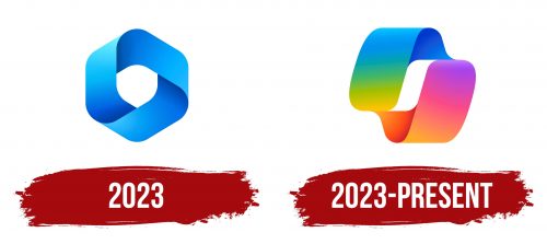
2023
2023 – today
As with other members of the Microsoft family, the logo of this digital product is designed in a corporate color palette that includes a rainbow of colors: blue, yellow, green, red, orange, and magenta. The difference is that these colors smoothly pass into each other as the designers use the gradient technique. The emblem is volumetric and has the form of a twisted ribbon of different thicknesses: it has both narrow and wide sections. The upper part is colored in cold tones, and the lower part is colored in warm tones.
The use of gradient allows you to take a new look at the usual Microsoft color palette and give it a sense of fluidity and dynamism. The three-dimensional shape of the twisted ribbon gives the digital product a tactile, tangible quality. It’s as if the viewer can reach out and touch it, breaking down the barrier between the digital and physical worlds. The varying thickness of the tape adds complexity and intrigue, inviting the viewer to take a closer look. The separation of warm and cool tones symbolizes the versatility of the product to meet a variety of needs and moods.


