The main theme of the Microsoft Teams logo is business approach and teamwork. The emblem’s hues and symbols create an office atmosphere, illustrate employees and documents, and give the user a sense of order and confidence.
Microsoft Teams: Brand overview
Meaning and History
The core of this desktop app is Electron digital technology powered by GitHub. It combines the JavaScript Node.js framework and the Chromium rendering service. Therefore, Teams is a great replacement for similar business messaging and real-time collaboration programs. During the COVID-19 pandemic, many business teams switched to this form of work and moved most meetings to a virtual environment.
In March 2017, developers actively experimented with Microsoft Teams and, in May, announced that it would replace Classroom with Office 365. A year later, the parent company offered a free option with advanced communications, unlimited users, and large storage for batch files.
At the beginning of 2019, the parent company made an important update to simplify interaction between members of the same group. It improved the program’s compatibility with different types of personal computers, thereby improving and popularizing the working platform just before the pandemic outbreak. Now, her logos are familiar to teams worldwide, and Microsoft Teams has only two of them.
What is Microsoft Teams?
Microsoft Teams is a specialized work environment for team collaboration on various projects. It combines chat, notes, attachments, appointments, and correspondence. It is a software product of Microsoft.
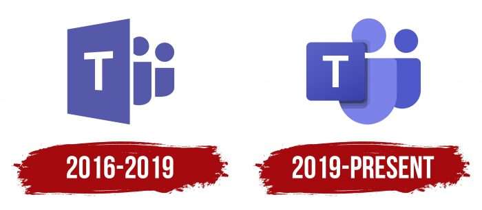
2016 – 2019
The opening emblem contained three graphic elements: one square turned sideways and two vertical semi-ovals with large dots. The first symbolized a virtual worksite, and the rest – people who used the services of this service. On the trapezoidal geometric shape was the letter “T” – the first character from the word “Teams.” The members of the team were depicted behind the flat structure. According to the spatial perspective, the figures were descending. The near elements were larger, and the distant ones were smaller. The body was cut into vertical ovals, the head – disproportionately large points.
2019 – today
After the recent update of the virtual platform, the designers offered a different identity. They started revising the logo in November 2018; in January 2019, they already approved the modern version. The developers have replaced the trapezoidal background of the letter “T” with a square with rounded corners. Moreover, they reduced it and placed it straight, and the semi-ovals located further, on the contrary, increased and made it rounded along the contour. Head points now appear proportional to bodies. The authors added new shades to the purple palette, forming shadows on the square’s right side.
Microsoft Teams: Interesting Facts
Microsoft Teams, launched by Microsoft in 2017 as part of what used to be Office 365 (now Microsoft 365), quickly became key for workplace collaboration and communication. Integrating well with Microsoft’s other productivity tools, Teams provides chat, video meetings, file storage, and teamwork capabilities all in one place.
- Launch: Teams started on March 14, 2017, to compete with platforms like Slack. Its compatibility with Microsoft’s productivity suite helped it quickly spread across organizations worldwide.
- Growth During COVID-19: The pandemic significantly boosted Teams’ usage as businesses moved to remote work, showing the importance of keeping teams connected.
- All-in-One Collaboration: It combines chat, video calls, file sharing, and Microsoft Office document collaboration, along with integration with other Microsoft 365 services.
- Customization: Teams allow adding tabs, bots, and connectors for personalization and integrating third-party services, making it adaptable to various organizational needs.
- Security and Compliance: Operating on Microsoft’s secure cloud, Teams provides advanced security and compliance features, such as data loss prevention and multi-factor authentication, suitable for regulated industries.
- Meeting Features: Innovations for meetings include background effects, Together mode, and live captions, making virtual meetings more engaging and accessible.
- Sector-Specific Solutions: Teams have versions for education and healthcare, offering tools for managing classrooms, remote learning, virtual healthcare visits, and communication in medical settings.
- Global Data Support: Supported by Microsoft’s global data centers, Teams meets performance and regulatory needs by allowing data storage in specific regions.
- Phone System: Teams also has a cloud-based phone system with voicemail, call forwarding, and emergency calling, which could potentially replace traditional phone lines.
- Ongoing Updates: Microsoft continually updates Teams, introducing new features and improvements to help organizations meet the changing demands of modern work.
Microsoft Teams has become vital for organizations, enhancing collaboration and productivity for teams everywhere and shaping the future of digital workplaces.
Font and Colors
In this case, we should discuss two versions of the same logo. First, it retains the same concept, and second, it consists of similar elements. Even the arrangement of parts is the same. The only difference is in the nuances not reflected in the ideological content: Teams are a working platform for everyone.
The designers used Sans Serif, a classic, sleek, angular typeface for the single letter. However, the logo palette is exclusive and rarely used for such a theme. It is purple of several types. The emblem’s early version is painted in a rich shade of # 5457b1, and the current one is in three different shades. The square is dark purple # 444cb7, the first figure of the “man” is light amethyst # 7c84ec, and the second is purple # 4f58ca.
FAQ
Can I use the Microsoft Teams logo?
Use of the Microsoft Teams logo or any icon is subject to trademark and trademark guidelines. The brand restricts the use of the logo to ensure consistency and prevent misuse.
Microsoft generally does not allow its logos to be used in advertising, publications, or other materials without express permission. All users must adhere to brand guidelines detailing how logos may be displayed, including color, size, and placement. Unless formally agreed upon, the logo may not imply partnership, endorsement, or sponsorship. You cannot alter the logo by changing colors, distorting the image, or combining it with other graphics or text.
To ensure compliance, visit the official Microsoft Branding Guidelines page or Media Resources for up-to-date information on using branding materials.
What is the color of the Microsoft Teams logo?
The Microsoft Teams logo uses a specific color scheme that includes several shades. Here are the colors used in the logo:
- Borage Blue: The primary color that gives the logo its recognizable blue appearance.
- Lavender Blue Shadow: Adds depth and shadow to the logo, complementing the Borage Blue color.
- Bell: A lighter blue color is used for highlighting, giving the logo a dynamic, three-dimensional appearance.
- Bleached Silk: Used to create lighter accents, providing contrast and detail while maintaining clarity.
- Black Wash: Used sparingly for finishing touches and accents, providing subtle contrast.
These colors were chosen to create a cohesive and harmonious image for the brand logo, ensuring all elements work smoothly together.
What do the symbols mean on Microsoft Teams?
Symbols indicate user status and activity. Here’s what the most common symbols mean:
- Green circle: The user is online and available. They are active and willing to chat or join meetings.
- Orange clock circle: The user is absent. This appears when they have been inactive for a while or have their status set to Away. They are not at work or cannot respond immediately.
- Red circle: The user is unavailable or busy. This appears when they are in a meeting, talking on the phone, or have their status set to Do Not Disturb. They should not be disturbed during this time.
These symbols help team members understand each other’s availability, making communicating at the right time easier.
Is it called Microsoft Teams?
This app is designed for organizations and provides a workspace for real-time collaboration and communication. Users can join meetings, share files and apps, and use emojis in one accessible place. The app helps team members stay connected and productive by creating a collaborative environment for everyone.
Where is my Microsoft Teams icon?
To find your Microsoft Teams icon, follow these steps:
- Open the App: Ensure the Teams app is open on your desktop or mobile device.
- Check the Sidebar: The icon is in the left-hand sidebar. It looks like two people standing next to each other.
- Scroll Down: If you don’t see it right away, scroll down the sidebar to check lower down the list.
- Pin the Icon: Right-click the icon and pin it to the sidebar for easy access.
- Update the App: Ensure your app is current, as updates can change the icon’s visibility or position.
- Check Settings: Go to the app’s settings to customize the sidebar and ensure the icon isn’t hidden.
- Restart the App: If you are still having trouble, restart the app or your device. This can fix minor issues.
How do you use the @ symbol in Microsoft Teams?
To use the @ symbol to get someone’s attention, follow these steps:
- Open a Chat or Channel: Go to the chat or channel where you want to mention someone.
- Type the @ Symbol: Start typing the @ symbol on your keyboard.
- Enter the Person’s Name: After typing @, begin typing the person’s name. A menu will appear with suggestions based on what you type.
- Select the Person: From the menu that appears, select the person you want to mention. Their name will be highlighted in the message.
- Send the Message: Complete your message and send it. The person you mentioned will receive a notification.
