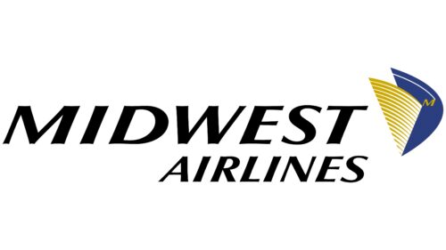
The Midwest Airlines logo was a model of impeccable aviation design, representing the high level of passenger service. The concise emblem beautifully showcased a commitment to flight, expressive dynamism, and a love for the sky.
Midwest Airlines: Brand overview
From its founding in 1984 until its closure in 2010, Midwest Airlines, formerly Midwest Express, significantly impacted the American airline industry. Based at Milwaukee Mitchell International Airport, the airline was characterized by exceptional service and a distinctive brand identity.
Midwest Airlines flew on June 11, 1984, using three McDonnell Douglas DC-9 aircraft.
Throughout the 1990s and 2000s, Midwest Airlines experienced significant growth. It expanded its network from coast to coast in the United States, including destinations in Mexico, Canada, and the Caribbean.
Unfortunately, Midwest Airlines ran into financial difficulties in the late 2000s. In April 2010, a merger agreement was reached with Frontier Airlines to save the airline. In November 2010, Midwest Airlines ceased operations, ending an era.
Meaning and History
What is Midwest Airlines?
Midwest Airlines, formerly known as Midwest Express, was an American airline that held a significant position in the aviation industry. Headquartered in Oak Creek, Wisconsin, it operated flights from Milwaukee Mitchell International Airport between 1984 and 2010. The company began operations in the mid-1980s when the U.S. airline industry was experiencing significant growth. Throughout its 26 years of existence, the airline has expanded its route network, serving many domestic destinations and shaping the air service of the Midwest.
1983 – 2002
Initially, the Midwest Airlines logo was a model of minimalism, concealing a vast avalanche of vibrant energy, which manifested in several factors that were not immediately apparent but created the desired impression. Specifically, these included:
- Expressive italics;
- Improvised serifs;
- Deep blue color.
The slanted font added energy to the emblem, showcasing the company’s commitment to rapid flight, tireless movement, and continuous development. The thickening at the ends of the letters visually infused the text with dynamism, smoothly transitioning from the narrow parts of the strokes to the wide parts without disrupting the harmony of the calm design. The rich blue color reminded viewers of the sky, altitude, and the swift traversal of airspace.
Although the name was divided into two parts, it was designed in a unified style, expressing the airline’s concept of impeccable passenger service. This design instilled confidence, demonstrated customer care, and showcased the company’s vast capabilities.
2002 – 2010
The Midwest Airlines logo combines graphics and text in a balanced design. The name “Midwest Airlines” is in bold, italicized black letters with small extensions at the ends, adding sophistication. Next to the text is the airline’s unique symbol—a pair of wings with an “M” inside. This “M” also reflects the Milwaukee Art Museum when viewed from the side, connecting the logo to Milwaukee, the airline’s home base.
The bold, italicized text is striking and readable. The small extensions on the letters give it a classic, elegant look. The wings and “M” symbol signify the airline’s origin and incorporate a local cultural element, making the logo memorable and deeply rooted in the community.
The black text provides a strong visual foundation, while the small extensions add a distinctive flair. The wings with the “M” denote the airline’s origin and pay homage to a significant local landmark, blending aviation with regional pride.
The reference to the Milwaukee Art Museum adds depth, connecting the airline to the cultural heritage of its home city. This design element makes the logo a symbol of local pride and architectural excellence.


