The Milky Way logo is sweet and refreshing. The emblem tells a story of rejuvenation and increased energy levels, reflecting the core properties of the candy bar. The sign is a sea of chocolate, evoking pleasant taste associations and the desire to try the candy.
Milky Way: Brand overview
In 1923, Frank Mars introduced the Milky Way chocolate bar in the U.S. It was a hit with its creamy nougat center and milk chocolate coating. A few years later, in 1935, his son, Forrest Mars, Sr., took the bar across the Atlantic to England, where he made it lighter with a vanilla-flavored mousse, still wrapped in delicious milk chocolate. This version was about enjoying a sweet treat without worrying too much about calories. The slogan “The sweet you can eat between meals” helped make it a favorite by suggesting you could enjoy it anytime.
Through the 1960s and 1970s, the Milky Way became more popular in the UK and Europe. It was appealing because it was a lighter snack option. They started making it in different sizes, including minibars, which people liked.
Ads in the 1980s and 1990s showed people enjoying Milky Ways daily, which helped make the bar even more popular. The red packaging and logo became well-known symbols of the brand.
Entering the 2000s, the Milky Way evolved with new flavors like the Crispy Rolls, adding a bit of crunch. Later, in response to people wanting healthier options, they introduced bars with less sugar and smaller sizes.
Today, the Milky Way is still loved across Europe for its light texture and great taste. It stands out from other chocolate bars and has fans of all ages. The bar’s success shows how adapting to people’s wants in different places can pay off. Even though it differs from the American version, it has become a key part of European snack culture.
Meaning and History
What is Milky Way?
The Milky Way brand is known for its chocolate bars that feature a unique blend of soft nougat and caramel covered in milk chocolate. Interestingly, the brand tailors its recipe to regional tastes: in the USA, the bars have a heavier caramel focus, whereas in Europe, they resemble more of a chocolate mousse.
1972 – 1989
The Milky Way bar in Europe got its first logo between 1972 and 1989, which captured the candy’s unique charm and its space theme. The logo showed a night sky filled with stars, with the candy’s name in white, stretching upwards like a Milky Way. The white text represents milk, fitting the candy’s theme well.
The Milky Way bar is famous for its special taste, from smooth milk chocolate, fluffy nougat-like marshmallows, and crunchy malted milk rice balls. Its creamy and white ingredients played a big role in choosing the name and color of the logo, highlighting its milky base.
A fun fact about the Milky Way bar is that it can float in milk because of its low density. This feature ties it back to dairy and makes it a fun addition to milk-based desserts.
In Europe, the Milky Way bar and its emblem represent sweet dreams and softness, blending visuals and flavors beautifully. Its light texture and creamy taste offer a brief escape into a dreamy, magical world. This makes the candy a reminder of carefree childhood days and happy moments.
1989 – 2001
Since the 1970s and 1980s, the Milky Way bar’s logo has evolved, maintaining its cosmic theme while adding new features. The latest design uses a sky-blue font that appears to rise upward with soft, rounded shapes, suggesting the vastness of space. This connects to the bar’s unique flavor and ability to evoke dreams and feelings of flight.
The logo now includes:
- There is a red star trail at the bottom of the name.
- Adding a vibrant accent symbolizes the brand’s dynamic growth and global reach.
- Reflecting its popularity worldwide.
The design also features five stars, representing the continents where the Milky Way bar is available, highlighting its broad distribution and appeal across different cultures.
The red and blue star trail also aligns with speed and energy themes, echoing the brand’s 1989 marketing campaign featuring racing cars. This underscores the brand’s commitment to innovation and active consumer engagement.
The logo cleverly introduces the Milky Way Magic Stars—small, star-shaped candies that continue the space theme and offer a unique treat. It reinforces the brand’s connection to space and its intent to bring magic and wonder to its customers.
2001 – 2007
The Milky Way brand has updated its logo to a classic style, using white lettering for the brand name. This change honors the brand’s history and tradition while keeping up with current trends, ensuring it remains distinctive. The white color of the letters nods to the dairy ingredients essential to the candy bar’s creamy texture and taste.
The logo’s dot above the letter “i” is designed as a splash of milk and chocolate, creatively emphasizing the main ingredients. This feature highlights the filling’s richness and the bar’s premium quality and flavor.
The logo includes an image of space with the Milky Way bar depicted as a comet moving through an orbit. This cosmic theme underlines the brand’s enchanting and unique character. The orbit imagery also represents the bar’s broad appeal and its journey into the hearts of consumers worldwide.
The Milky Way candy is a well-known bestseller, and its new logo visually places it among the stars, symbolizing its high quality and unique flavor, which make it stand out in the market.
2007 – 2021
The Milky Way brand has redesigned its logo to include images of people above the letter “i,” where previously there were milk and chocolate splashes. These figures symbolize the energy and strength the bar’s key ingredients, milk and chocolate, provide. This design showcases the energizing effect of these ingredients.
The logo now features bolder letters and a designed background that creates a sense of movement, reflecting the brand’s dynamic nature.
A new element in the logo is the red star comet, which enhances the logo’s appeal and symbolizes the Milky Way bars’ market success. The comet ties to themes of dreams and aspirations, aligning with the brand’s message that enjoying the bar is about inspiring dreams and achieving new goals.
2021 – today
The logo is now simple and minimalistic, showing only the brand name and a comet symbol. This design emphasizes the essential elements of the brand’s identity, focusing on clarity and significance. The blue letters, pointing upward, symbolize ambition and striving for greatness, enhanced by bright star fragments in a creative space.
Since its creation, the candy bar has adapted to changing consumer preferences and market trends. Despite these changes, the brand remains a leader in global taste preferences, highly popular among consumers, and known for delivering pleasure.
The candy bar is recognized worldwide and celebrated for its unique taste and texture, which offer culinary delight, a surge of emotions, and inspiring achievements. Each piece invites discoveries and adventures, providing moments of joy that encourage reaching new heights and realizing dreams.
US version
Milky Way is the first American chocolate bar produced by Mars for over 100 years. There are two versions of the treat. The original American recipe consists of nougat covered in caramel and milk chocolate. The sweet sensation for the rest of the world consists of light nougat in chocolate. The difference is due to the separation of the business into American and European branches from 1932 to 1964 due to family disputes.
Frank Mars introduced the Milky Way chocolate bar in 1923, creating a candy inspired by the malted milkshakes that were popular then. Its malt-flavored nougat covered in milk chocolate offered a new taste experience and quickly became a favorite in the U.S.
In the 1920s and 1930s, the Milky Way gained popularity with its unique taste and texture, leading to the launch of the Milky Way Giant Bar and other variations. This responsiveness to consumer preferences helped solidify its position in the market.
In the 1940s, during World War II, Milky Way bars were part of American soldiers’ rations, enhancing its recognition. Post-war, the brand continued to thrive, maintaining its status through a growing product range emphasizing its versatility.
The 1960s and 1970s marked a period of expansion as Milky Way reached beyond the U.S. The brand introduced a European variant with whipped vanilla mousse and milk chocolate, appealing to new fans. This era also saw the introduction of Milky Way Dark, adding to the brand’s flavor options.
Entering the modern era, Milky Way introduced Milky Way Midnight with dark chocolate and vanilla-caramel filling, and Milky Way Caramel expanded its flavor and texture variety. The brand also explored new areas with frozen desserts and coffee drinks while remaining true to its essence.
In recent years, responding to changing health trends and consumer preferences, Milky Way introduced smaller sizes and options with less sugar. This ensured a wider audience could enjoy the candy. Seasonal flavors and limited editions have been launched to keep the brand fresh and engaging.
As Milky Way nears its 100th anniversary, it remains a cherished candy bar. Its story reflects a commitment to innovation, adaptability, and quality. This enduring popularity suggests that the Milky Way will continue to delight chocolate lovers for many years.
The brand’s logo has undergone several transformations over time. However, the overall concept has remained consistent, as it is related to having a single owner for 100 years and a long-standing family affiliation. The brand’s emblems are full of life, energy, and strength, which fill the candy bars and those who consume them. All elements resonate with the components’ properties and the treat’s taste qualities.
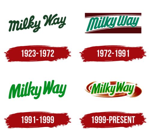
1923 -1972
The first candy bar logo consists of the name in green cursive font. The brand name is derived from the following:
- Our galaxy—the Milky Way. Candy enjoys cosmic popularity and is sold virtually worldwide. The invention of candy bars was a breakthrough for our galaxy.
- Milk is included in the nougat and outer coating. Hence, the company’s most popular slogan: “Milk is twice as tasty if it’s a Milky Way.”
- A cocktail with the same name. According to legend, Frank Mars took the candy bar recipe from a drink his son liked. The company often refers to this interpretation of the name.
The connection of letters in the brand name represents the elastic, stretching mass of the creamy inner filling. All symbols are round with smooth curls, hinting sweetness, softness, and a pleasant taste.
The choice of green color is associated with the theme of life and vital energy. The candy bars were initially considered a children’s treat and a good snack for workers during lunch breaks. The sweet replenished energy and brought inspiration to accomplish complex tasks.
This theme was also linked to the first advertisement, where a sailor survived a shipwreck thanks to the strength gained from eating the candy.
The upward lift of the logo is a common technique for embodying growth and development. This is especially true for the Milky Way, as it was due to the candy bar that Mars went from losses to revenues of 700,000 dollars within two years.
1972 – 1991
The founder’s grandchildren began managing the corporation. They brought a fresh approach to marketing the released brands, including the Milky Way logo. The new sign became closer to the actual candy bar.
The inscription was placed on a white stripe surrounded by a brown foundation. The white part symbolized nougat and milk, while the brown represented the chocolate coating.
The letters of the inscription were made more slender. At the same time, M and W were displayed as mirrored, identical symbols. This technique demonstrated the chocolate coating on top and bottom. The two curves spoke of the two types of recipes and the two coating layers.
1991 – 1999
The company focused on the candy bar’s benefits. To this end, instead of cocoa butter in the recipe, they used caprenin (a low-calorie product made from glycerin and fatty acids). This innovation was reflected in the logo with the help of a salad green color, symbolizing a new beginning and young, healthy greens. The light shade indicated a reduction in calories. All other techniques, such as connecting letters and smooth lines, remained.
1999 – today
The visual identity was updated on the eve of the 21st century. In the new logo, the salad green inscription was placed on a background of liquid chocolate, making the image more thematic and understandable. Chocolate evokes associations with sweetness, indicating that the subject is a candy.
The company has not changed the theme of life, which was chosen as the concept of the product, since the beginning of production. The advertising slogan, Life, evidences this’s better than the Milky Way, and the green shade of the emblem’s letters.
The name’s font has changed – it has become straight and even, bringing the inscription closer to the rectangular shape typical of the candy.
The white substrate under the name is a symbol of milk.
The colors of the logo embody both the composition of the product and its properties.
- Green – life-affirming shade. It shows replenishment of strength, active life, and health benefits. It predicts the development and prosperity of the product.
- White – the color of milk and dairy products central to the recipe. It demonstrates lightness and low calories.
- Brown – the shade of caramel and chocolate. It is associated with desserts and pleasure.
The font is similar to Ligurino SemiCond Bold.
Font and Colors
The Milky Way logo uses a custom sans-serif font with rounded edges and subtly tapered letters. This gives the logo a soft, welcoming feel. Although it shares some characteristics with fonts like Fun Club Sprit and Jolly Angel Italic, the Milky Way logo has unique contours that make it stand out.
The logo’s colors are blue, red, and white, a combination that has represented the brand for many years. Blue stands for reliability and confidence, which are important for the brand’s promise of quality. Red adds energy, reflecting the candy’s indulgent nature. White ensures the logo looks clean and balanced. This color scheme makes the logo eye-catching and consistent across different media.
The special font and color scheme make the Milky Way logo memorable and easy to recognize, which is important in the competitive candy market. These elements convey the brand as trustworthy and vibrant, helping it remain a favorite among consumers.
FAQ
What is the Milky Way brand?
The Milky Way is a famous chocolate bar made by Mars, Incorporated, one of the biggest candy companies. Since it started in 1923, it’s the oldest Mars chocolate that people still enjoy. This long history shows how much people love it and how it keeps up with changing tastes. Milky Way bars have chocolate, nougat, and caramel. These ingredients mix well to give a great taste and texture. The smooth chocolate outside covers the light nougat and gooey caramel inside. This mix makes the Milky Way a favorite around the world.
Milky Way has added new flavors and sizes to keep up with people’s liking. There’s the Milky Way Midnight with dark chocolate and the Milky Way Simply Caramel, which is all about caramel. They even made smaller versions for different needs and preferences. Milky Way’s success comes from good marketing and keeping the product exciting. Mars has worked hard to keep the brand alive with ads and new ideas, especially as it is nearly 100 years old.
What’s the difference between a Mars bar and a Milky Way?
The Mars bar and the Milky Way bar are two popular chocolates made by Mars, Incorporated, but they’re different in a few key ways. Around the world, except in the United States, a Mars bar has nougat and caramel inside, all covered with milk chocolate.
The Milky Way is similar to the United States but does not have caramel, making it less sweet and lighter. It’s mostly whipped nougat covered in milk chocolate. The Milky Way came before the Mars bar in 1923, offering a smooth and fluffy treat. A Mars bar sold in the U.S. had nougat, caramel, and almonds, but it stopped being made in 2002. It returned later as the “Mars Almond” bar, keeping its unique mix. The main difference between them, especially in the U.S., is what’s inside. The Mars bar has nougat, caramel, and sometimes almonds, while the U.S. Milky Way just has nougat.
What is the Flavour of the Milky Way?
The Milky Way chocolate bar has been a favorite since Frank C. Mars made it in 1923 in Minneapolis, Minnesota. It’s known for its nougat, caramel, and milk chocolate mix. The soft nougat at the bottom has a light, sweet malt flavor, paying tribute to the malted milk drinks popular back then. “Milky Way” comes from these drinks, not the stars. On top of the nougat, caramel adds a chewy, buttery taste. The whole thing is covered in creamy milk chocolate, which adds a rich flavor and makes the bar even more delicious.
This mix of flavors makes the Milky Way unique. The malted nougat gives a comforting sweetness, the caramel brings a rich butteriness, and the milk chocolate ties it together with a smooth finish. It’s a blend that’s both nostalgic and satisfying. The Milky Way bar’s taste isn’t inspired by outer space but by the joy of drinking malted milkshakes.
Why is Milky Way chocolate called Milky Way?
Surprisingly, the Milky Way chocolate bar got its name. Many might guess it was named after the galaxy, especially with the creator’s last name being Mars. However, the real inspiration came from a favorite drink back in the day: the malted milkshake. Malted milkshakes were all the rage in the early 20th century. They were made by blending milk, malted milk powder, and ice cream, creating a rich and creamy treat everyone loved. Frank C. Mars wanted to capture this popular flavor in a candy bar. So, he created the Milky Way to mimic the taste of these beloved shakes in a convenient candy form.
The company even advertised the Milky Way as “a double malted milk in a candy bar,” emphasizing its unique appeal. This slogan showed how the bar was different: it had the familiar taste of malted milkshakes but in a brand-new way. This clever marketing helped the Milky Way stand out and connect with people who enjoyed malted milkshakes. “Milky Way” indicates the candy’s flavor, inspired by malted milkshakes, not the stars.
Why is the Milky Way different in Europe?
The Milky Way chocolate bar is made differently in Europe compared to the United States. The main reason is that people in Europe prefer lighter snacks. So, the European Milky Way doesn’t have caramel, and its nougat is fluffier and not as dense as the American version or the British Mars bar. This makes the European Milky Way taste lighter and not too sweet.
Mars Incorporated, the company that makes Milky Way, decided to do this because they wanted the bar to fit what people in different places like to eat. In the U.S., the Milky Way is a heavier snack with caramel and dense nougat wrapped in milk chocolate. But they removed the caramel for Europe and made the nougat lighter to match local tastes. The European Milky Way is lighter because that’s what people there enjoy. It shows how Mars is good at making sure their candy bars fit in with what people in different countries like to eat.
What brand makes the Milky Way?
The Milky Way chocolate bar, known for its delicious mix of chocolate, caramel, and nougat, comes from Mars, Incorporated. Mars is a big name in making sweets, pet food, and other foods worldwide. They started selling Milky Way bars in 1924, making it their oldest chocolate bar that’s still around today. This shows how much people have loved it for a long time and how Mars keeps making quality products.
Nowadays, you can find Milky Way bars worldwide, in different versions to suit various tastes. The U.S. version is well-liked for its caramel and nougat, but bars sold in other countries might taste a bit different, showing Mars’s effort to please everyone everywhere.
What is the difference between the US and the UK Milky Way?
The Milky Way chocolate bar is known by the same name in the United States and the United Kingdom, but they’re quite different. In the US, the Milky Way has caramel and nougat covered in milk chocolate, giving it a rich taste with a mix of sweet and chewy textures. In the UK, however, the Milky Way is simpler, with just whipped nougat in milk chocolate, making it lighter and fluffier than the US version. This difference shows how companies change their products for different places.
Mars, Incorporated, the company behind these candies, matches their chocolate bars with what people in different places prefer to eat. The US and UK versions offer different tastes and experiences for chocolate lovers in those countries.
