Miro, the visual workspace giant known for enabling teams to craft the “next big thing,” has rolled out a series of brand modifications to harmonize with its mission and improve user interaction. With a clientele that boasts 60 million users worldwide, including the crème de la crème of the Fortune 100, Miro has long been a catalyst for innovation. The company’s latest changes reflect its enduring commitment to fostering creativity among distributed teams.
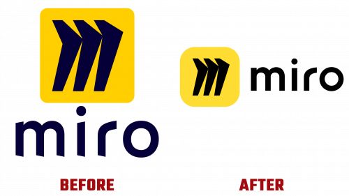
The Miro logo’s revamped look is taking center stage in this brand metamorphosis. Initially part of a quartet of “collaborative characters” rolled out in 2019, the monogram “M” has been elevated to serve as the brand’s primary symbol. This fresh design allows more breathing room to the “M,” signaling a minimalist shift rather than a brand elevation. The wordmark has been streamlined, jettisoning angular distractions for a more refined appearance.
Complementing the new logo are two pivotal design enhancements: an innovative illustration system and a collection of animated arrows. The illustrations, composed of black strokes and shadow effects, ingeniously incorporate the “M” icon, portraying it as a gateway to limitless possibilities. Interestingly, these floating arrows mirror the in-product experience on Miro, where team members are represented with color-coordinated arrows and labels. While the resemblance to Figma’s design approach is noteworthy, it could be an incidental overlap due to the platforms’ similar functions.
However, not everything is avant-garde in Miro’s brand update. The overall deployment of the branding elements leans towards the conventional. For example, the website keeps a professional, albeit somewhat vanilla, design that doesn’t stray far from the common look of many Software as a Service (SaaS) platforms. Similarly, promotional materials like posters stick to a straightforward and centered layout.
Miro’s latest brand update seems to be a step in the right direction. While some elements might come off as ‘playing it safe’ or echoing competitors, the overarching brand shift—anchored by the new Miro logo—appears designed to offer a cleaner, more intuitive interface for its extensive and varied user base.


